What’s in a Name: Zaha Hadid’s Legacy and the Business of Branding Architecture
Architects: Want to have your project featured? Showcase your work through Architizer and sign up for our inspirational newsletters.
Zaha Hadid passed away in 2016. But her company, Zaha Hadid Architects, lives on. Clients who want to commission one of her trademark gravity-defying curvilinear buildings are still free to do so. It won’t be a “real” Hadid, of course, but then again, isn’t this a question of semantics? Does any building ever really have one sole author anyway? And one cannot say that ZHA’s recent projects don’t bear the mark of her influence.
In any case, ZHA believes that its founder’s name is very valuable. In fact, they pay a great deal in order to use it. In a recent case settled by the UK’s High Court, it was revealed that the architecture firm pays six percent of its revenue each year to the Zaha Hadid Foundation for permission to use its founder’s name. Since 2018, this has resulted in £21.4 million in fees.
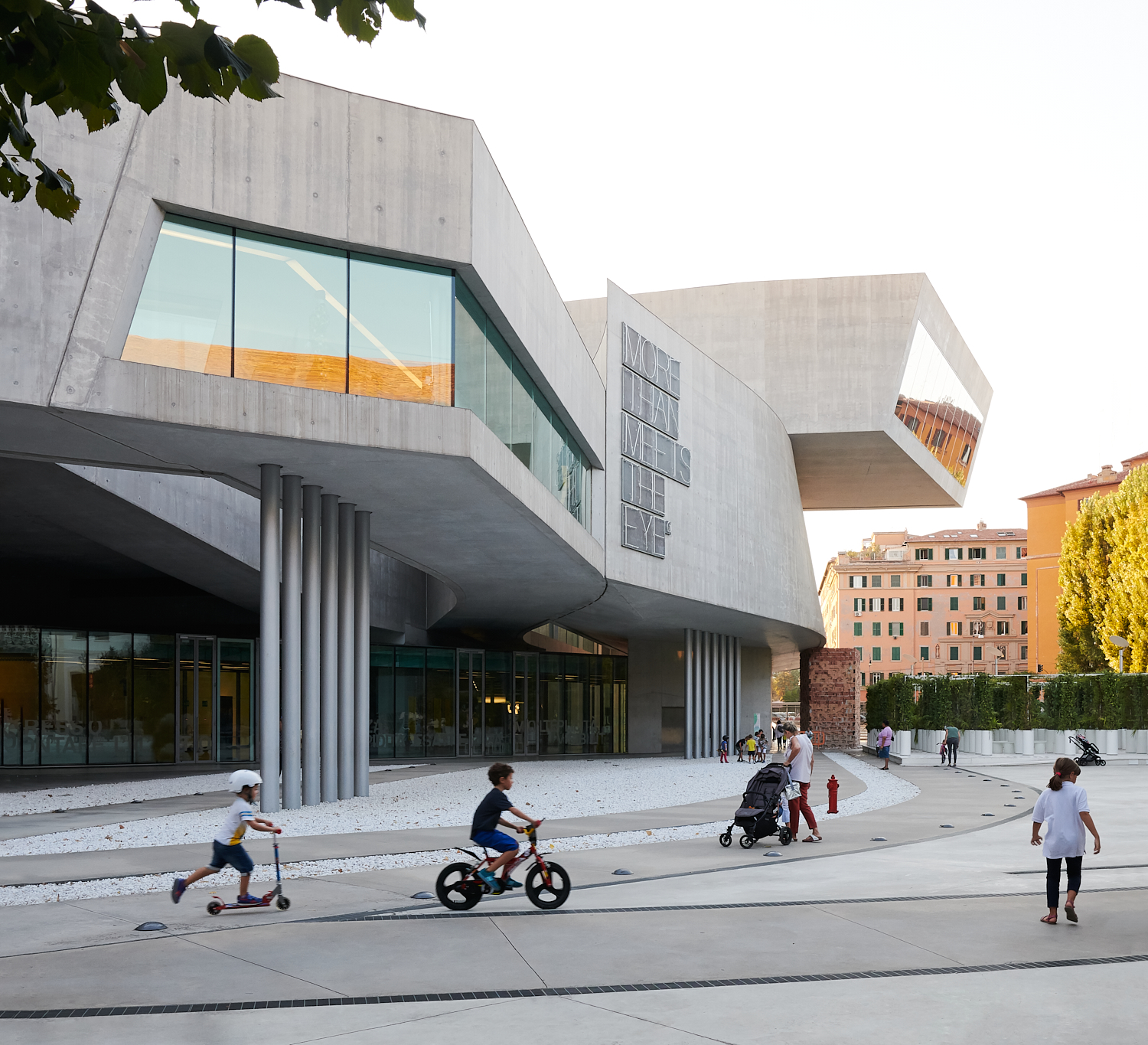
MAXXI by Zaha Hadid Architects, Rome, Italy (circa 2010) | Photo by Konstrukt Photo
The court case was brought by ZHA, which sought to be released from this licensing agreement. They argued that it places an unsustainable burden on their business. The court ruled, however, that the licensing agreement was valid. It was Hadid herself, after all, who set up this arrangement before her death. The Foundation, not the firm, was to be the guardian of her legacy as an artist. For the firm, the name primarily has marketing value and so — the court argued — it has to pay for it.
“The company’s economic activity has not been sterilized,” wrote Judge Adam Johnson. “In fact, it has achieved considerable financial success in the period since the licence agreement was entered into.”
Tom Ravenscroft, writing for Dezeen, reports that “According to figures in the judgement, Zaha Hadid Architects revenue was over £60 million in 2021, 2022 and 2023. The figures showed that revenues had almost doubled since the agreement was signed in 2013.”
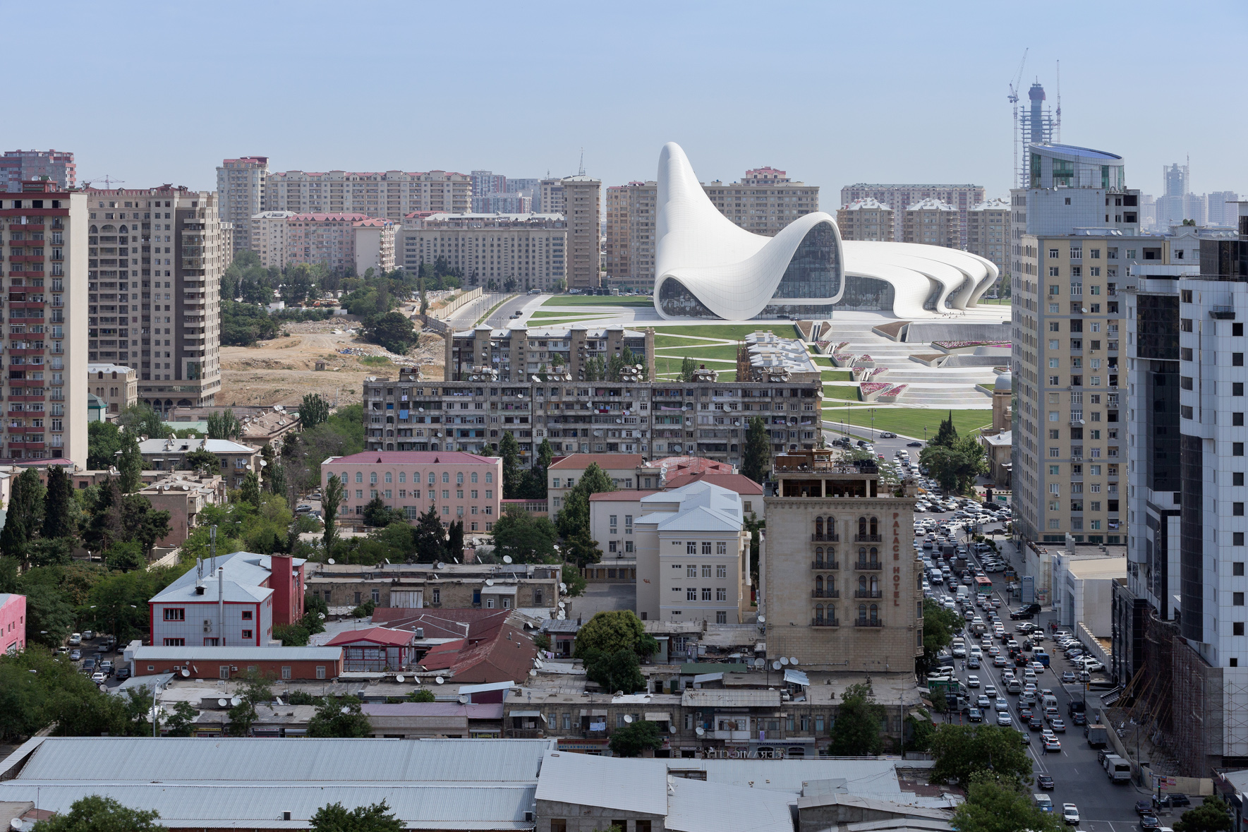
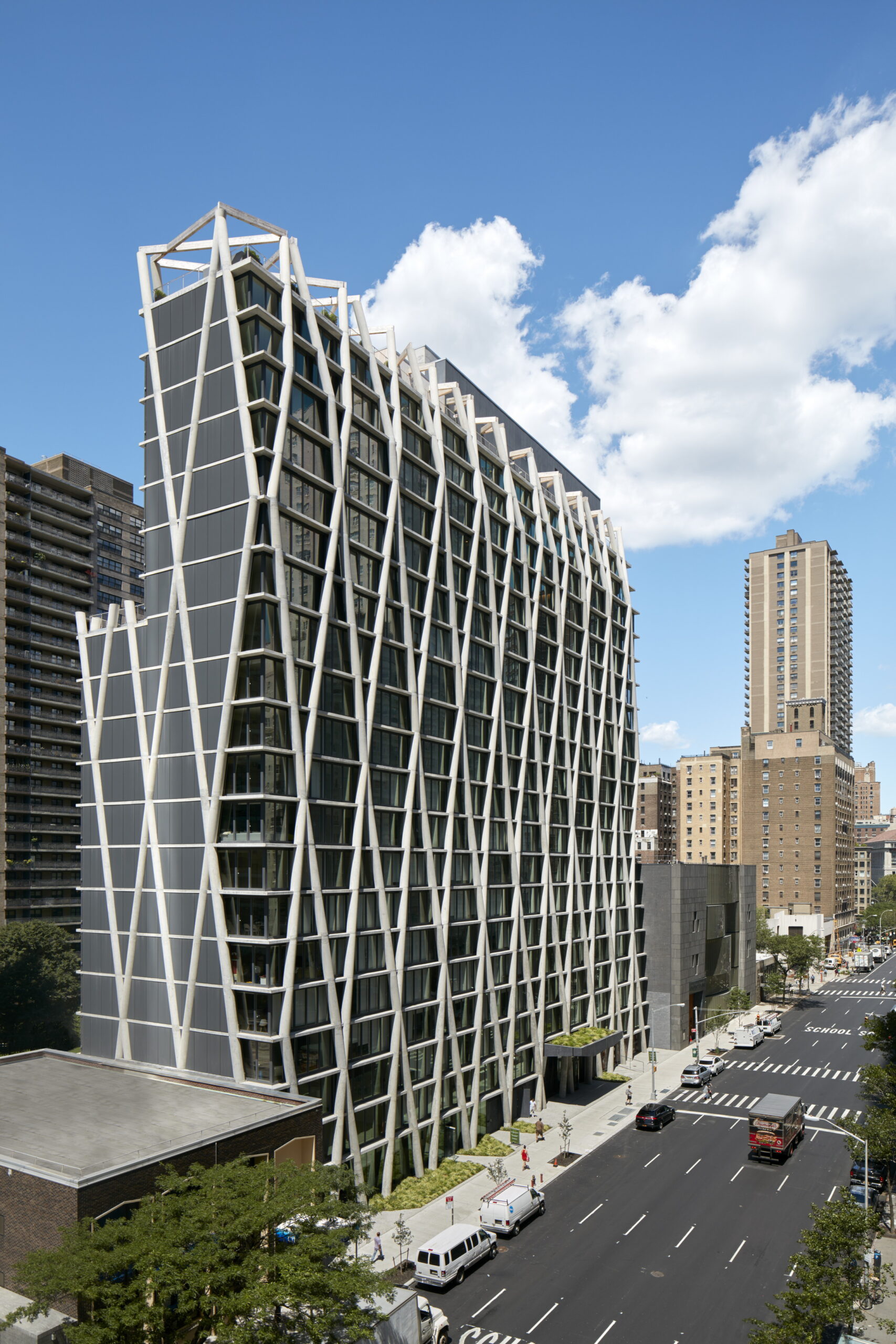
Heydar Aliyev Center by Zaha Hadid Architects, Baku, Azerbaijan
The firm’s continued success after its founder’s passing is evidence of the value of Hadid’s name as a brand. Interestingly, this is the fact that most irked commenters on Ravenscroft’s Dezeen article — the idea of Hadid’s aesthetic as a packaged commodity, like a signature. And while I usually hold with the conventional wisdom that one should “never read the comments,” this comments section was actually quite interesting. Posters debated how the proper names of architects, while valuable in helping us categorize styles and movements, can often result in stylistic stasis, as architecture becomes a matter of different stars and their trademark “looks.”
A poster named Milton Welch wrote, “keeping the Zaha’s [sic] name is, apparently, way to have a client willing to pay as-if-paying-her, for the ‘signature curves’ that, by now, everybody should be tired of.” Milton was jumped on by another poster, Michael Leonard, who defended the curve over “orthogonal construction.” But Welch explained that curves themselves are not what he takes issue with. Welch argued that Hadid’s early innovations were stunning, but seeing the same motifs over and over gets “tiresome.” Seeing “Hadid buildings” pop up like pre-fab constructions is not true to the spirit of her legacy or really to what modern architecture should be about.
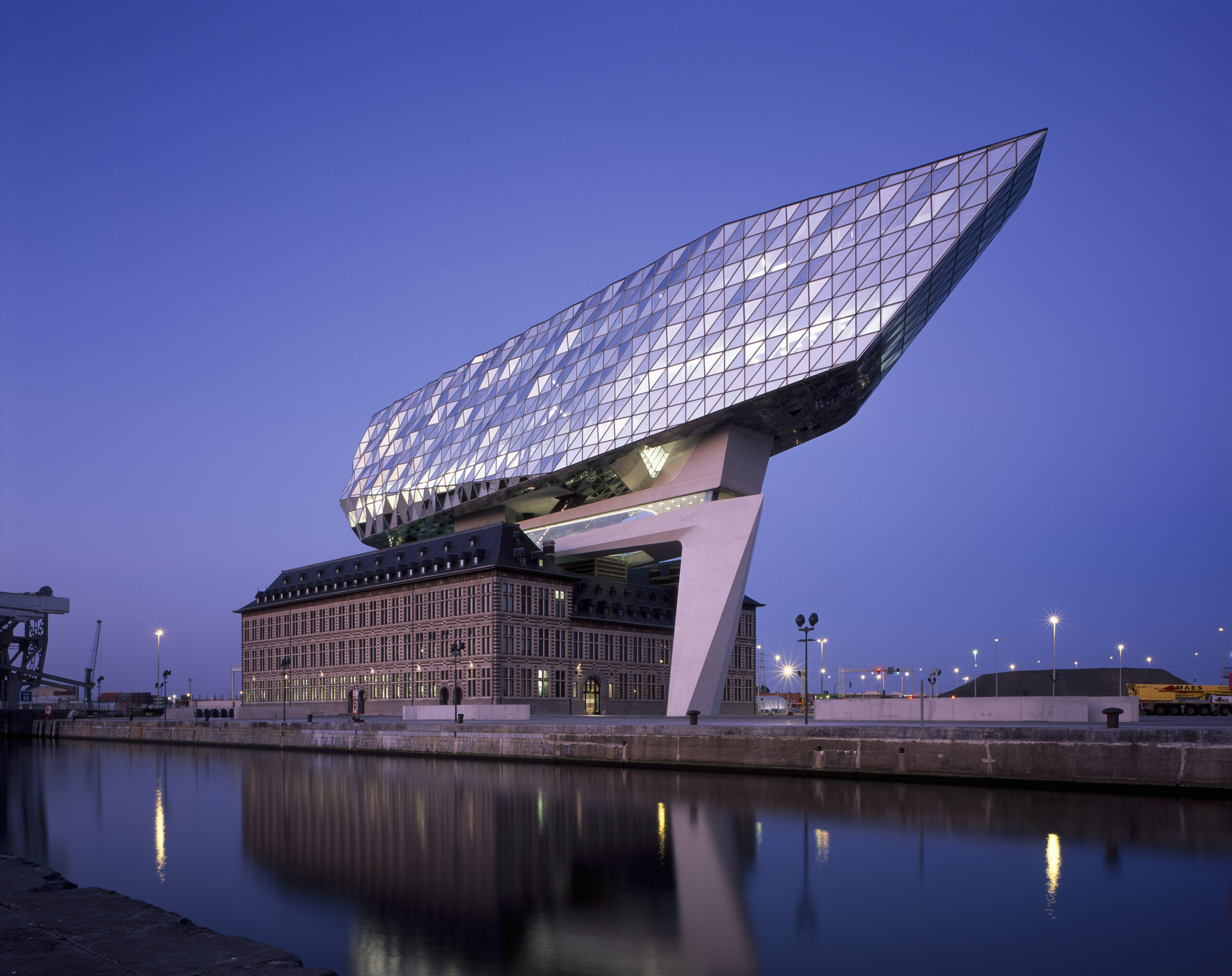
Port House by Zaha Hadid Architects, Antwerp, Belgium
And this really is the issue with the starchitect system. Key creative visionaries like Hadid made their name by designing buildings that were truly distinctive, structures that expanded the language of architecture. And yet, many of these stars fell into a rut later on, producing what was expected of them rather than venturing into new territory. Clients want to commission “a Gehry” or “a Hadid” rather than just an innovative building. Like a Louis Vuitton handbag, they are paying for the name, not the design integrity.
I wouldn’t totally blame the famous architects for this. The same thing happened to Picasso in his final decades, when collectors would pay huge sums for anything he produced — even when it was derivative junk. The problem isn’t really about fault. It is about the way branding stifles innovation. No actor likes to be typecast; architects should feel the same way.
Perhaps the best thing ZHA could do is let go of the Hadid name and reinvent themselves for a new century. The world needs more original architects like Zaha Hadid — not more “Hadid” buildings.
Architects: Want to have your project featured? Showcase your work through Architizer and sign up for our inspirational newsletters.
Cover Image: Guangzhou Opera House by Zaha Hadid Architects, Guangzhou, China (circa. 2010)
The post What’s in a Name: Zaha Hadid’s Legacy and the Business of Branding Architecture appeared first on Journal.

 What inspired the creation of the Clay Pot Bio-Acoustic Plant Wall, and how did the cultural influence of handmade clay pots shape its design and functionality?
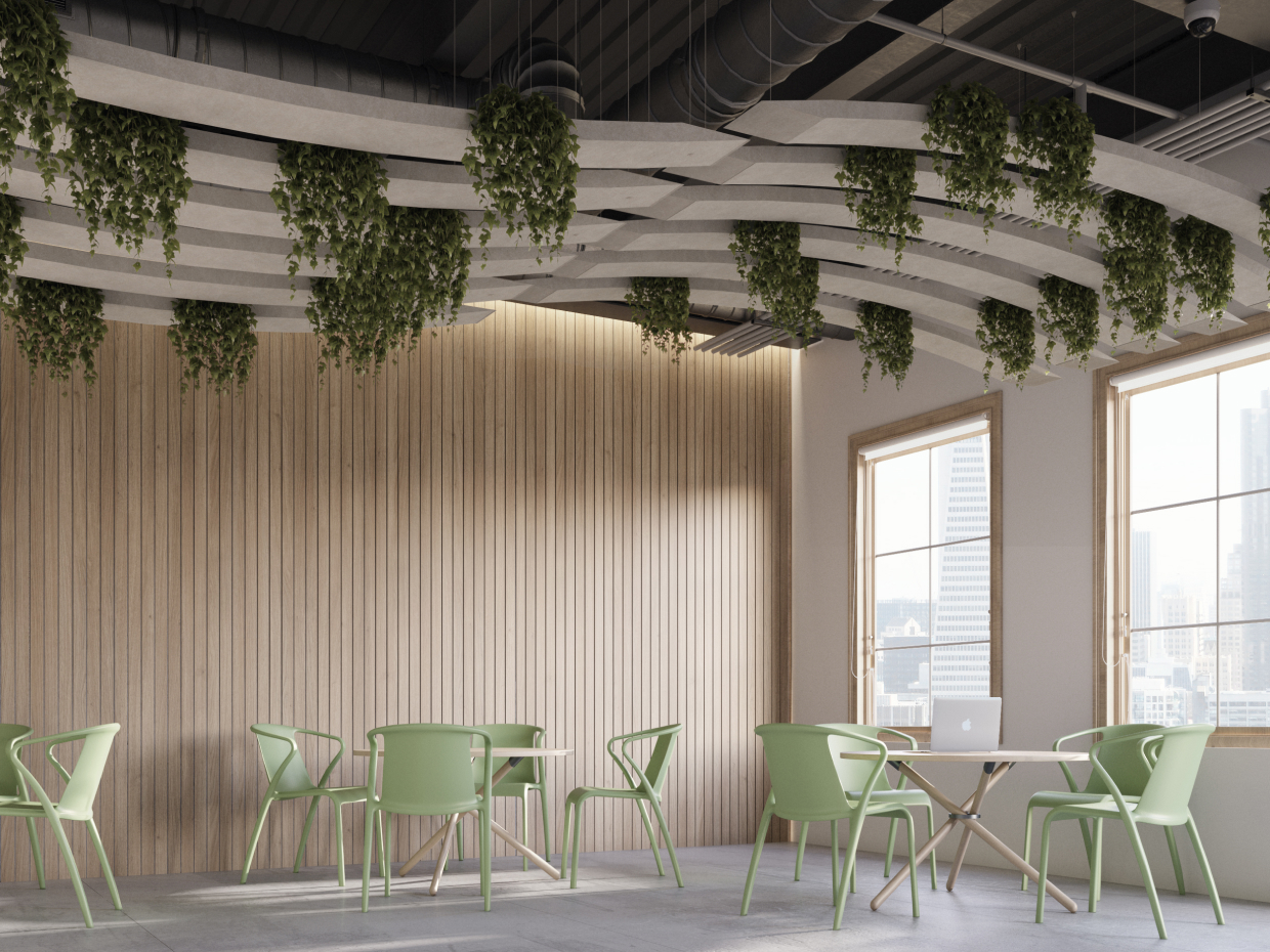 Sustainability is a key aspect of this product, from its materials to its recoverable attachment system. How does the Clay Pot Wall exemplify CSI Creative’s commitment to eco-conscious design?
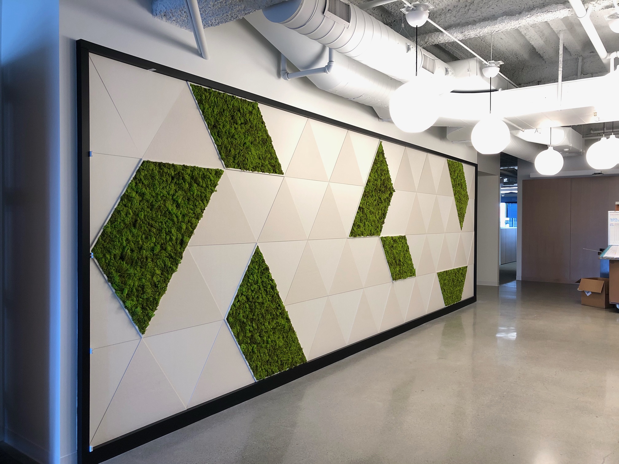 What has been the response from clients and the design community to the Clay Pot Bio-Acoustic Plant Wall?
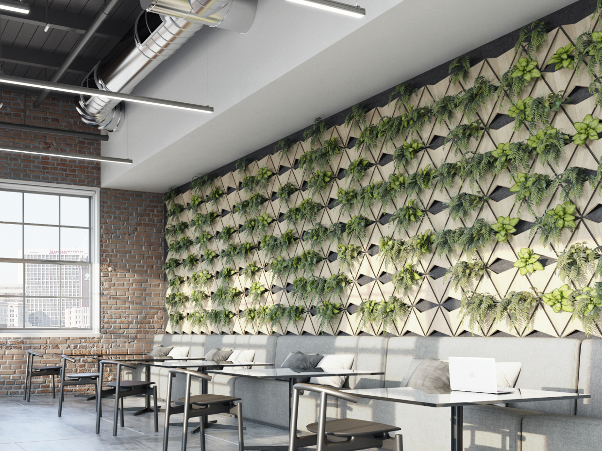
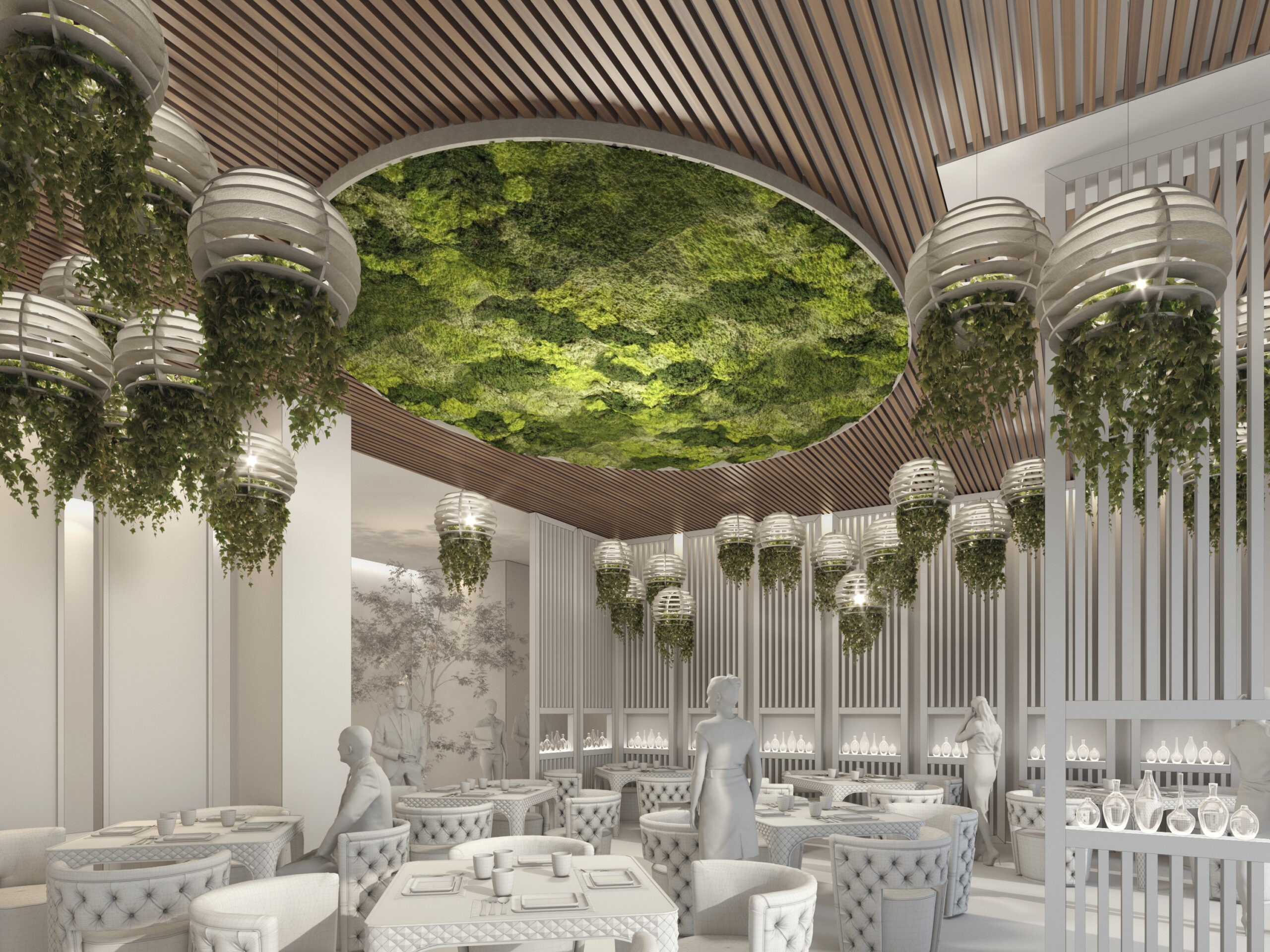
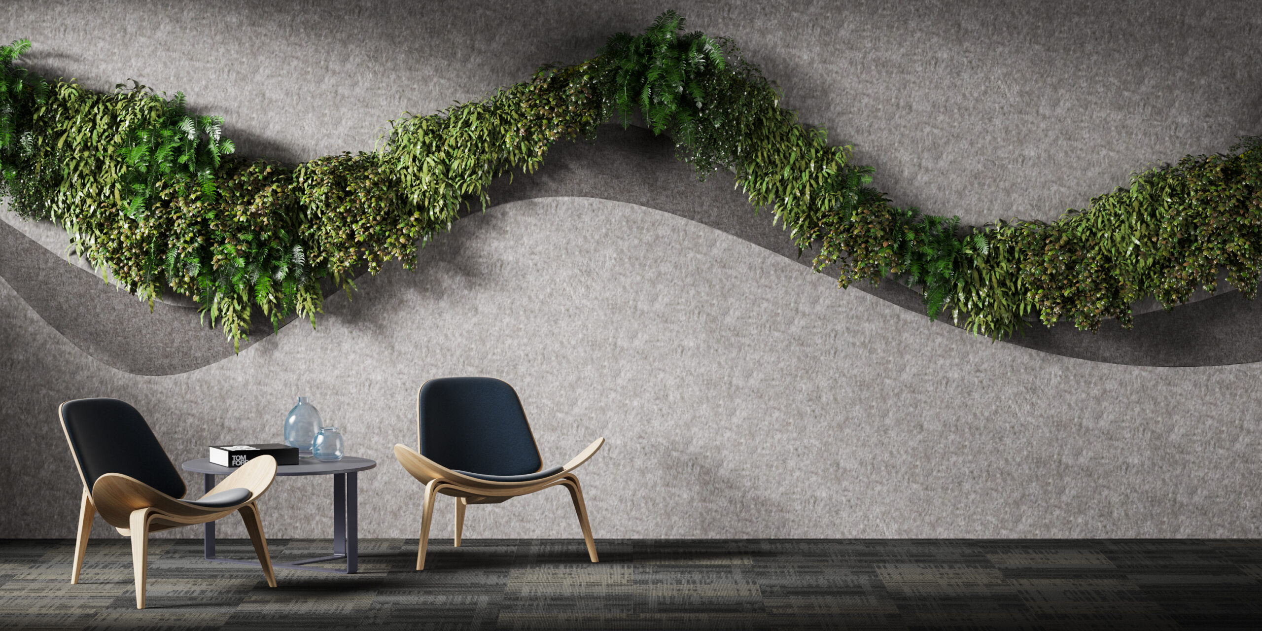 Acoustic Greenery represents a revolutionary approach to combining greenery with advanced acoustic solutions. What motivated CSI Creative to pioneer this category, and how has the industry responded?
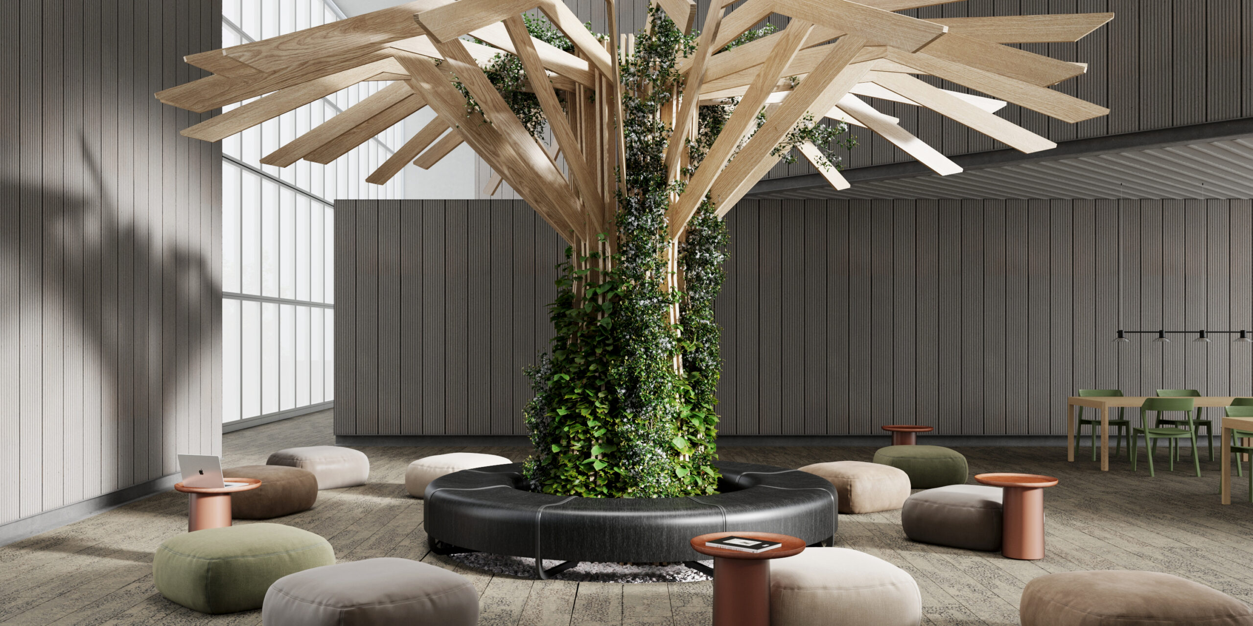 In short, it was not only about access to certain proprietary materials, but more about how Plantscape Inc.’s core belief about the power of design, became self-filling prophecy, in which the internal spatial and organizational design at Plantscape Inc.’s HQ, germinated and nurtured the seeds of innovation, transforming 50 years of experience with materials, multidisciplinary complex design and engineering challenges from two Plantscape brands, into a third, newest one, CSI Creative.
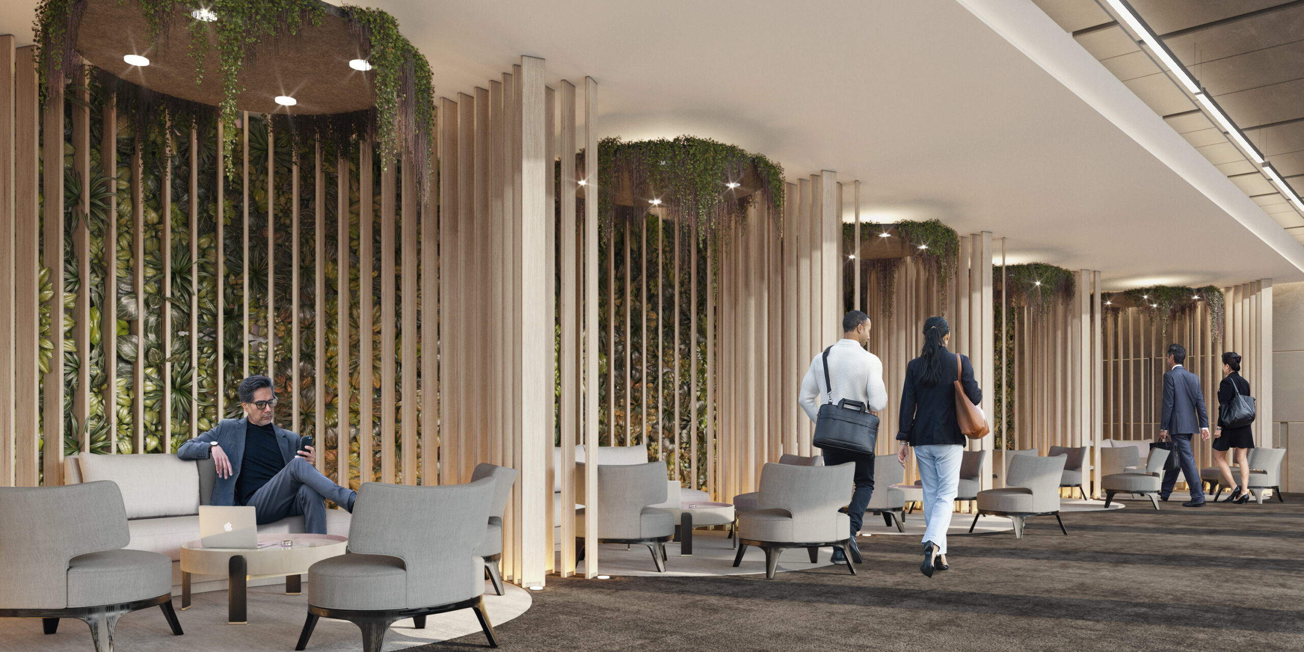
 What are the biggest challenges and opportunities you’ve encountered when designing modular systems that incorporate both biophilic and acoustic elements?
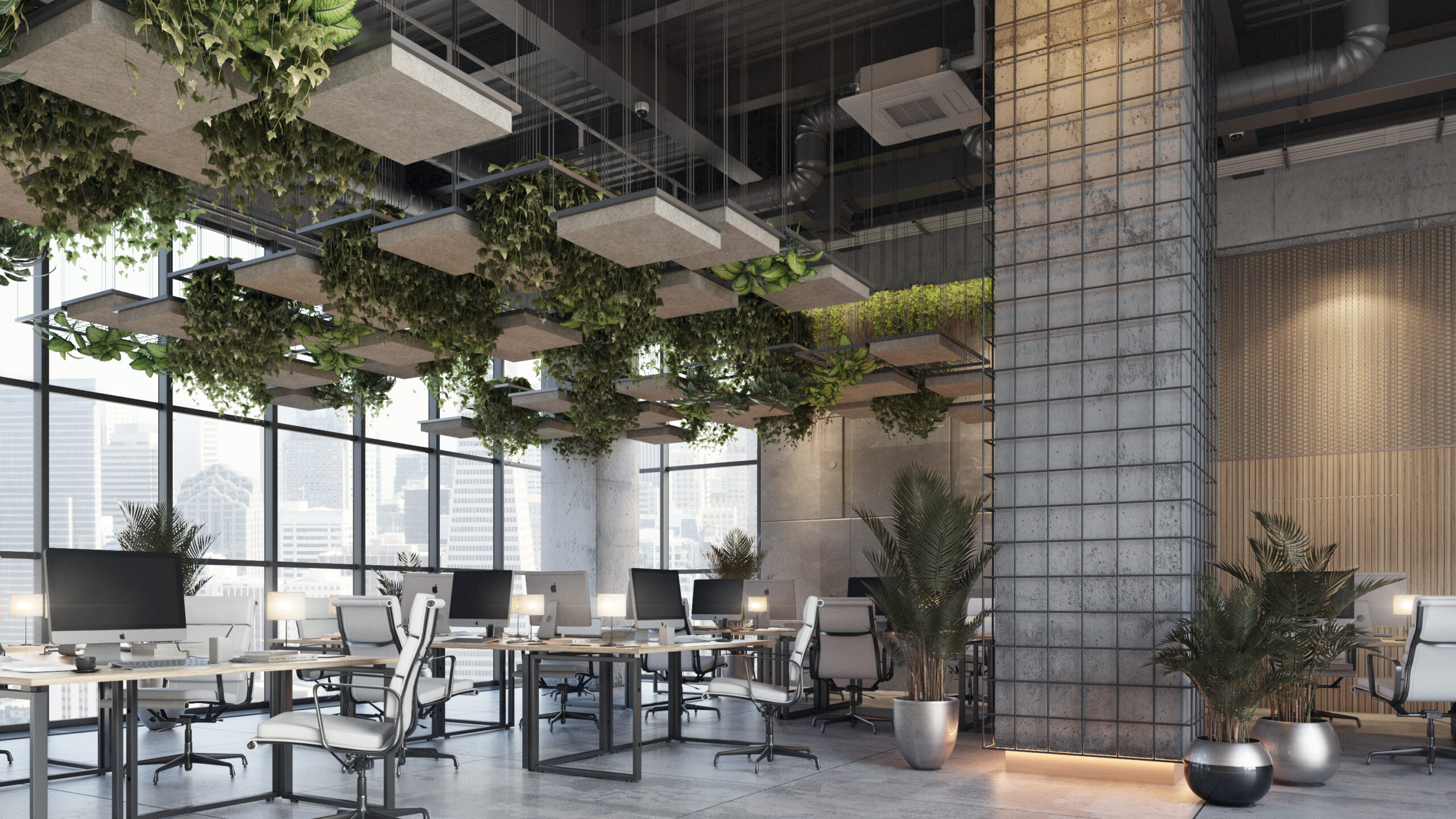 How do CSI Creative’s patented technologies, like ThermaLeaf and Soundcore, set your Acoustic Greenery products apart in terms of safety, aesthetics and performance?
 Looking ahead, how do you see Acoustic Greenery evolving, and what role does CSI Creative aim to play in shaping the future of biophilic and acoustic design trends?