
Architecture 101: What is Maximalism in Architecture?
Architects: Want to have your project featured? Showcase your work by uploading projects to Architizer and sign up for our inspirational newsletters.
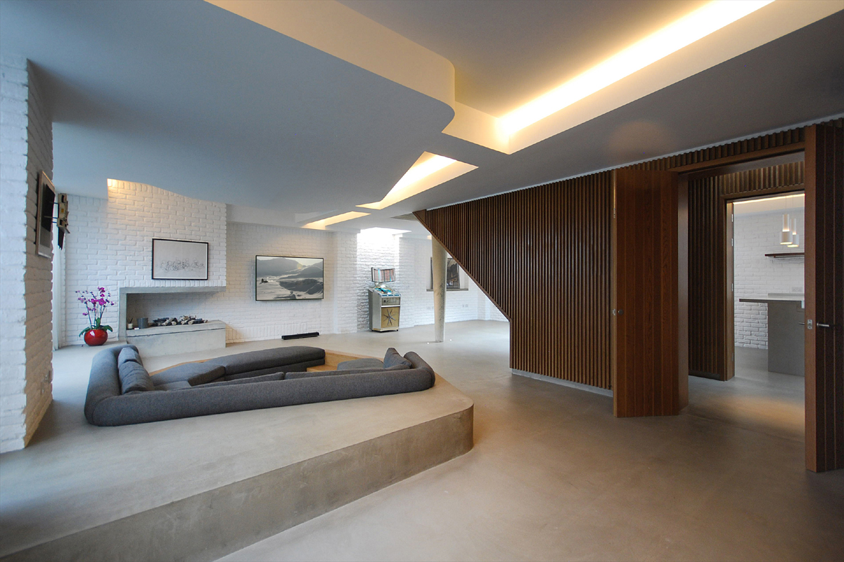
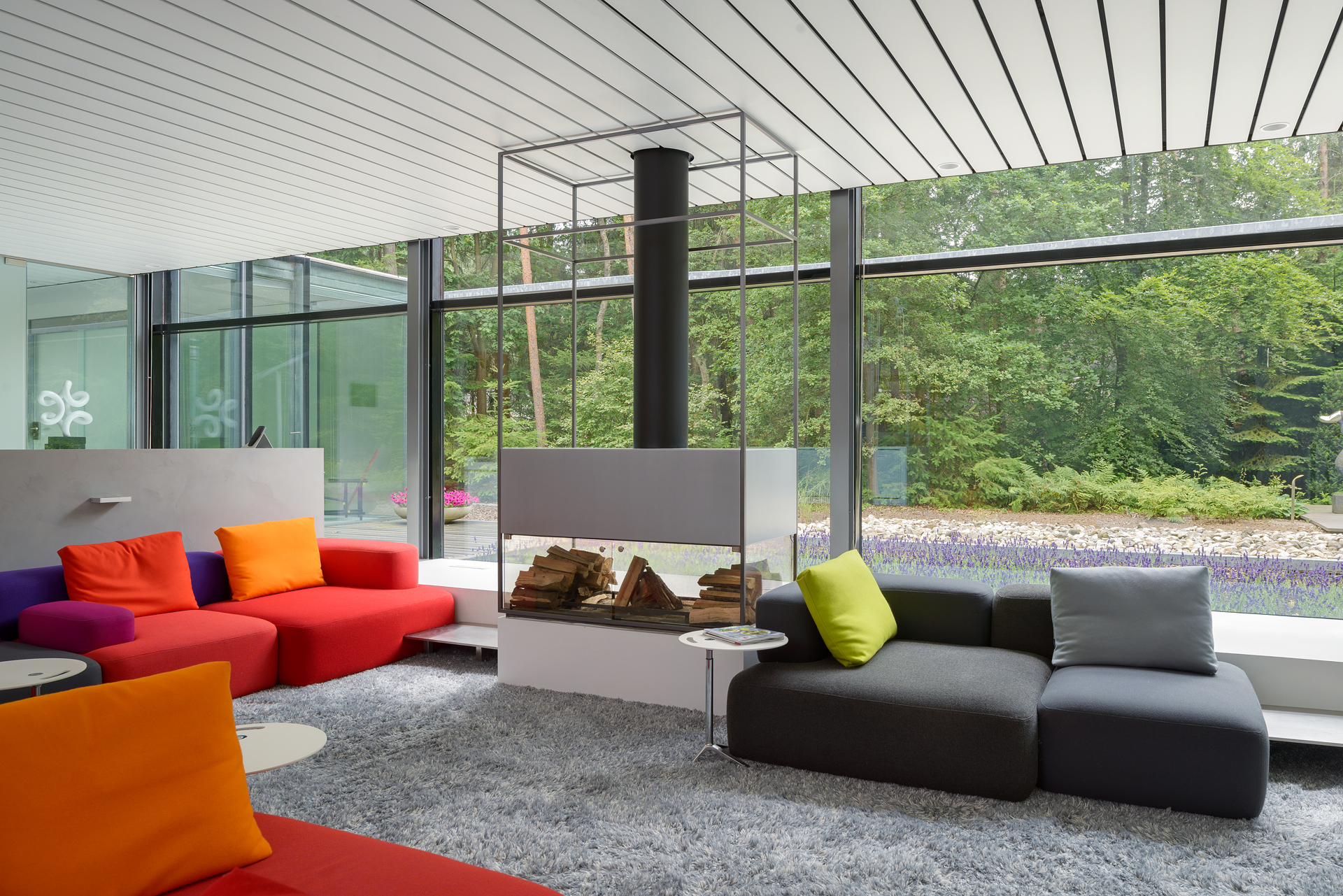
Maximalism in architecture embraces expressive forms, ornamentation, and a rich diversity of materials, colors, and textures. In this approach, excess is perceived as a positive quality in contrast to minimalism‘s “less is more” philosophy that prioritizes simplicity and clean lines. While minimalism prioritizes functionality, clean lines, and restrained ornamentation, maximalism thrives on visual richness, eclectic compositions, extravagant decoration, and unconventional material combinations.
At its core, maximalism follows a “more is more” philosophy, rejecting the idea that simplicity is a synonym for sophistication. This design approach can manifest through highly decorated façades and bold, theatrical interiors filled with art, ornate furniture, and intricate details. Maximalism is a popular style in contemporary architecture, specifically in the digital age, when AI-driven design and parametric tools allow for intricate, complex structures.
Characteristics of Maximalism in Architecture
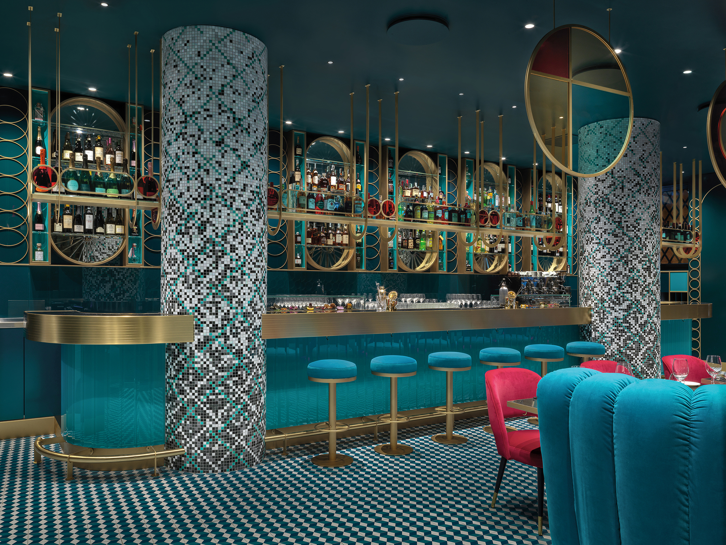
LIÒN restaurant by COLLIDANIELARCHITETTO. Rome, Italy. | Photo by Matteo Piazza
What are the key elements of maximalist interiors and façades?
Maximalist interiors and façades embrace bold expression, rich ornamentation, and layered complexity. Maximalist interiors feature vibrant colors, layered textures, and intricate patterns, creating visually bold and colorful interiors. Eclectic furnishings, statement lighting, ornate decor, and art enhance depth and personality. Luxurious and varied materials create depth and sensory richness. Textures add contrast, while vibrant, saturated colors amplify visual impact. Maximalist façades prioritize bold material contrasts and dramatic forms. Sculptural elements, expressive ornamentation, and amplified proportions create striking building envelopes. These designs often incorporate historical influences that blend with contemporary aesthetics.
How do materiality, color, and ornamentation influence maximalist design?
Materiality, color, and decoration are essential to maximalist design, shaping its bold yet curated aesthetic. Opulent materials like velvet, marble, intricate craftsmanship, and gold accents produce a sense of grandeur, often drawing inspiration from historical styles like Baroque or Rococo. Maximalism is not afraid of too much; rather, it pushes boundaries with daring combinations that enhance the dynamic and expressive nature of an interior or building envelope. Elaborate moldings, intricate tilework, decorative motifs, and sculptural elements add layers of detail for a unique look.
History of Maximalism

Catherine’s Palace in Pushkin, Russia. | Photo by Buster&Bubby via Flickr.
How did the Baroque and Rococo periods influence maximalism?
The Baroque and Rococo periods significantly influenced maximalism by establishing a design language characterized by theatricality and ornamentation. Baroque architecture emphasized dramatic spatial compositions, bold contrasts, and intricate detailing, using rich materials, gilded surfaces and elaborate frescoes to evoke a sense of power and movement. Rococo emerged as a lighter, more playful evolution of Baroque. It introduced asymmetry, pastel colors and delicate ornamentation, favoring intricate stucco work, curved forms and whimsical motifs. Both styles inspired maximalism’s embrace of opulence, layered textures and an expressive aesthetic.
Did postmodernism bring about the resurgence of maximalism?
Postmodernism played a key role in the resurgence of maximalism by rejecting the strict minimalism and functionalist principles of modernism. Postmodern architecture, which emerged in the late 20th century, embraced eclecticism, bold ornamentation and historical references, often mixing styles, colors and materials in playful and unconventional ways. Architects like Michael Graves, Robert Venturi and Ricardo Bofill are significant figures of the postmodernist movement. They reintroduced decorative elements, symbolism and a sense of irony, aligning with maximalism’s celebration of complexity and visual richness. This revival of expressive design paved the way for contemporary maximalism, which continues to embrace layered aesthetics, diverse influences, and an unrestrained approach to form and materiality.
Case Studies and Example of Maximalist Buildings

Bankers Hall Towers by Dialog (formerly Cohos Evamy). Calgary, Alberta, Canada. | Photo by Bernard Spragg via Wikimedia Commons.
Which designers and architects are known for maximalist buildings?
- David Rockwell: Known for theatrical and richly detailed interiors, particularly in hospitality design.
- Marcel Wanders: His work, particularly with Moooi, blends luxury with theatrical design, making him a key figure in the movement.
- Studio Job: An interior design studio known for its creative and vibrant spaces that merge art, design, and maximalist themes.
- India Mahdavi: Famous for creating immersive, colorful, and highly ornamental interiors.
Additionally, works by architects Zaha Hadid, Jean Nouvel, and Frank Gehry exhibit some maximalist qualities, especially through dynamic forms, expressive materiality, and bold spatial compositions. However, their unique architectural approaches don’t strictly adhere to the principles of maximalism.
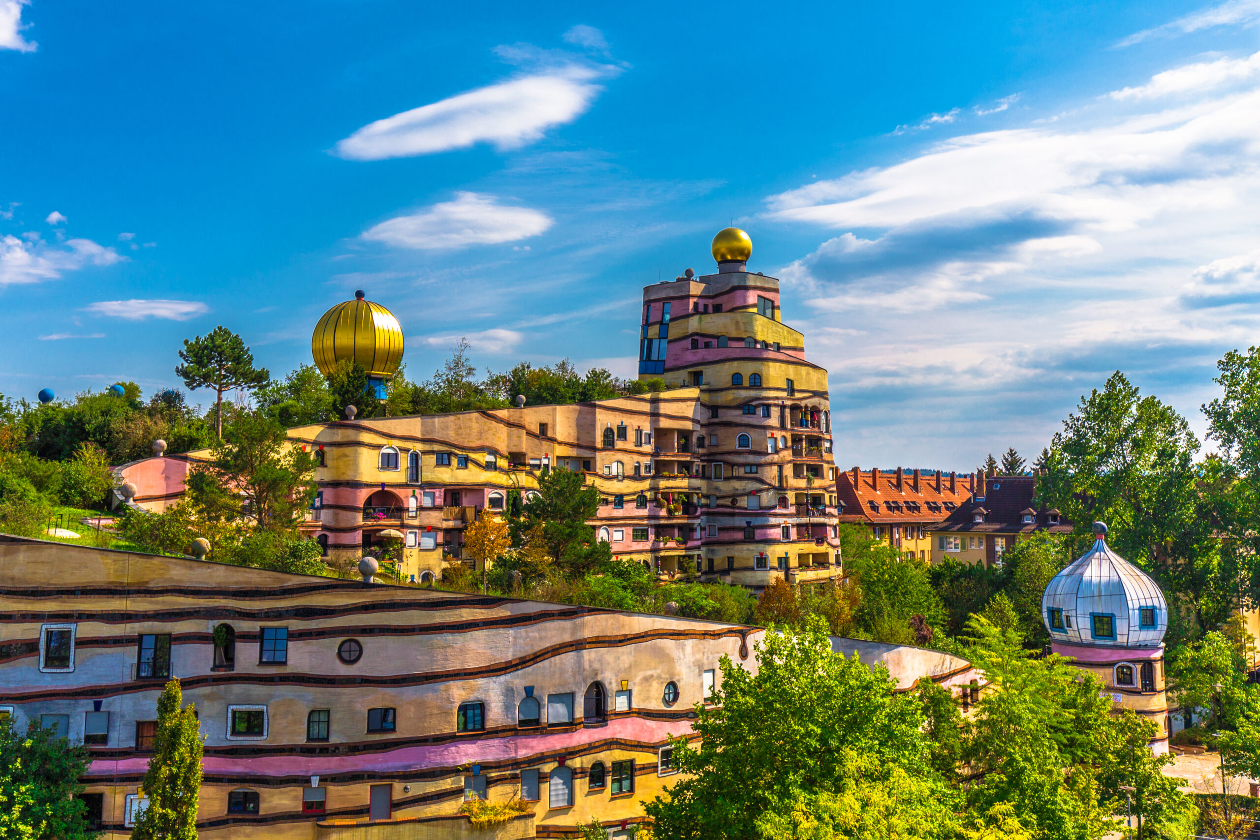
Waldspirale by Austrian artist Friedensreich Hundertwasser, Darmstadt, Hessen, Germany. | Photo by Kiefer via Flickr
What are famous examples of maximalist buildings?
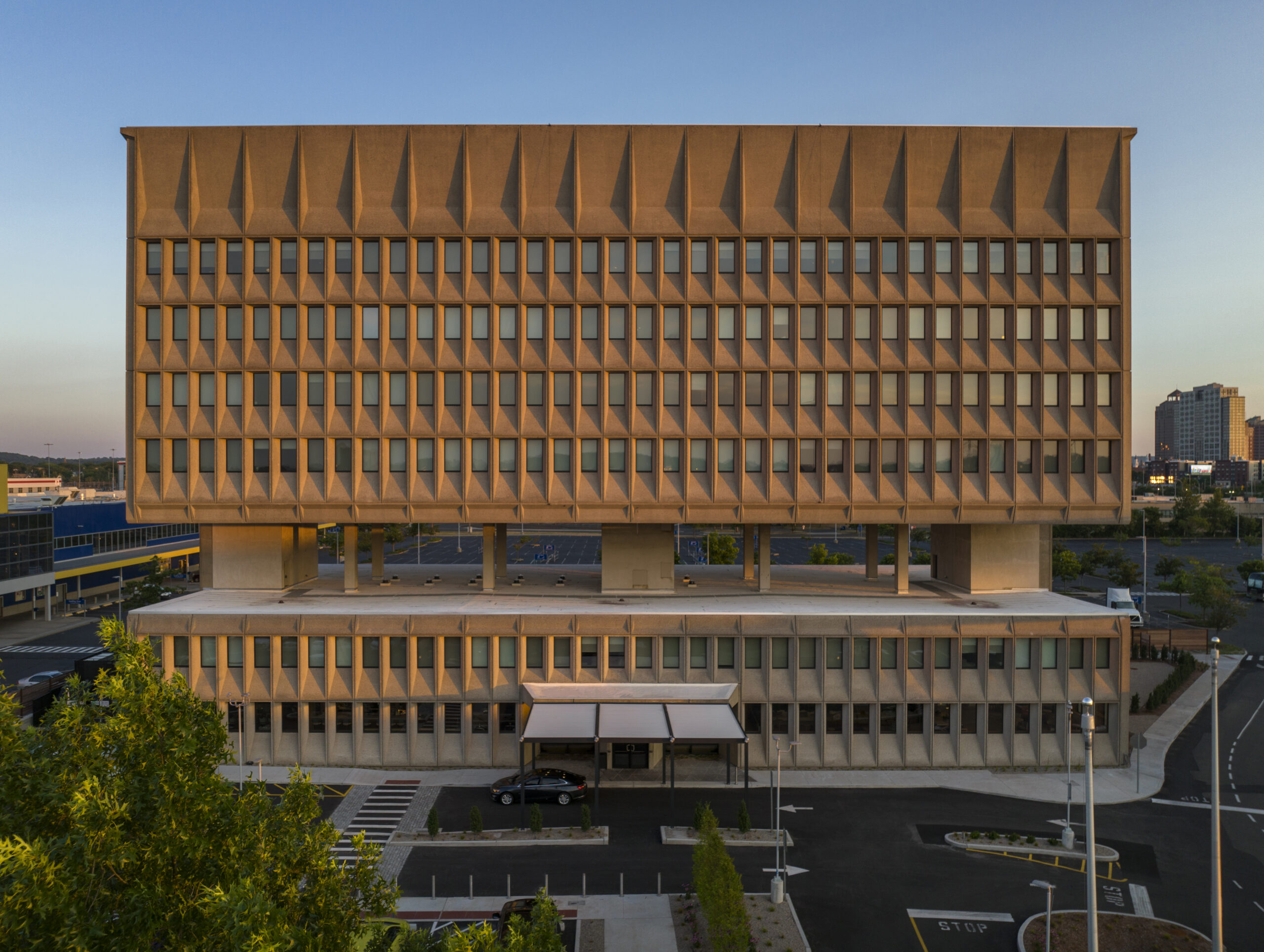
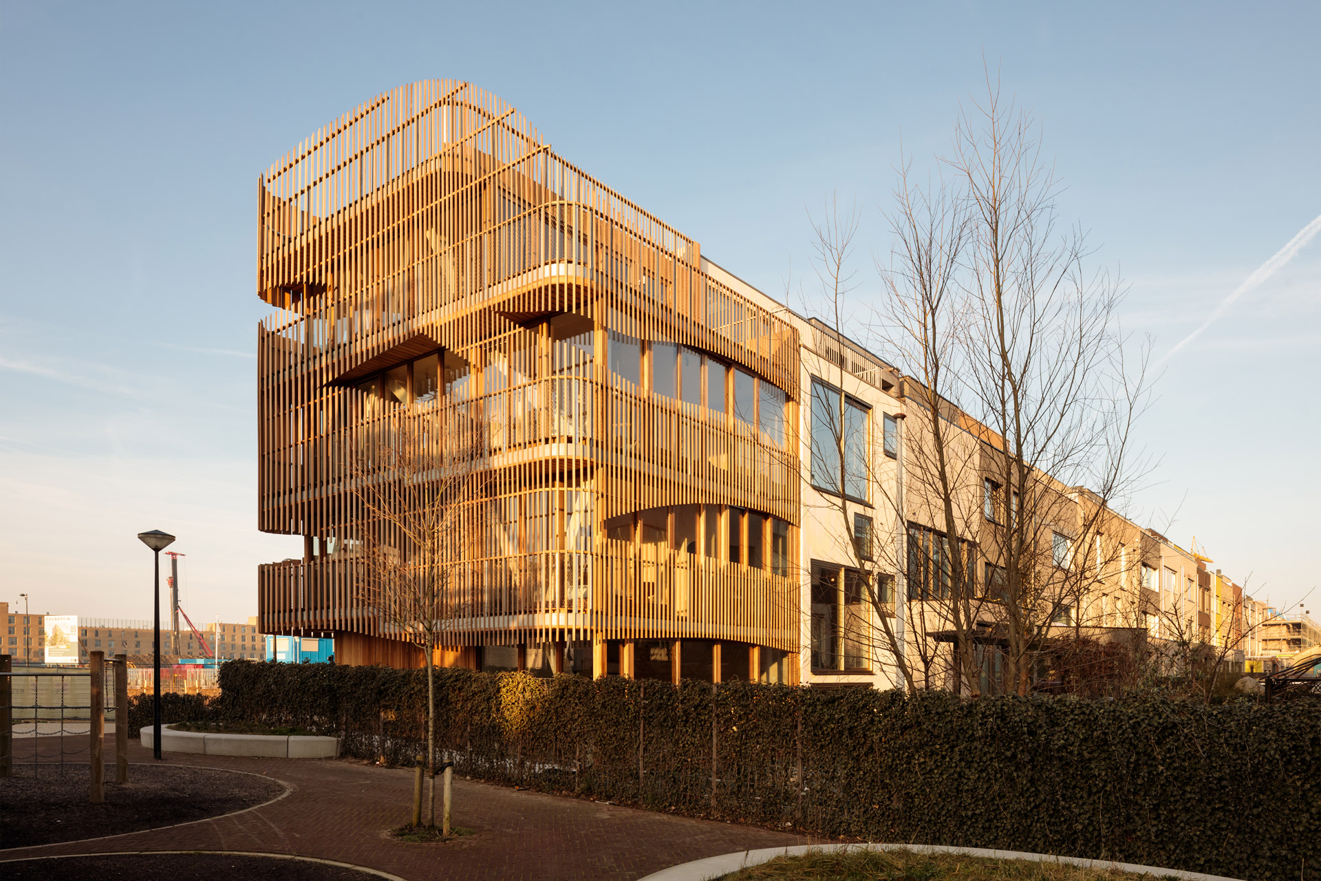
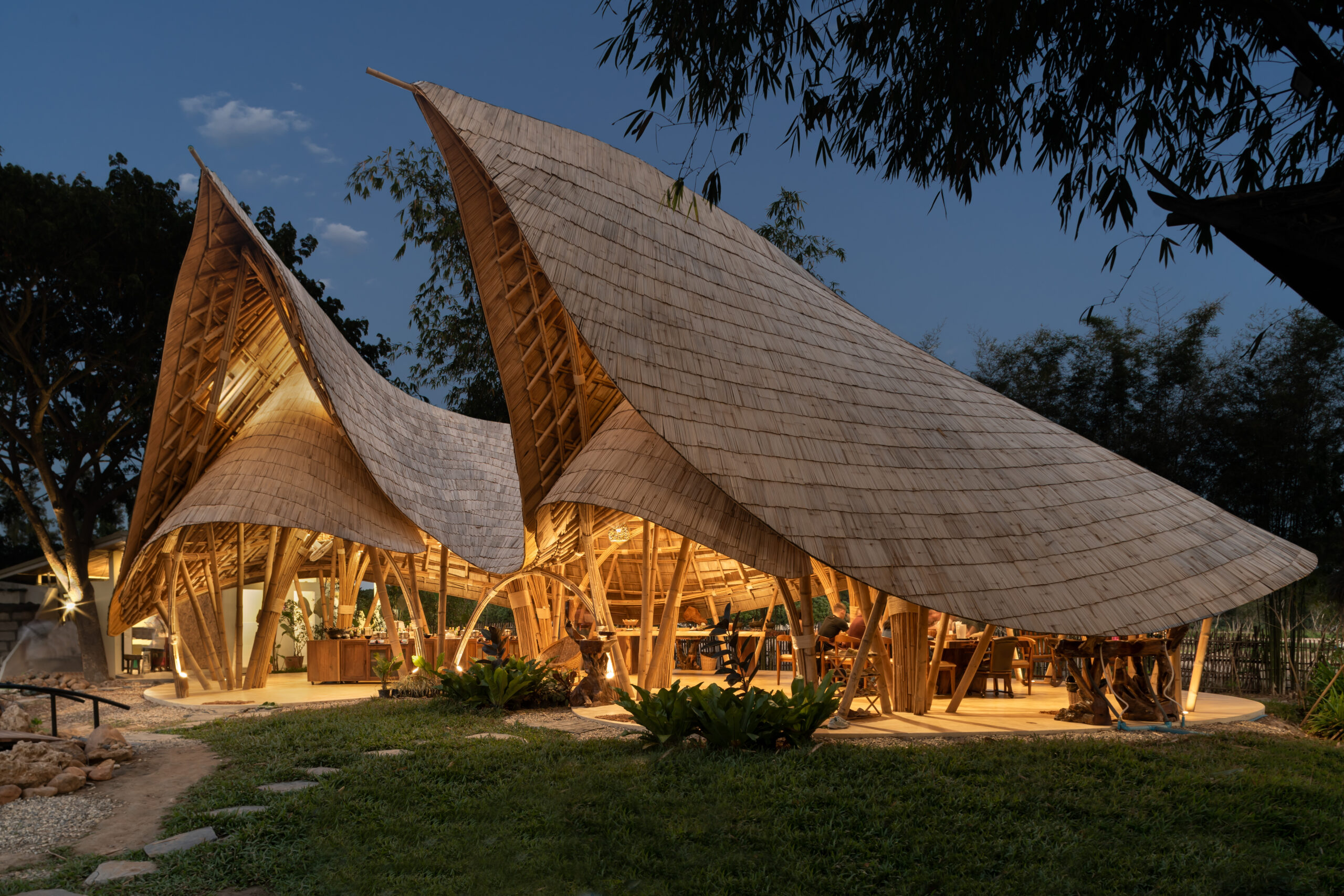
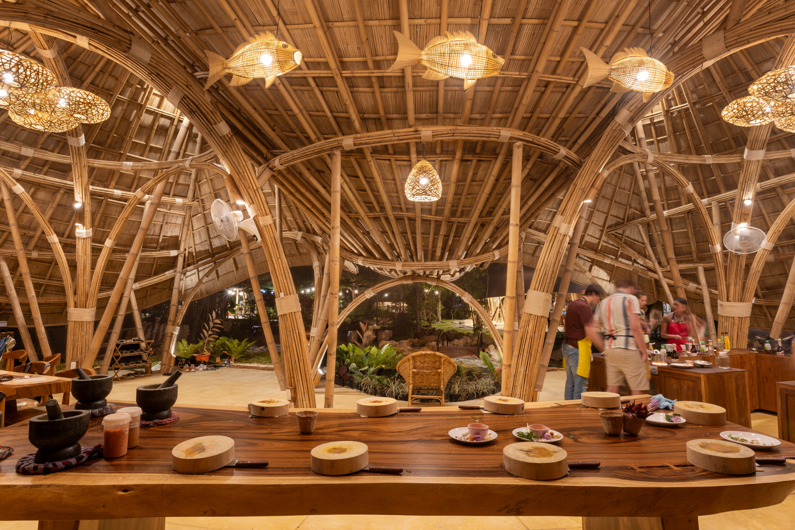
Maximalism is more commonly expressed in interior design, while examples of it in architecture are rare. When we think of maximalism, we envision an explosion of color, texture and abundant ornamentation. However, contemporary architecture often leans toward other stylistic approaches, such as deconstructivism or parametric design, emphasizing complexity and fluidity rather than a bold expression of decoration and color. While few buildings strictly adhere to maximalist principles, certain architectural works exhibit maximalist qualities, such as dynamic forms, expressive materiality, and highly intricate detailing. With this in mind, several contemporary buildings stand out for their bold forms and expressive materiality, creating a visual richness that aligns with maximalist aesthetics.
- Guggenheim Museum Bilbao by Frank Gehry, Bilbao, Spain
- Morpheus Hotel by Zaha Hadid Architects, Macau, China
- Learning Hub (The Hive) at NTU by Heatherwick Studio, Singapore
- Kunsthaus Graz by Peter Cook and Colin Fournier, Graz, Austria
- Waldspirale by artist Friedensreich Hundertwasser, Darmstadt, Germany
The Future of Maximalism
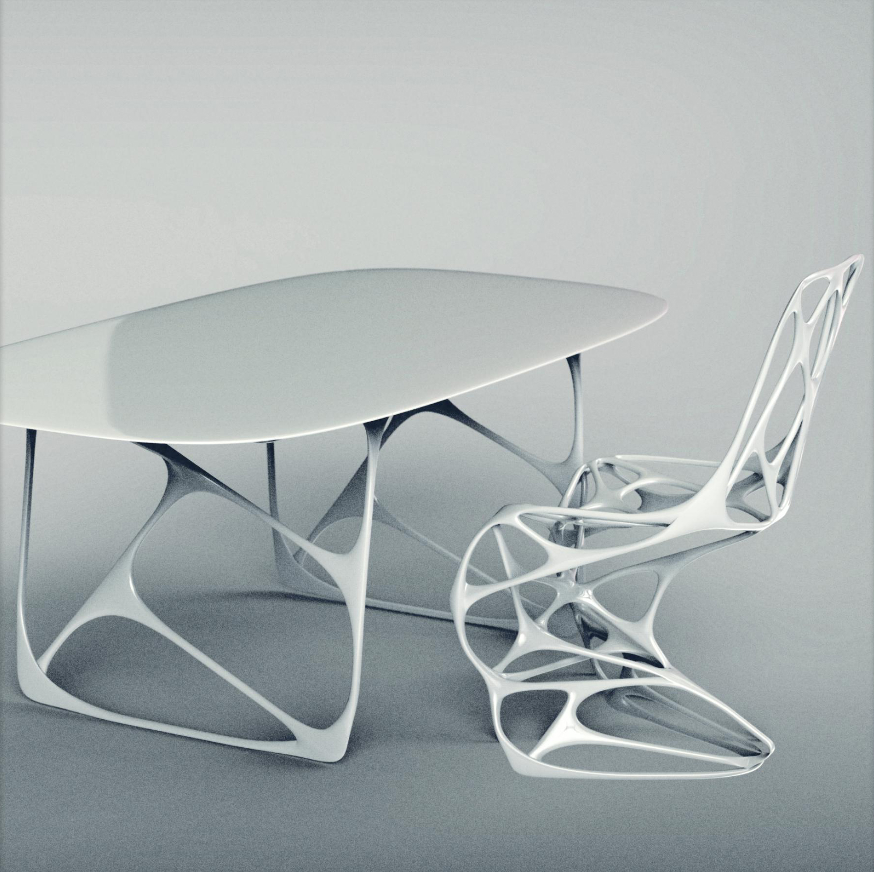
Visualization by Emmanuel Touraine, 3D Printing of “Generic” Home Collection by Emmanuel Touraine for Ventury Gallery, CC BY-SA 4.0
Why is maximalism making a comeback in design today?
Maximalism is making a comeback in design today at various levels. It is a loud response to years of minimalism and a growing desire for visual richness. Material technology and digital fabrication advances enable designers to push boundaries with complex compositions and detailing. Maximalism also resonates with sustainability, often embracing vintage and repurposed furniture and materials. Additionally, bold and expressive interiors appear to align with the era of digital culture and social media.
How does maximalism intersect with digital fabrication and AI-driven design?
Maximalism intersects with digital fabrication and AI-driven design by utilizing advanced technologies to create complex forms that are difficult or even impossible to achieve using traditional methods. For instance, 3D printing and CNC machining allow for elaborate textures and complex geometries, highlighting maximalism’s focus on visual and material richness. AI design tools facilitate rapid iteration and data-informed aesthetics, increasing customization possibilities.
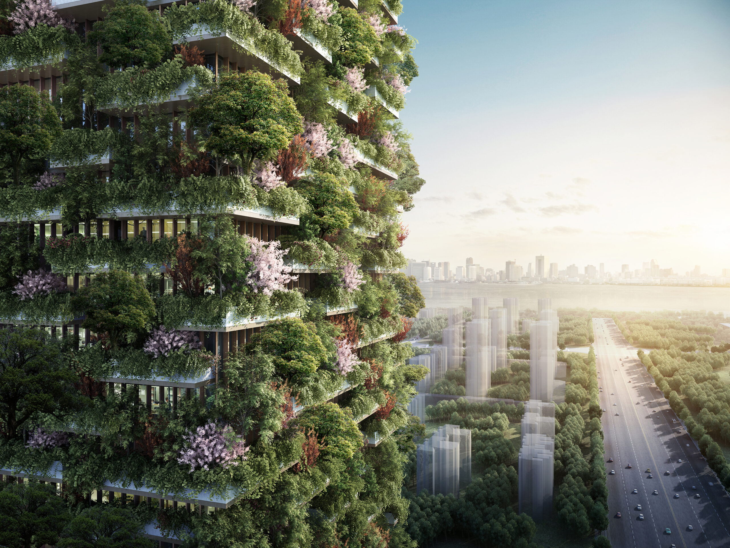
Nanjing Vertical Forest by Stefano Boeri Architetti. Nanjing, China. Visualization by Stefano Boeri Architetti.
Can sustainability and maximalism coexist in architecture?
Sustainability and maximalism can coexist in architecture, promoting environmental responsibility while highlighting maximalism’s opulence. However, it requires a thoughtful approach. Architects and designers can implement sustainable features to minimize waste and optimize energy use while seeking expressive aesthetics, including material richness and bold ornamentation. For instance, biophilic design elements, such as green walls, can enhance maximalist spaces without excessive resource consumption. Additionally, AI-driven optimization and parametric design allow for material efficiency and structural performance without compromising maximalism’s characteristic vibrancy.
Architects: Want to have your project featured? Showcase your work by uploading projects to Architizer and sign up for our inspirational newsletters.
Top image: Motta Milano 1928 by COLLIDANIELARCHITETTO, Italy
The post Architecture 101: What is Maximalism in Architecture? appeared first on Journal.


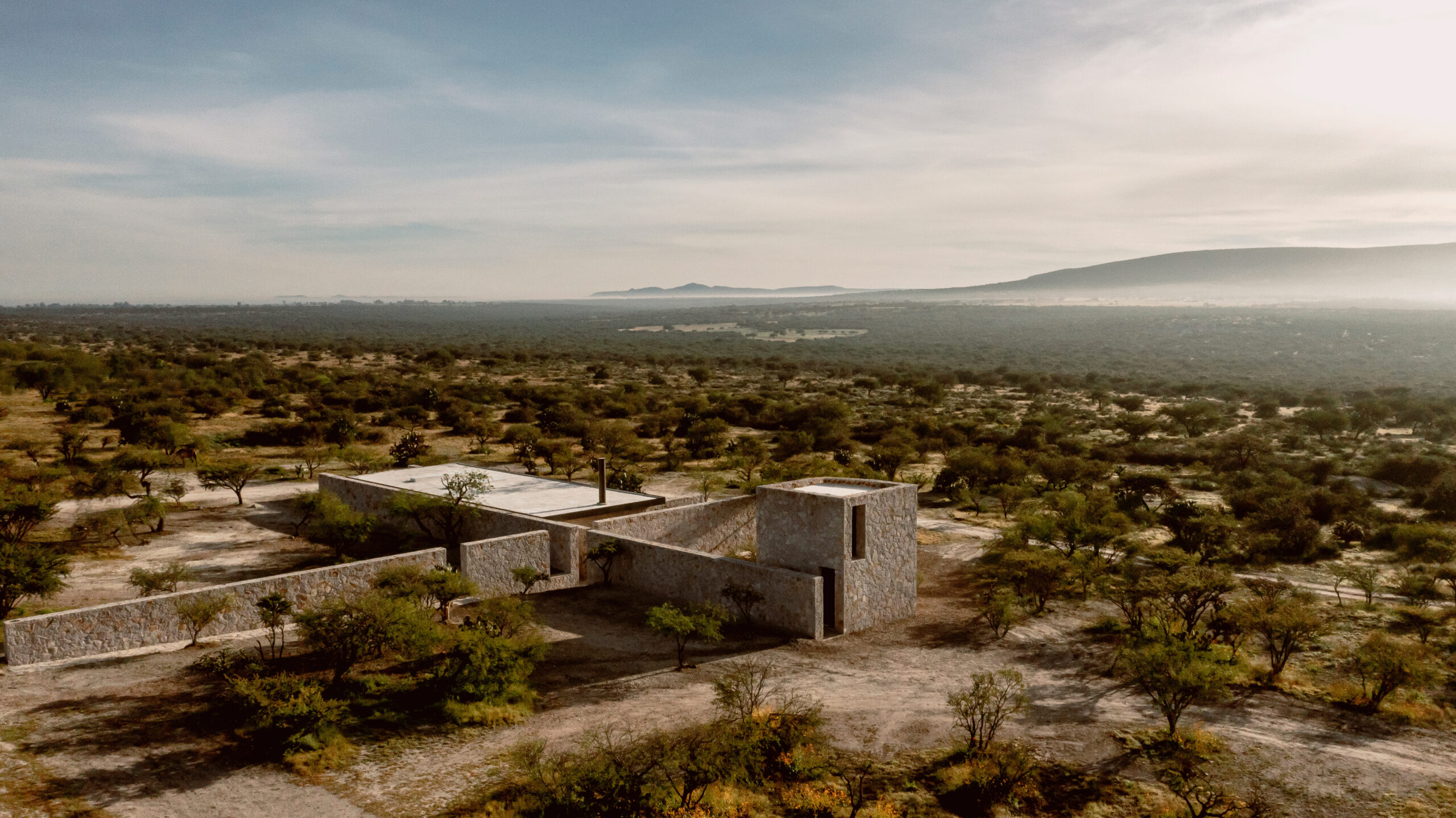
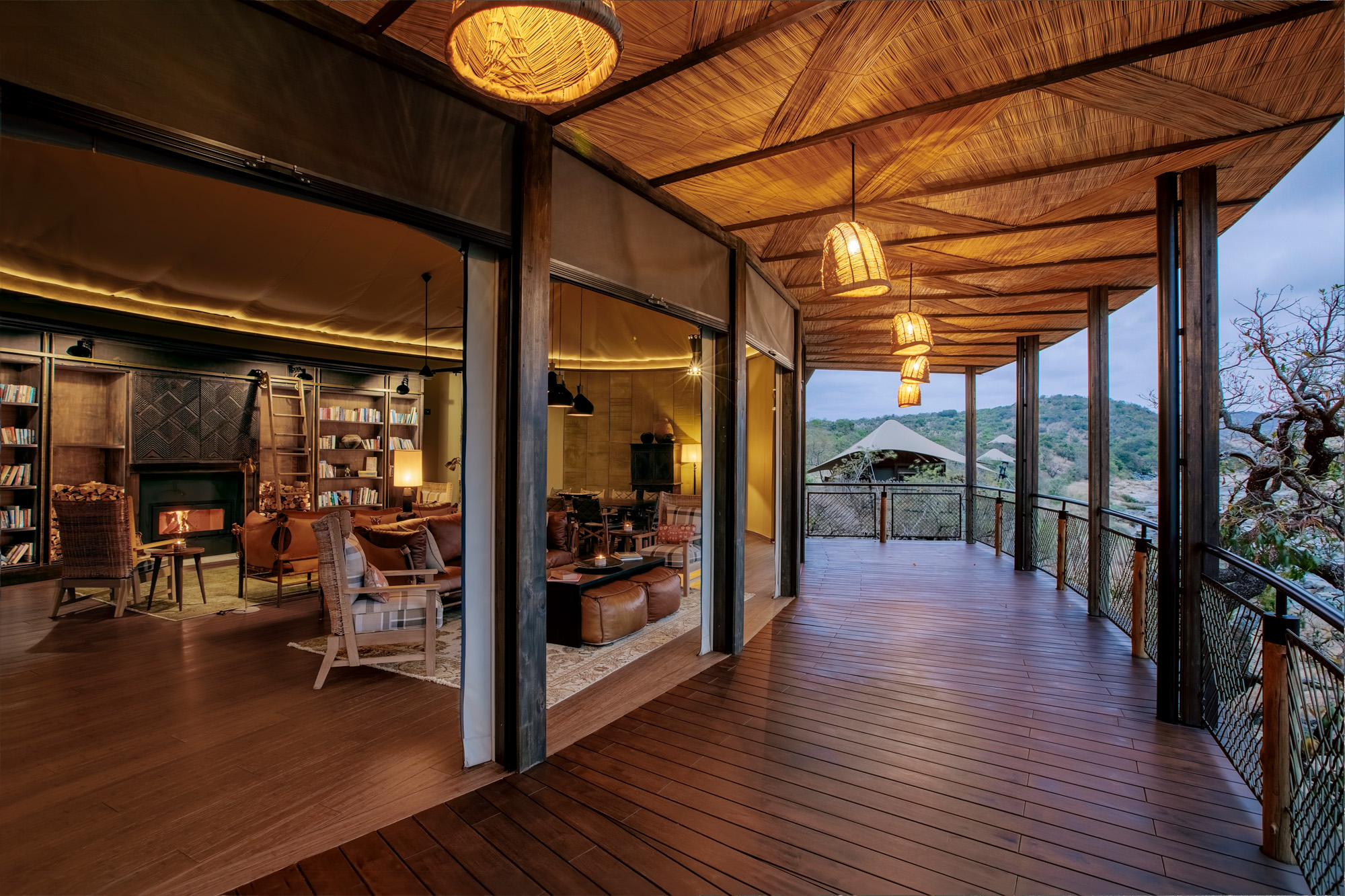 Building in remote, ecologically sensitive regions requires an entirely different approach. Importing materials is ecologically and financially costly. Madwaleni River Lodge is built using what is at hand. Raised on stilts to minimize land disturbance, the lodge employs locally sourced thatch and timber while embracing traditional construction methods that require little energy or infrastructure. It demonstrates that keeping things simple can yield incredible results.

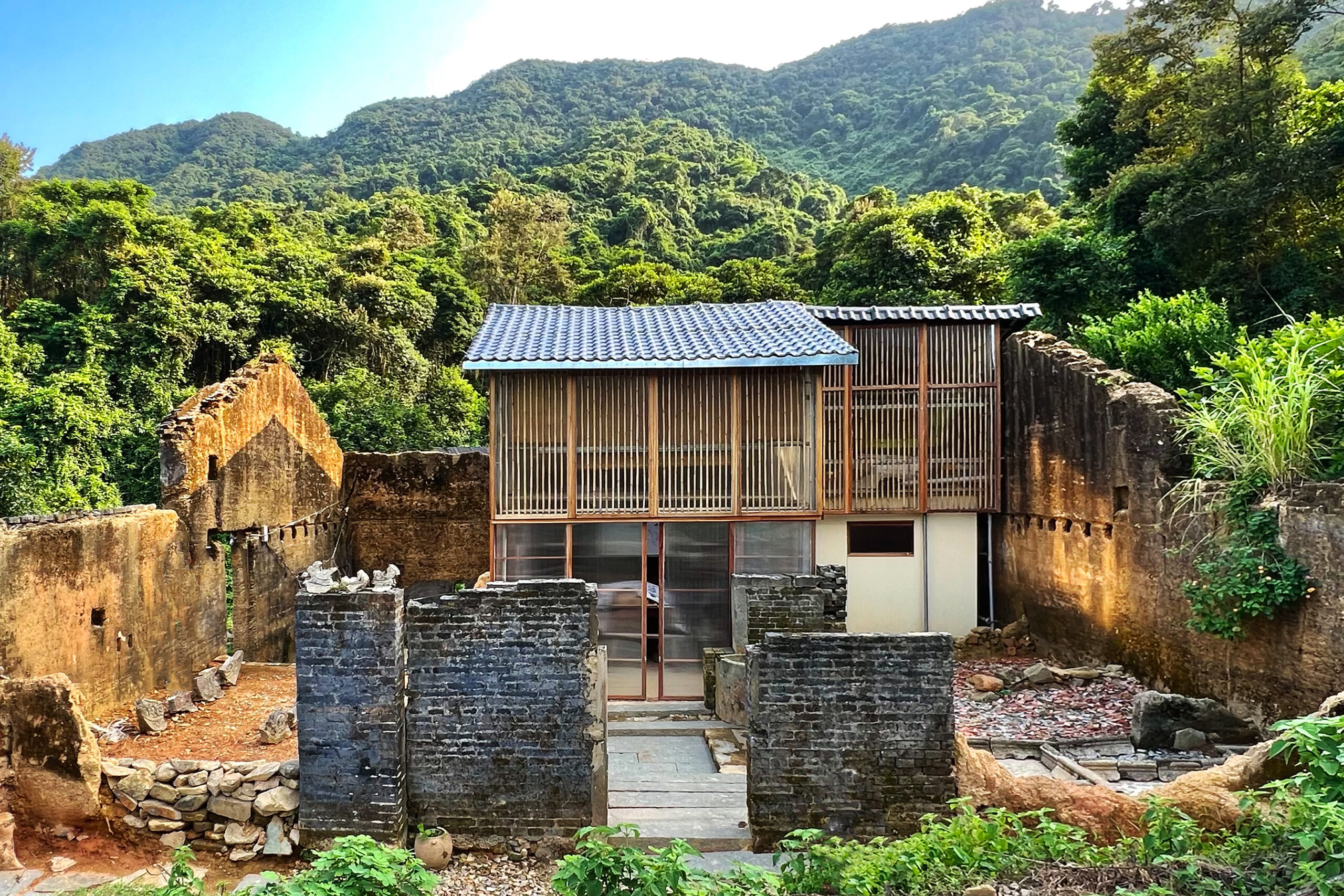
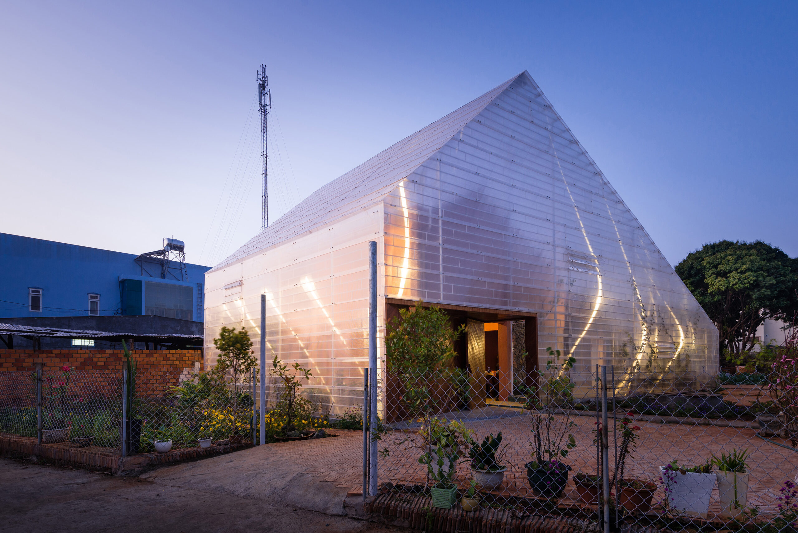
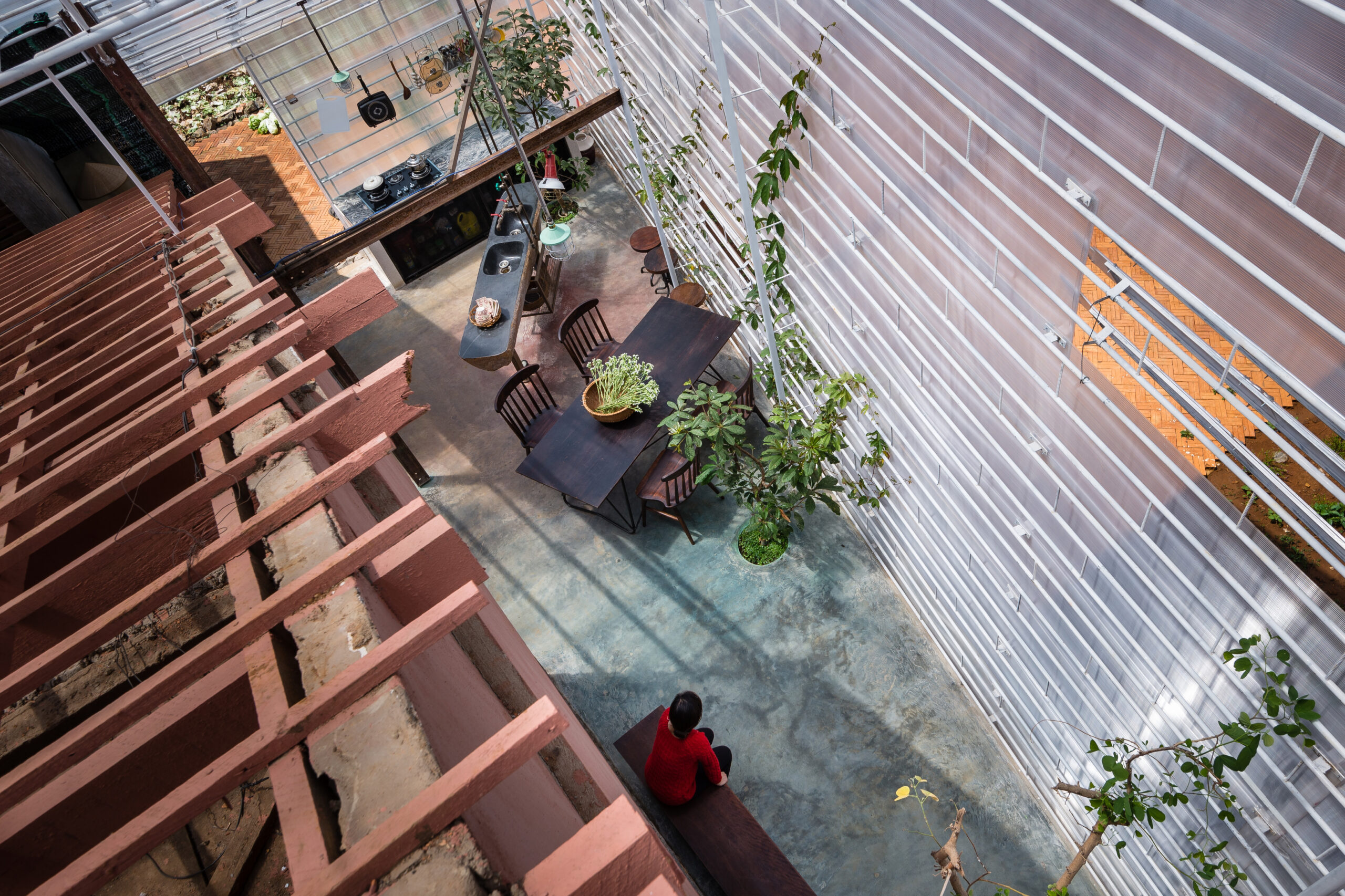
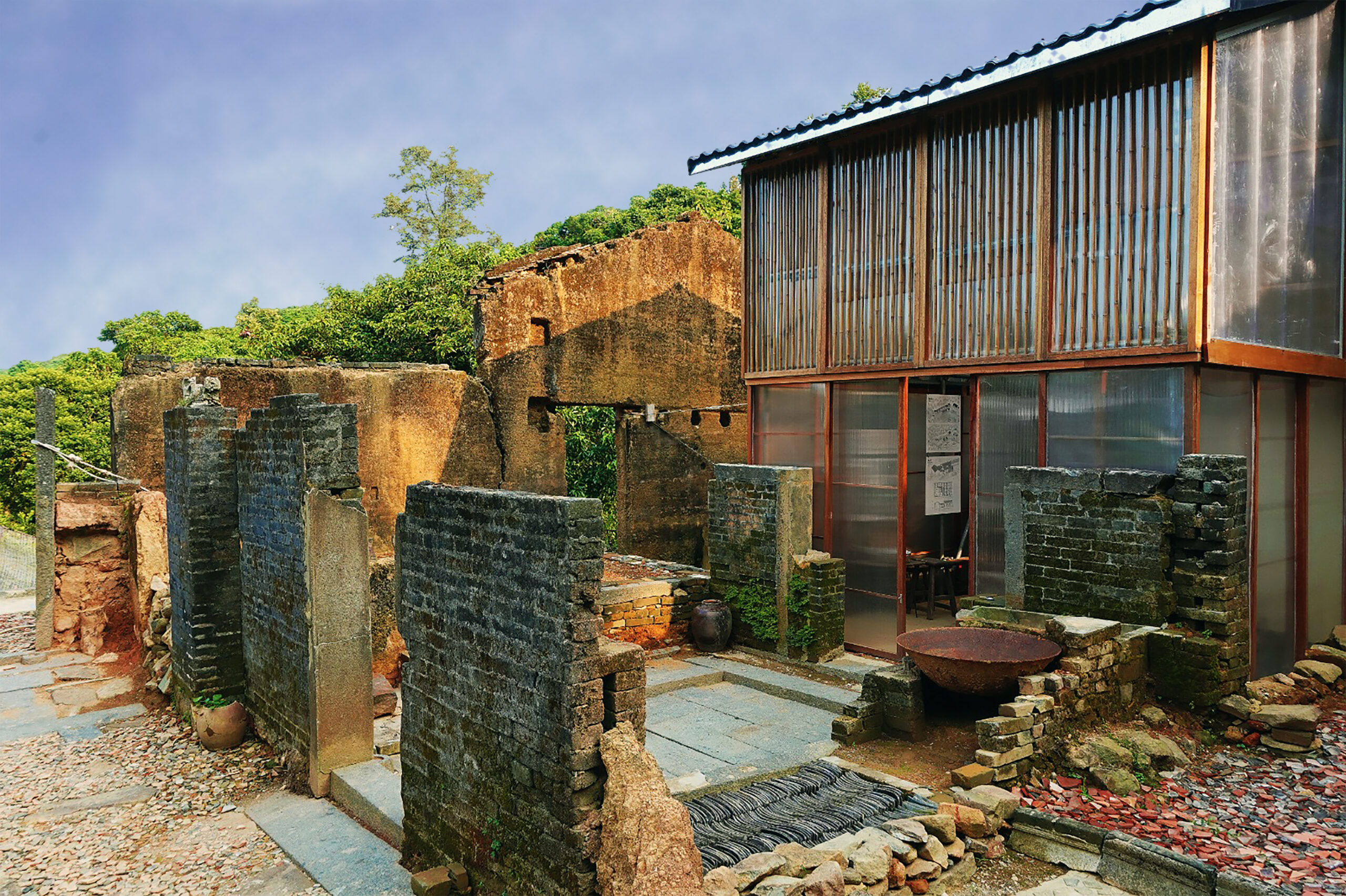 Rather than demolishing an abandoned Hakka village, Project Plum Grove restores and reinforces what remains. Stone and timber are salvaged from collapsed structures, while polycarbonate panels provide insulation without obscuring history. Instead of replacing vernacular architecture with modern materials, the project embraces repair as a design philosophy. Sometimes, the most sensible solution is simply to leave things standing.