Entradas

Is Freelance Architecture the Future of the Industry?

Architects: Want to have your project featured? Showcase your work through Architizer and sign up for our inspirational newsletters.

Following the Covid-19 pandemic, the US freelancing workforce skyrocketed, growing by 22% in the past couple of years. Especially after trends such as remote work, the digital nomad lifestyle and the establishment of personal brands gradually became the norm rather than the exception, freelancing is no longer seen as a temporary gig but rather as a viable — and sometimes even more exciting — option in many professions, offering a more flexible schedule and even the potential to make more money.

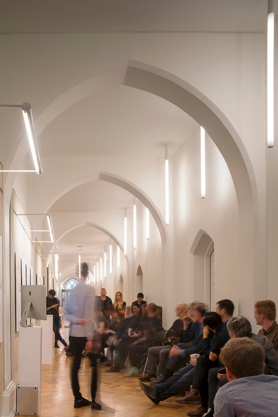
Still, how does freelancing directly apply to architects and, more importantly, does it deal with the many challenges that the profession and its working culture currently face? Being part of the University of Edinburgh’s architecture department, I have been involved in many discussions with students who, even though enjoy studying architecture, they do not wish to practice it. Apart from the many issues constantly being raised regarding the architectural industry — i.e., low salaries, long hours, competitive working environments — another recurring concern is the lack of creativity, especially in entry-level positions.

01_CameoCourt_Centerfield Studio

Cameo Court by Centerfield Studio,  Lake Oswego, Oregon | Jury Winner, Best Sole Practitioner, 12th Annual A+Awards

A typical working structure in a small or medium sized firm consists of a project architect that usually guides the concept and the early-stage design, followed by a team of junior architects, who are primarily in charge for producing the necessary drawings for the project. While not always the case, this task includes countless hours of repetitive drafting, technical work and annotation that often make young architects lose any interest in the actual profession. A response to this is the recent business model of a firm becoming established as an architectural collective, which is an innovative form of a limited company that is employee owned.

However, what is the common denominator with freelancing architects and this new form of architectural practice? It is the idea of ownership and accountability; not in the actual sense of owning shares in a company but rather being responsible and engaged in all aspects of an architectural project, from the creative conceptual parts to the mundane contracts and the endless technical detailing. In other words, whether an architect works as a freelancer or in an architectural collective, they become responsible for their own professional development and create their own individual approach towards architecture.

02_Z House_NOA Studio

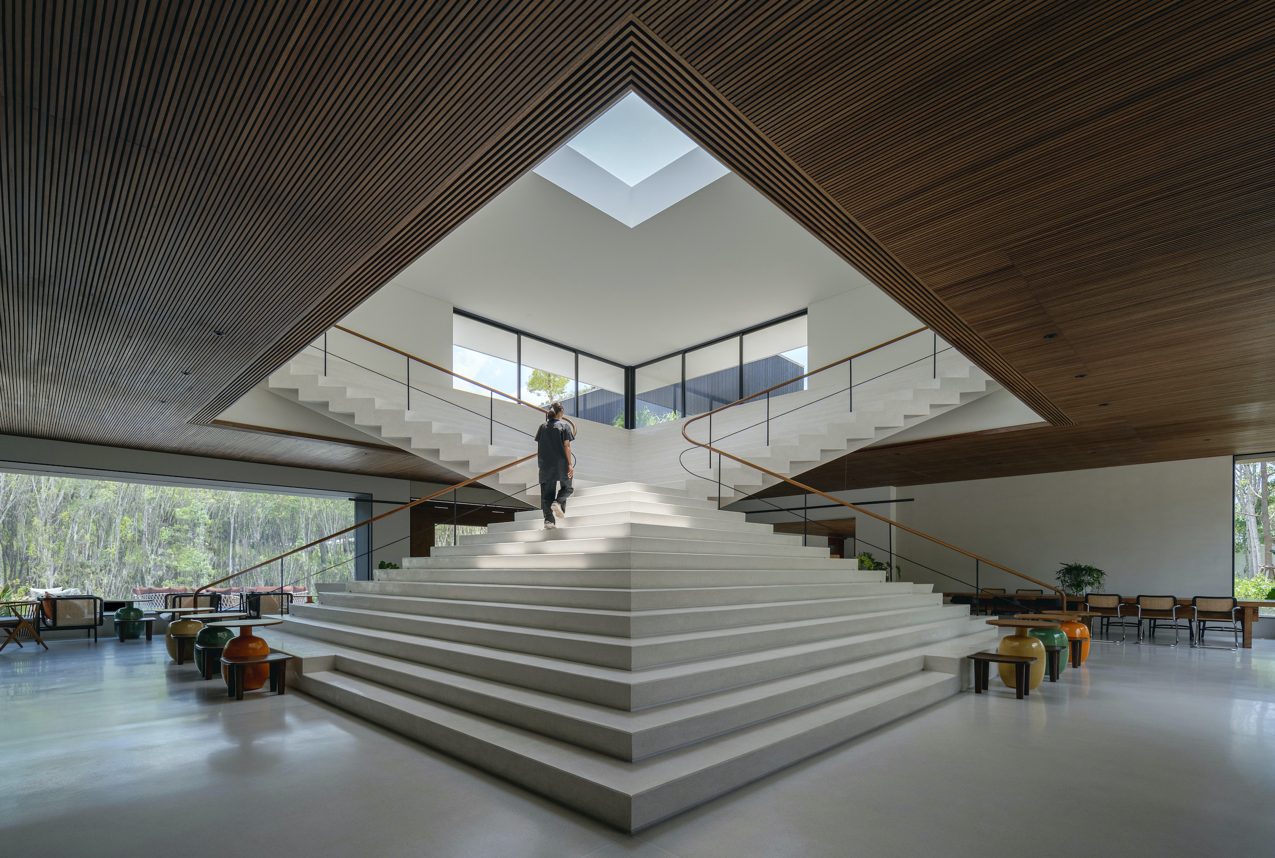
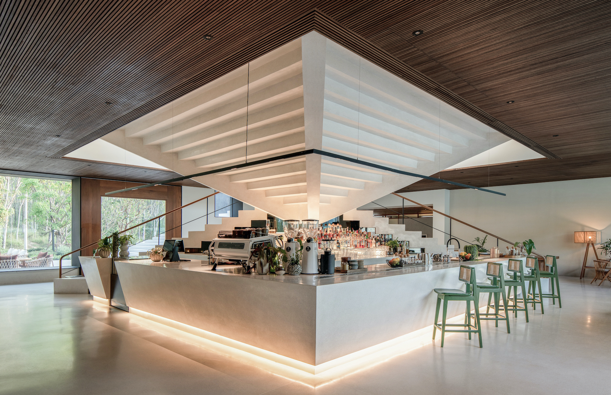
Z House by NOA Studio, Beijing, China

In parallel, there is an endless debate on whether architectural education efficiently prepares students for working in practice. Many architects argue that universities focus on design or theory, completely disregarding the necessary “practical” skills, for example knowledge in construction, contract procurement, site visit documentation etc. However, I would argue that these are merely the supporting tools that drive the process of a project forward.

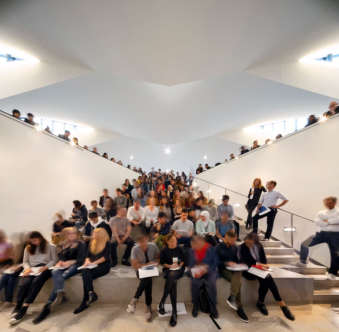
With architecture being a multi-faceted discourse, in which architects are free to experiment and eventually choose how they themselves are going to approach a project, education should encourage diverse and creative thinking (both conceptual as well as technical) rather than equipping students with textbook knowledge. In fact, the current education model fits perfectly with an architectural industry comprised of freelancers. More specifically, the studio culture in universities encourages collaborative work and communication without any hierarchical structure, fostering a vigorous exchange of ideas as well as methods of making. Could this then become the new norm in practice, negating the role of the project architect (and their team) and instead establishing a network of free-thinking, “equal” professionals regardless of their experience?

01_Park-Avenue-Penthouse-gne-Architecture

Park Avenue Penthouse by gne Architecture, New York, United States | Popular Choice Winner, Best Sole Practitioner, 12th Annual A+Awards

It is likely that this sounds like a utopian vision and admittedly, there will be many voices arguing that are “too many architects and not enough work” or “the lack of expertise in younger practitioners will be catastrophic for the construction industry.” Nevertheless, with the recent technological advancements and the emerging mindset change regarding working culture, the architectural profession is in need for an upgrade.

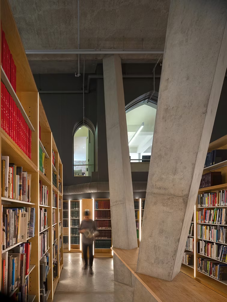
Starting from the endless artificial intelligence tools that have been developed, architects are able to produce and communicate concepts in second as well as efficiently respond to building regulations along with the environmental, social and economic conditions found in specific contexts. However, what is even more impressive is the array of new databases gradually being established to create open source platforms for architects, thus democratizing the profession. Companies are developing cloud systems where architects can store all their work — from architectural details they have designed to the contracts or technical descriptions they have used and even their early conceptual sketches. As a result, through this new mode of partnership, even the most inexperienced architects can have access to years’ worth of information, without having to draft endless window schedules or go through infinite site checklists.

The challenges found in the current architecture industry are quite complex, however, perhaps this new freelancing movement could hold the key to a more open and fast moving profession. This shift may foster a more dynamic and transparent collaboration, enhancing a sense of ownership and accountability among architects and reigniting their passion for their work.

Architects: Want to have your project featured? Showcase your work through Architizer and sign up for our inspirational newsletters.

Featured Image: Z House by NOA Studio, A+Awards 2024, Special Mention 

The post Is Freelance Architecture the Future of the Industry? appeared first on Journal.

Timber Tech: MGA’s Google HQ Offers a Total Vision for New Green Architecture

The jury and the public have had their say — feast your eyes on the winners of Architizer's 12th Annual A+Awards. Subscribe to our Awards Newsletter to receive future program updates.

Right now, the British Standards Institute (BSI), Colombia’s ICONTEC, and experts from around 170 national standards agencies have a huge job on their hands. An independently verifiable system for measuring net zero needs to be presented at COP30 next year, and the lay of the land today is a mixture of confusion, chaos and confidence tricks. At best, the ‘carbon market’ has had a turbulent time over the past decade. Meaningless credits have done enough to damage trust in a sector most people have never fully understood, and even buying legitimate offsets raises massive questions about overall legitimacy. 

How can we ever hope to rebalance our planet’s atmospheric content, necessary for it to continue supporting life over the coming millennia, if we’re not actually addressing the root cause? Instead, we’re paying into piecemeal projects as part of a broader corporate social responsibility directive, which is also part of a sales angle. Without sounding cynical, it’s easy to feel very cynical. 

However, a singular truth is always worth remembering — everything we build from here on should use as few resources as possible, using the most environmentally friendly materials and processes. This is an approach the famously climate-aligned MGA | Michael Green Architecture took for Google’s new home in Sunnyvale, California. A strikingly angular five-story office building, like the BSI, faced a monumental challenge helping bring down the sizeable footprint of a tech giant while also setting new standards in the architecture industry  — for biophilic and structural design, construction techniques, material sourcing and carbon reduction.

Google Borregas by MGA | Michael Green Architecture, Sunnyvale, California | Jury and Popular Choice Winner, Architecture +Workspace; Jury Winner, Architecture + Wood, 12th Annual A+Awards

The pilot project is the fruit of five years of rigorous research and development alongside Google, in collaboration with SERA Architects and XL construction. A departure from its typical steel, glass and concrete neighbors in Silicon Valley, MGA has used mass timber, timber-glass, cross-laminated timber and glulam throughout their LEED Platinum structure (materials we’ve featured numerous times in projects boasting comparatively low embodied carbon). Overall, a whole-building life cycle analysis has shown that the project’s global warming potential is 47% lower than the baseline and 96% lower when biogenic carbon sequestration is accounted for.

An ‘envelope’ filter system featuring closed-cavity skin, wooden blinds and high performance glass means temperature and light levels are responsive and climate control comes with a reduced energy footprint. Analysis of energy and daylighting informed the building massing and façade at a 35% reduction from baseline. The amount of natural light flooding in also forms part of wider biophilic design principles primarily employed for staff welfare and wellbeing — another being the siting, in a quiet landscape of local fauna, with the intention of building a connection between employees and nature. Again, it’s a case of what’s better for the planet is better for us, too.

Google Borregas by MGA | Michael Green Architecture, Sunnyvale, California | Jury and Popular Choice Winner, Architecture +Workspace; Jury Winner, Architecture + Wood, 12th Annual A+Awards

As MGA Principal Natalie Telewiak put it, the project “promotes health, connects to nature, and addresses the global need for repeatable, affordable, and sustainable new buildings.” This scalable solution is an ambitious effort on the part of the Vancouver-based firm to create a prototype for more sustainable — in an expanded and conscientious use of the term — workplaces in the future.

Natural materials are blended perfectly with views over surrounding landscapes the building actively complements with its earthy, timber look and feel. Cantilevers create covered areas, speaking to the less uniform aesthetics we find everyday in nature. This variety is mirrored on the inside, where mixed single and double height areas connect through a four story atrium. Here, daylight is again used to maximum effect with a timber-glass skylight accentuating the feeling of not quite being indoors.

Google Borregas by MGA | Michael Green Architecture, Sunnyvale, California | Jury and Popular Choice Winner, Architecture +Workspace; Jury Winner, Architecture + Wood, 12th Annual A+Awards

Reuse and circularity are also high on the agenda, serving as a reminder that redesigning, redeveloping and renovating alone are not enough to redeem a carbon-addicted industry; while better than demolition, an entirely new way of thinking about sustainability is required. So many buildings desperately need bringing up to modern efficiency and sustainability standards, and if not done in a future-oriented manner, retrofitting will surely be required again later on. Not so at Google Borregas; the tech company’s commercial flagship has essentially been future-proofed.

Floor plans are made to be fully reconfigured and so can be adapted to suit myriad purposes and phases of the business cycle, a decision that speaks to the green agenda as much as an understanding that in industries like tech staffing levels can fluctuate wildly. New departments will be born, deep recessions will hit again in the future.

Timber detailing at Google Borregas by MGA | Michael Green Architecture, Sunnyvale, California | Jury and Popular Choice Winner, Architecture +Workspace; Jury Winner, Architecture + Wood, 12th Annual A+Awards

There are greater challenges at play here, too. MGA’s blueprint reflects a major corporation taking responsibility for the footprint of its estate, and the mental and physical health of staff — values that are both symbolized and enacted in the building’s plan and functions. Of course, the fusing of nature with technology is also symbolic. These ideas can sometimes feel at odds with multinational globalized business culture as a whole, and if there’s a lot of ground to make up in the court of public opinion for companies with more GDP than entire nations, there’s an even bigger hill to climb in terms of perceptions of environmental accountability.

At Google, this is particularity pronounced. The onset of AI has sent energy consumption soaring across the sector, and according to Bloomberg the company is now warming the planet 48 times faster than it was in 2019 — a rate which, without serious interventions, is only going to increase exponentially as a relativity nascent tech field becomes increasingly mainstream and widely used. The firm’s plan to run on 100% green energy by 2030 is just one example of steps being taken, as is the new approach to carbon budgeting.

Atrium inside Google Borregas by MGA | Michael Green Architecture, Sunnyvale, California | Jury and Popular Choice Winner, Architecture +Workspace; Jury Winner, Architecture + Wood, 12th Annual A+Awards

Yet, this year, for the first time since 2007, Google is no longer carbon neutral. Given the rapid rise in its energy use, it’s alarming to think the company could have claimed such status until this year, emphasizing how skewed current net zero measurements can be. The decision at board level to stop using offsets and instead deal with actual emissions, with Google Borregas contributing to this reduction, definitely isn’t the norm. But it is also a shrewd move.

One of the reasons the BSI and its affiliates are working on a net zero standardization is because of the complexity of gauging corporate impact. Without a standard we will never accurately set targets. And if that standard is fit for purpose, once it has been adopted there will be few options left for companies other than direct reduction.

Though MGA has long been a leader in addressing architecture’s green shortcomings, by taking a holistic approach to sustainability by addressing embodied and operational carbon, energy reduction and renewables, Google Borregas provides a repeatable template for flexibility and long life that, just like the tech giant whose headquarters it houses, also sets new standards for their peers in the architecture industry.

The jury and the public have had their say — feast your eyes on the winners of Architizer's 12th Annual A+Awards. Subscribe to our Awards Newsletter to receive future program updates.

The post Timber Tech: MGA’s Google HQ Offers a Total Vision for New Green Architecture appeared first on Journal.

Foundations of Excellence: 6 Instances of Institutional Architecture at Its Finest

Architects: Want to have your project featured? Showcase your work through Architizer and sign up for our inspirational newsletters.

Design holds the power to enrich the lives of communities and people around the world. For this year’s Architizer A+ Awards program, projects were submitted across institutional architecture that stand out for their profound impact on how they bring people together. These buildings encompass an array of libraries, schools, community centers and civic buildings — spaces integral to the fabric of cities. In an era marked by rapid urbanization and societal shifts, the relevance of exceptional institutional architecture has never been more pronounced. These structures not only provide essential services but also foster community, inclusivity and innovation.

The A+ Awards highlight the most inspiring and innovative architectural projects from around the globe. This year’s winners in the institutional architecture category exemplify some of the best in contemporary design. From state-of-the-art educational facilities to inviting community hubs, these projects showcase a commitment to accessibility and beauty. Each design also reflects a deep understanding of the unique needs and aspirations of the communities they serve. Discover a few of the winners below,  and see the full list of human-centric designs here.


Kresge College Expansion at the University of California, Santa Cruz

By Studio Gang, Santa Cruz, California

Popular Choice Winner, 12th Annual A+Awards, Higher Education and Research Facilities

Located in a redwood forest in northern California, Kresge College has been an experiment in student-driven education since 1971. Originally designed by Charles Moore and William Turnbull, the “hill town” campus features a playful village anchored by a winding pedestrian street where students could practice participatory democracy and explore new ways of living and learning. Fifty years later, Studio Gang’s campus expansion plan aims to rejuvenate this experimental environment while making it more inclusive and connected to the surrounding university and landscape.

The expansion includes four new buildings — three residential halls and an academic center — that complement the original design’s rectilinear, angular language with a more organic one of curvature and porosity. These buildings are carefully sited to preserve redwood trees and integrate with the natural topography. The project extends the original pedestrian street into a loop path, incorporating accessible pathways and connecting the campus with the surrounding forest and university. Enhancements to the historic runnel system improve stormwater management, while the redwood canopy and operable windows optimize passive cooling and ventilation.


Dich Vong Hau Kindergarten

By Sunjin Vietnam Joint Venture Company, Hanoi, Vietnam

Popular Choice Winner, 12th Annual A+Awards, Kindergartens

This 20-year-old suburban school, now within an urban growth area, has been restored to meet modern land use planning standards and updated teaching requirements. Originally a two-story building in poor condition with limited amenities and no play areas, the structure lacked the necessary facilities for contemporary education. The redesigned school retains the original framework but adds a third story with a steel frame coated in plastic wood, embracing a “students as the center” philosophy.

Two additional four-story blocks are being constructed on the west side, creating a secure central playground that serves as the school’s main skylight and promotes cross-ventilation. Classrooms have been reconfigured to increase their size by 1.5 times, featuring villa-like designs with lush gardens for natural ventilation and roof overhangs for shade. The roof is transformed into a green space, providing an area for learning and play while contributing to the city’s ecological landscape.


Nunawading Community Hub

By fjcstudio, Australia

Jury Winner, 12th Annual A+Awards, Community Centers

This new community hub, located on the former Nunawading Primary School site, is interlinked with its old football oval and Tunstall Park. Built on the traditional lands of the Wurundjeri Woiwurrung People of the Kulin Nation, the site is historically referenced as a place of gathering. This heritage schoolhouse remains at the threshold, reflecting local materiality and celebrating the collective memory of those who spent their childhood there. Abstract white forms rise as a backdrop to the heritage fabric and park, creating a sense of monumentality and dignity for this important public place.

The design team’s approach was to create an open, inviting public space, expressing equitable access for all. The scheme includes flexible settings for a wide range of community activities, while addressing specific user group needs. An inviting and transparent architecture reinforces the connection to the natural assets of the landscaped setting and residential suburban context. The design, with its simple forms and appropriate proportions, celebrates people, their creativity and their sense of togetherness, honoring the highly valued park and school building integral to Nunawading’s community.


Tainan Public Library

By Mecanoo and MAYU, Tainan City, Taiwan

Popular Choice Winner, 12th Annual A+Awards, Libraries

Mecanoo and MAYU’s design for the Tainan Public Library embodies the convergence of cultures, generations and histories. Inspired by Tainan’s local culture and tropical climate, the library houses the city’s cultural heritage, modern art, music, films and over a million books, including 16,000 from the Japanese occupation period. Equipped with modern library technologies, it serves as a cultural hub. The library’s most striking feature is its inverted stepped shape, supported by slender columns reminiscent of a bamboo forest.

The crown of the building, adorned with vertical aluminum slats carved with flower patterns, filters light and reduces heat, creating a distinctive façade visible from afar. The library’s design seamlessly transitions between exterior and interior spaces. The stepped structure provides shelter, with four sunken patios for outdoor activities, such as lectures, concerts and exhibitions. The interior features a spacious double-height atrium with art by Paul Cocksedge and interactive installations. A red sculptural staircase intersects all levels, while upper floors offer stunning city views from the uppermost levels.


PEGS Gymnasium

By McBride Charles Ryan, Keilor East, Australia

Jury Winner, 12th Annual A+Awards, Primary and High Schools

McBride Charles Ryan has been developing projects for the Penleigh and Essendon Grammar School (PEGS) senior campus for a number of years, creating a rich and diverse architectural experience. The campus is reimagined as a vibrant mini-city, with the latest addition, the ‘Palazzo della Regione,’ serving as the central meeting place. This building fosters civic engagement among students while offering flexible, utilitarian functions and a distinct civic presence. It seamlessly integrates with the existing gymnasium through a full-height operable wall, doubling the space for performances and competitions and maintaining its unique character.

The new facility enhances the school’s interaction with the larger community. It frames the main school oval to the north, intensifying the connection between players and spectators, while the south facade serves as the main civic interface with a welcoming colonnade and scalloped brickwork. The design leverages the natural topography for tiered seating, reducing excavation costs and providing flexible space for gatherings. The building includes basketball courts, fitness centers, classrooms and multipurpose rooms, with sustainable features like a vaulted ceiling for passive cooling and a rooftop photovoltaic farm for electricity.


Changsha International Conference Center

By SCUT Architectural Design and Research Institute, Changsha, China

Popular Choice Winner, 12th Annual A+Awards, Government and Civic Buildings

The Changsha International Conference Center is located in the High-speed Railway New Town of Changsha City, overlooking Changshanan Railway Station and adjacent to the Changsha International Convention and Exhibition Center. The building consists of three above-ground floors and one underground floor. It features 60 conference halls and rooms that can accommodate up to 10,500 people, including a column-free main venue, a roundtable conference hall, a banquet hall, and a roof garden, making it the largest conference center in central China.

The design of the conference center draws on traditional Chinese aesthetics and cultural symbols, integrating natural, architectural, and cultural elements such as mountain contours, sloped roofs, and unfolded Chinese folding fan patterns. This approach highlights the harmonious coexistence of human civilization and the natural environment, embodying the core values of Chinese culture. The building’s façade is inspired by ink paintings of the Chinese landscape and local guqin masterpieces, showcasing the dynamic scenery of the Xiao and Xiang Rivers.

Architects: Want to have your project featured? Showcase your work through Architizer and sign up for our inspirational newsletters.

The post Foundations of Excellence: 6 Instances of Institutional Architecture at Its Finest appeared first on Journal.

Architectural Classicism Versus Modernism: Ethic or Aesthetic?

Architects: Want to have your project featured? Showcase your work through Architizer and sign up for our inspirational newsletters.

As a kid, all the buildings I loved were old. I grew up in Cranbury, New Jersey, a small town best known for its Rockwellesque Main Street lined with historic homes. Think white colonials with wrap-around porches adorned with patriotic bunting, wooden churches with dramatic steeples, and bronze placards from the local historical society indicating where the local mill, general store, and cinema once stood.  

Many of my friends lived in homes built in the 19th century, which might not seem like a big deal to our European readers, but for an American child, this was enough to convey an Aura of History. I loved these houses, with their scratched hardwood floors, crooked ceilings and doors that never quite closed. Teachers at Cranbury School told us how George Washington once enjoyed a meal at the still-operational Cranbury Inn. On my walk home from school, I often passed through Brainerd Cemetery and visited the eroded gravestones of Revolutionary War veterans. Ghosts were in the air here — in a good way. They gave the town a sense of place amid the anonymous sprawl of suburban New Jersey.

The Aura of History was foundational to my early interest in architecture and design.  As a kid I had a strong sense that some buildings evoked a sense of place and that others did not, and I resented the soullessness of much of the surrounding suburban landscape, with its endless parking lots and charmless big box stores. 

The point of all of this is to say that I understand, emotionally, where classicists are coming from when they lament the legacy of modernism, especially the International Style, which they (half-correctly) blame for having an anonymizing effect on cities around the world. I even understand the bitterness that classical architects feel toward their marginality in the profession. (When was the last time a classicist won the Pritzker Prize?) And to be clear, there is a lot of bitterness there. 

The classical alternative to the Pritzker Prize is the Richard H. Driehaus Award. Presented by the University of Notre Dame, the annual award grants a $200,000 prize to “a living architect whose work embodies the highest ideals of traditional and classical architecture in contemporary society, and creates a positive cultural, environmental and artistic impact.” The award aligns with the “classical and urbanist curriculum” of the University of Notre Dame School of Architecture, which “celebrat[es] and advanc[es] the principles of the traditional city.” The award was established in 2003 by the late financier Richard H. Driehaus who made no bones about his dissatisfaction with the state of architecture. 

“I believe architecture should be of human scale, representational form and individual expression that reflects a community’s architectural heritage,” Driehaus explained when asked why he established the prize. “There is a delight, proportion and harmony in classical architecture that I wasn’t finding in the contemporary buildings coming up around me in Chicago.” 

Driehaus’s criticism of modern architecture was not unique — nor was it new. In one form or another, these same themes have been expressed for over half a century by figures as varied as Jane Jacobs, Roger Scruton and Thomas Heatherwick. In his recent book Humanize, which I reviewed for Architizer last month, Heatherwick refers to the architectural profession as a “cult” that is bizarrely committed to a minimalist aesthetic template established in mid twentieth century despite the fact that survey after survey shows that the public does not like these kinds of buildings. 

While Heatherwick shares the classicist critique of modernism, he is not a classicist. For him, the solution is not to return to tradition, but to take a more critical look at contemporary building practices and strive to find new ways to achieve that sense of place, that je ne sais quoi, I once admired in my little picturesque hometown. One can see this philosophy at work in the playful nature of many of Heatherwick’s best known buildings, like Learning Hub South in Singapore, which locals refer to as the “dim sum basket building” due to its resemblance to the steamer baskets used to serve dim sum. In Heatherwick’s language, this building is “human” in the way an anonymous, merely functional academic building with a glass or metal façade would not be. 

Heatherwick’s ideas are themselves something of a throwback to the views of Robert Venturi and Denise Scott Brown, who helped established postmodern architecture in the 1970s by critiquing the “less is more” ethos of the High Modernists. As the duo put it in their book Learning from Las Vegas, “anomalies and uncertainties give validity to architecture.” I love that. It speaks to the importance of local texture and idiosyncrasy that led me, as a young man, to prefer old houses to new ones and to find homogenous chain restaurants to be not just ugly but depressing.

I am going to name the Venturi-Brown-Heatherwick position left populism, even though the sensibility is aesthetic rather than political. Like the Jacobins who sat on the left hand side of the National Convention during the French Revolution — establishing the terms “left” and “right” to describe the political spectrum — the architectural left populists are discontented with the present, but committed to a vision of the future that will be different from the past. Architectural left populism encourages a bricolage approach to design and urbanism, drawing on both the modernist tradition and earlier periods in architecture to create buildings that speak to the present. It is not the same as right populism, which is a point of view I see reflected in the mission statement of the Driehaus Prize, with its repeated use of the word “traditional.” (However, to the Driehaus’s credit, the award has been grants to architects I would consider left populists as well, including Michael Graves in 2013.)

Again, the way I am using the words left and right here is not strictly political. However, it is not not political either. Architectural right populism is often, but not always, associated with political conservatism. King Charles is probably the most infamous right populist in architecture, having gone so far as to construct a whole town according to classical architectural principles. Indeed, Charles’s Poundbury is a good example of the right populist viewpoint in action. Harmony, balance, a sense of cohesiveness that never crosses over into monotony — all of this is achieved. However, in my view, there is something bleak about this contrived little town. With everything arranged just so, according to historical architectural styles, one intuits not merely reverence for the past, but anxiety about the present.

Another person you might have heard of, Donald Trump, is an architectural classicist too — despite the fact that he has built a bunch of shiny glass towers. In 2020, then President Trump issued an executive order banning the construction of new federal buildings that were not constructed in one of six recognized styles: “Neoclassical, Georgian, Federal, Greek Revival, Beaux-Arts, and Art Deco.” As with the construction of Poundbury, the goal here was not just to elevate classical architecture, but to make a statement against modernism. And for conservatives, modernism is not just a style, but an embodiment of progressive ideals.

The work of Peter Pennoyer, the most recent winner of the Driehaus Prize, is a good example of classical architecture at its best. The private homes he has designed are absolutely magnificent, blending harmoniously into their context whether that is a brownstone block in Manhattan or a marshy estate in Maine. He achieves this, he says, through paying attention to classical principles such as proportion, harmony and beauty — ideals that Vitruvius knew well but that modern architecture has not only overlooked but, in Pennoyer’s account, actively suppressed.

“So I graduated from college in 1981, architecture school in 1984. And there were people who were more excited about Modernism, certainly the faculty,” Pennoyer explains in a recent interview with Common/Edge. “You heard things like, ‘Well, your symmetry is fascist.’ Another favorite of mine, which has stuck in my mind forever: A professor looked at a beautiful arch for a subsidized housing scheme, one of our studio problems. He looked at this arch and said, ‘What a pity. Because where there are arches, there are princes, and where there are princes, there are slaves.’”

Pennoyer’s anecdote reflects a number of common right populist tropes. He blames modern architecture’s blandness on the revolutionary fervor of professors who express their radicalism in aesthetics because they cannot do so in politics. They distrust beauty because they distrust everything, having totally imbibed the hermeneutics of suspicion.

It’s a caricature, but is it true? Maybe a little?

Asked in this same interview if beauty is subjective, Pennoyer has an interesting response: “I think there is an absolute standard of beauty around which we can all, most people, agree — until they go to architecture school or study architectural theory. I think it’s educated out of people. There’s much more consensus and basic human instinct for beauty, proportion, and harmony than we’re led to believe. There are absolute values of beauty.”

Pennoyer’s view is that architecture schools — the elites — have trained people out of their instinctive understanding of what they like. Again we see that his view is not only conservative but populist. He presents himself as a champion of common sense over expertise. And like the right populism we see in politics, this perspective has a dark side.

If architects, en masse, accepted the right populist view and decided to stick to established and recognizable styles, the profession would be giving up on the possibility of doing something new. It would come to resemble the American motion picture industry, which for the past decade has invested heavily in sequels and remakes at the expense of original projects. These films can be enjoyable, but they are never masterpieces. Inversely, most art house films are awful, but every once in a while this scene produces a work that is truly special and enduring. Maybe flawed work is the cost of innovation.

In any event, the right populists are wrong that modernism’s shortcomings can only be addressed by returning to the past. There are other ways to address these issues, ones that don’t involve architecture becoming trapped in stylistic and ideological stasis. Heatherwick’s book Humanize proposes a way of thinking about architecture that is neither cold nor sentimental. It continues a tradition that has been overlooked for too long and has not been named until now: left populist architecture.

Cover Image: Landscape with Classical Architecture by a Lake, drawing, anonymous, French, 17th century (MET, 1972.118.15) via Wikimedia Commons

Architects: Want to have your project featured? Showcase your work through Architizer and sign up for our inspirational newsletters.

The post Architectural Classicism Versus Modernism: Ethic or Aesthetic? appeared first on Journal.

Visual Vignettes: An Interior Designer’s Guide to Creating Memorable Moments

Architects: Want to have your project featured? Showcase your work through Architizer and sign up for our inspirational newsletters.

As designers, we often see our projects in 2D, working with layers and lines to produce plans and elevations that could easily be considered artworks in their own right. To the trained eye, a well-drawn elevation is a thing of beauty. Our drawings are a place where, through the deep understanding of space and dimension that is common to designers, we can experiment with the intricacies of form and placement to explore the interaction between objects. Yet, the true magic happens when the successful elevation drawings are translated into reality, a skill that can transform spaces into immersive environments that captivate and inspire visitors.

“Visual Vignettes” are carefully composed moments within an interior design scheme that capture the balance of a two-dimensional elevation while harnessing the user’s or visitor’s sensory perceptions. They result from bridging the gap between the theoretical and the tangible. Visual vignettes are where the art of designing meets the science of space planning, turning abstract lines and shapes into moments. By thoughtfully manipulating light, texture, scale, and other parameters, designers can craft these vignettes to instill emotion and create memorable spaces — as is exemplified in this year’s A+Award-winning projects.

NeueHouse Venice Beach by Loescher Meachem Architects and DesignAgency, Los Angeles, California | Popular Choice Winner, 12th Annual A+Awards, Remote Work and Coworking Space

Establishing focal points is a great place to begin when building a visual vignette within a space. The aim is to guide the viewer’s eye and create a clear visual hierarchy. By creating a focal point in a space, your aim is to draw attention to a specific area or object, making certain that a chosen element or area stands out. These could be created by specifying a striking piece of furniture, highlighting unique architectural features, or choosing an artwork that effectively illustrates the desired atmosphere for the space. Intelligent placement of focal points in a room allows a designer to direct a visitor’s gaze with purpose to coordinate a sense of order and reaffirm the intended narrative of the space.

When striving to create visual vignettes, the principle of balance is key. Balance in a space ensures that no single element overshadows the others. For the person experiencing a space, balance or lack of it is one of those feelings we can never really put our finger on. When it’s right, typically, a user will feel a sense of comfort. When it’s not, a sense of uneasiness that cannot be determined is common. There are many ways to achieve balance in a design. However, two of the simplest to master are based on humanity’s innermost desire for order and ordered chaos.

Tree O’clock — Villa Qabalah by Studio Locomotive, Phuket, Thailand | Photos by Beer Singnoi | Jury Winner and Popular Choice Winner, 12th Annual A+Awards, Mixed Use (S <25,000 sq ft)

As you’ve probably noticed, humans enjoy symmetry. It appeals to us on both a conscious and subconscious level, providing a sense of aesthetic pleasure and cognitive ease. It makes us think of health and stability and off—ers a sense of order. In interior design, symmetry shows up all the time. Think about in bedrooms with headboards, bedside tables and lamps. Or fireplaces with mantels centered on a lounge wall. As designers, we can introduce symmetry in subtle ways, for example, by framing areas with a set of curtains or choosing patterns that are symmetrical in design; even how we style shelving can bring symmetry into a design and instill harmony into a space.

Conversely, asymmetrical choices can also be highly effective. In this instance, designers use visual weight to capture a sense of balance as opposed to having an exact reflection. By grouping different elements of equal visual weight, we can achieve equilibrium while creating a more dynamic and intriguing composition. For instance, balancing a large piece of art with a cluster of smaller objet d’art items brings a lively yet cohesive feel. Similarly, a large armchair is flanked by nesting tables and a floor lamp — the varying heights and weights make the arrangements both engaging and balanced.

Building on the foundation of balance, composition and proportion are crucial to ensuring that each of the elements in a space relate well to each other. To achieve cohesion, many designers turn to established proportional strategies to guarantee pleasing relationships. “The Rule of Thirds” is often used to prevent monotony by introducing our old friend dynamic asymmetry, guiding the gaze through the space in an engaging manner. Adopting a well-understood idea like “The Golden Ratio” replicates the kind of organic balance we would typically experience in nature, making the composition of a space feel inherently satisfying in a primal way. Equally, designs that follow a grid system rely on proportions and the relative size of elements to ensure unity and balance.

House FC by fws_work, Taipei, Taiwan | Photos by Suiyu | Jury Winner, 12th Annual A+Awards, Apartment

This idea of grid systems can be used to great effect when making visual vignettes. Rhythm and repetition are excellent at mimicking a sense of movement that has continuity. By deliberately repeating design elements, designers can establish a visual flow that appeals to users. There are many ways to do this and different types of rhythm to try and create. Regular rhythm involves consistent intervals, equal spacing and positioning. Think of a corridor of artwork, all the same size in the same frames or a pathway flanked by the same species of tree.

Alternating rhythm introduces variety, using two different repeating elements that alternate back and forth. This could be a checkered floor or striped wallpaper. Progressive rhythm uses gradual variations, color gradients, or light washes, which are common ways to introduce progressive rhythm into a design. Random rhythm scatters elements in a planned yet spontaneous manner. This can be used effectively when designing shelving units, making each opening unique while consistent material and color bring cohesion. Introducing rhythm into a design can make a space feel both unified and engaging, creating a visual journey that truly captivates and holds a visitor’s attention.

Liminal House by McLeod Bovell Modern Houses, West Vancouver, Canada | Photos by Hufton and Crow | Jury Winner and Popular Choice Winner, 12th Annual A+Awards, Residential Interiors (>3000 sq ft)

Finally, contrast is one of the simplest yet most powerful tools for creating a visual vignette. By juxtaposing different elements, such as texture, color, material and even something as basic as shadow and light, it is easy to create visual interest and highlight key features. Contrast, for example, using dark and light woods together or a high gloss finish paired with matte surfaces, allows elements to stand out from one another and adds further depth to a design. Effective use of contrast ensures that key elements capture attention, enhancing the overall visual appeal and dynamism of the composition.

Architects: Want to have your project featured? Showcase your work through Architizer and sign up for our inspirational newsletters.

The post Visual Vignettes: An Interior Designer’s Guide to Creating Memorable Moments appeared first on Journal.

“Yposkafo:” Digging Deeper Into Greece’s Wildly Popular Undercut Architectural Typology

Architizer is thrilled to announce the world' best architecture firms in 2024, all winners of the 12th Annual A+Awards! Want to get your firm in the running next season? Stay up to date by subscribing to our A+Awards Newsletter. 

Yposkafo, Greece’s undercut residential typology, opens up a subterranean world within the Greek island landscape. Different morphologies, techniques and processes have produced some of the quirkiest yet breathtaking architecture in the Greek rural topographies. Still, the origins of this architectural typology remain under-explored and, more importantly, so is the impact of such construction on the rough, untamed terrain of the island countryside.

Only a decade ago, yposkafo was primarily found on the islands of Santorini and Therasia. Because their soil is volcanic and thus quite malleable, this approach allowed builders to carve homes directly into the rock, usually underneath other buildings. Yet, today, all Greek islands are filled with yposkafo residences, many of which have received an award for architectural excellence.

This proliferation may be attributed to a building regulation law passed in 2012, allowing architects to build up to an additional 50% of the plot’s allowed square feet as long as the residence is partially under the earth. These legal parameters were an attempt to provide more homes and hotels and boost the tourist sector while at the same time preserving the islands’ natural landscape.

01_DECA_Aloni_Reeve_2

Aloni by Deca Architecture, Antiparos, Greece | Built in 2008, this site-sensitive yposkafo design was constructed four years before the government passed legislation promoting this approach. 

This architectural, political and economic move has led to the development of countless undercut residences, which admittedly do not always comply with the necessary regulations and have, as a result, instigated ample negative criticism in the past couple of years. Issues such as overbuilding, lack of the necessary infrastructure to sustain and support such buildings as well as the immense carbon footprint generated from all the supply transportation to the islands from the main country has achieved the exact opposite result: the deterioration of the natural landscape as well as the resource exploitation of most Greek islands.

Nevertheless, there is another, more optimistic side to the yposkafo typology. Even though this particular law has generated an overwhelming surge of newly built structures, it has unlocked a different approach to architectural conservation. More specifically, the alternative would be to faithfully preserve the existing Cycladic typology: small, one- to two-story white cubic houses situated on the steep island cliffs. If this type of structure were to spread as extensively as the yposkafo architecture, the islands would literally turned white.

The project LIKNON by k-studio is an excellent example that showcases the benefits of placing a building into the ground. LIKNON is a museum dedicated to the well-known Metaxa brand of premium Greek brandy, situated in a 100 year old vineyard in the island of Samos. The building is integrated into the landscape, immersing the visitors underground to get in touch with the brand’s history and eventually leading them to a series of stone terraces above the building, where the vines for the brandy are cultivated. The museum acts as an extension of the vineyard, without disrupting the natural scenery or the actual ecology of the place and thus suggesting a new, bioclimatic angle of the yposkafo typology.

03_Liknon_001_ClausBrechenmacherReinerBaumann

02_Liknon_001_ClausBrechenmacherReinerBaumann

LIKNON by K-Studio, Samos Prefecture, Greece | Jury Winner, 11th Annual A+Awards, Architecture +Stone

Apart from conserving the existing topography of the landscape as well as the local flora and fauna, undercut structures also maintain ideal temperatures in their interior. With the ground acting as a layer of natural insulation, yposkafo buildings offer unparalleled thermal comfort without the need of additional ventilation or cooling systems.

At the same time, during the excavation process, a lot of the ground’s material can be stored and reused, minimizing any unnecessary material waste. PetrA, a project designed by react architects, is a residence located in Paros and is purely made of the stone extracted from the excavation. It is comprised of thick walls and solid, heavy roofs, forming a new “artificial” rocky terrain, which is then utilized for agricultural cultivation as well as animal herding. This simple, morphological gesture contributes to the island’s overall economy without pulling from available resources.

02_PetrA_reactArchitects

01_PetrA_reactArchitects

PetrA by react architects, Paros, Greece | Popular Choice Winner, 12th Annual A+Awards, Architecture+Stone

When thinking about the negatives and positives of the proliferation of the yposkafo typology across the Cycladic landscapes, one can’t help but think of a quote by the ancient Greek philosopher Cleobulus: “all in moderation.”

The yposkafo typology started as an attempt to boost the Greek economy whilst preserving the landscape’s natural beauty, an action which has sadly escalated to the uncontrollable construction of oftentimes unnecessary luxurious tourist homes. Still, the solution is not to regress to the old impractical — albeit beautiful — white characteristic cubes, nor should the county’s natural heritage be sacrificed in the sake of profit.

Recognizing the functional, environmental, cultural and financial benefits of the yposkafo typology, architects, governing bodies and the wider society have an opportunity to experiment and introduce a different approach to heritage conservation — one where context becomes not only a conceptual but also a material building foundation.

Architizer is thrilled to announce the world' best architecture firms in 2024, all winners of the 12th Annual A+Awards! Want to get your firm in the running next season? Stay up to date by subscribing to our A+Awards Newsletter. 

Featured Image: LIKNON by K-Studio, A+Awards Finalist 2023, Concepts Architecture+Landscape

The post “Yposkafo:” Digging Deeper Into Greece’s Wildly Popular Undercut Architectural Typology appeared first on Journal.

The Future of Architecture: How Today’s 3D-Printed Projects Could Shape Tomorrow’s Urban Landscape

The latest edition of “Architizer: The World’s Best Architecture” — a stunning, hardbound book celebrating the most inspiring contemporary architecture from around the globe — is now available. Order your copy today.  

In 1981, Dr. Hideo Kodama invented the first rapid prototyping machine. A couple of years later, in 1986, Chuck Hull filed the first patent for stereolithography (SLA). Even though it was not apparent at the time, both inventors changed the course of manufacturing forever. One of the most significant advantages of 3D printing is its ability to materialize complex designs with impressive speed and precision while using specific amounts of the material necessary, thus reducing waste. In parallel, 3D printing technology is also democratizing manufacturing by allowing small firms and individuals to participate in their own custom components.

Even though architects are highly aware of the benefits of such technology and have witnessed countless 3D printing applications, the scale of these endeavors has primarily remained quite small. In the realm of architecture and construction, 3D printing is mostly used to print models of the actual designs rather than the design itself. Issues such as technical limitations, the lack of large-scale printers as well as concerns about material durability pose significant challenges. Still, what if we could 3D print entire cities? What kind of future settings and applications would this technology unlock?

213 Third Avenue by KUSHNER studios Architecture & Design PC, Brooklyn, New York | Popular Choice Winner, 12th Annual A+Awards, Architecture +Models and Rendering | This 14-story new residential building, planned for construction, will feature a unique ground floor system of two-story high 3D printed commercial entryways and storefronts. The company producing the 3D components is an offshoot of the designer’s architectural practice, allowing a unique delivery methodology that bypasses many of the traditional conflicts present in the current traditional architect-contractor paradigm.


Scenario 01: The Circular Metropolis

It is 2060 and a newly established city situated in Munich’s outskirts, entirely constructed using eco-friendly 3D printing materials. Walls, slabs and roofs are made of concrete, synthesized by the water and soil found on site. Disintegratable resin is used for windows and glass panels, while furniture and utility devices are 3D printed using locally sourced metals and alloys. The Circular Metropolis is primarily a research center and home to innovators who have majored in material science and aspire to develop robust and long-lasting material composites.

01_HouseZero

House Zero by ICON and Lake|Flato Architects, Austin, Texas Jury Winner, Architecture +Experimental Design; Jury Winner, Architecture +New Technlogy, 11th Annual A+Awards

Back in 2022, House Zero, located in Austin, Texas, was completed. The project was materialized by using a 9500 pound robot that 3D printed the entirety of the residence’s walls made of a proprietary cementitious-based material dubbed “Lavacrete,” insulation, and some steel for reinforcing. The material provides increased insulation, forming an air-tight wall that slows the heat transfer into the home.


Scenario 02: The Rapid Relief Disaster Zone

On June 19th, 2043, San Francisco is devastated by a major tsunami, destroying most parts of the city. Within days of the disaster, large-scale 3D printing arms are deployed, creating temporary shelters in just a couple of hours. Over the following months, residents are contributing to the reconstruction of their homes and the city’s infrastructure, designing components and feeding them into 3D printing robots, situated all over the city. 3D printed levees and barriers are installed to protect against future flooding, turning San Francisco into an urban design model for disaster response.

02_Striatus_BRG-ZHA

Striatus 3D Printed Bridge by Zaha Hadid Architects, Venice, Italy Jury Winner, Architecture +Concrete, 12th Annual A+Awards

In 2021, an arched masonry footbridge composed of 3D printed concrete blocks that demand no mortar or reinforcement was exhibited at the Giardini della Marinaressa during the Venice Architecture Biennale. Known as Striatus, this “striated” compression-only structure is made of flexible, interlocking building blocks, which could become dismantled and reassembled to respond to any context or functional requirement.


Scenario 03: The Heritage Preservation District

In 2037, the restoration works for the Acropolis in Athens are coming to a close. Using precise 3D printed replicas of the damaged building elements, a series of parts are produced to “fill in the gaps” of the ancient temples. The components are 3D printed out of a special pigment made of marble dust, ensuring longevity and durability, while at the same time blending seamlessly with the existing historic structure. The success of the project has instigated a new conservation program that aims to use the same processes and technologies to restore the array of deteriorating neoclassical buildings currently scattered within Athens’ historic city centre.

02_Studio_RAP_DelftPassage_Riccardo_De_Vecchi

New Delft Blue by Studio RAP, Delft, Netherlands

In 2023, the project New Delft Blue, situated in the historic Dutch city, Delft, was completed. By integrating 3D clay printing, computational design and traditional glazing techniques, New Delft Blue set a precedent by reinterpreting traditional ceramic ornamentation and creating its contemporary 21st century version, unfolding a new architectural restoration potential based on the design language of Delft Blue porcelain.


Scenario 04: The Mars Colony

In 2100, a self-sustaining colony on Mars is constructed using entirely  3D printing technology with locally (i.e. interplanetary) sourced materials. The colony consists of domes and tunnels, designed to protect inhabitants from harsh Martian conditions. Colonists use 3D printers to create durable and insulated structures, made of regolith (MaDtian soil), functioning as greenhouses that provide fresh food, shelters and recycling centers. The portability and ease-of-use of these extraterrestrial 3d printers allow colonists to construct additional structures to accommodate their ever-growing community.

The village of Darak is an area in Iran where the sea surrounds the sand dunes of the desert. In 2025, the construction of the Sandy Darak Pavilion will be completed. The structure is materialized through a special 3D printer, which can use endemic materials, such as clay and sand. In parallel, by using a layer-by-layer construction method, the form is gradually created without any harm or disruption to the environment and the natural surroundings.


This juxtaposition between projects that are currently materialized and potential future architectural scenarios reveal 3d printing’s immense potential. Eco-friendly materials, customizable kits-of-parts, precise components for architectural restoration as well as methods of construction that are respectful towards their context are all practices that are already becoming implemented through the 3d printing industry. By looking at today’s projects as architectural and technological prototypes, fosters an aspiration for taking these “methodologies” further and creating a future where sustainable, innovative, and contextually respectful architecture and — more importantly — its materialization becomes a reality.

The latest edition of “Architizer: The World’s Best Architecture” — a stunning, hardbound book celebrating the most inspiring contemporary architecture from around the globe — is now available. Order your copy today.  

Featured Image: House Zero by ICON and Lake|Flato Architects

The post The Future of Architecture: How Today’s 3D-Printed Projects Could Shape Tomorrow’s Urban Landscape appeared first on Journal.

The Cultural Currency Urban Redevelopment: Lessons From Finland’s Oldest City

Architizer is thrilled to announce the world' best architecture firms in 2024, all winners of the 12th Annual A+Awards! Want to get your firm in the running next season? Stay up to date by subscribing to our A+Awards Newsletter. 

“When we think of big cities, we think of fast life, people rushing around, nobody has time to get to know their neighbors. I don’t think we should see it like that; it hasn’t always been like that.”

To understand Minna Arve’s perspective on urban planning, you only need to spend five minutes with her in Turku’s market square. The redesign of this historic landmark, the centerpiece of Finland’s oldest city, was completed in 2021 — meaning that we’re now sipping coffee outside the al fresco Cafe Eino on a sunny early summer morning, and the only thing interrupting our conversation with the elected mayor is the locals saying hello to her as they pass by our table.

It’s a small but significant detail that reveals plenty about how this corner of Scandinavia is rethinking the relationship between town and people. Nowhere is this more evident than the riverfront, which is undergoing the kind of monumental transformation usually reserved for Alpha and Beta metropoles, rather than a city that, albeit growing, is still home to just 200,000 or so people. On the banks of the Aura, though, major works are underway in all directions.

Artist rendition of Turku Music Hall Fuuga courtesy of PES Architects

PES-Architects’ Music Hall Fuuga is the most significant project currently underway, and expectations are high. A few minutes away, the older Turku Concert Hall continues to operate for now, the country’s first concert hall and a stunning example of mid-century Finnish modernism conceived by national architecture hero, Risto-Veikko Luukkonen.

While there was an option to renovate and regenerate, careful consideration revealed this would cost almost as much money, and still leave boxes unchecked. Not least accessibility, something Arve is clear must be prioritized when awarding new developments to master planners.

Public realm outside the forthcoming Museum of History and the Future (C) Sigge Architects

Further up the water, out towards the Baltic, there’s currently no sign of another groundbreaking moment in the city’s story which will contribute towards a new placemaking blueprint for a Cultural Riverfront. But here, at the ferry terminal, huge changes are about to take place. The port itself will be moved further out of town, a large new park will replace the tarmac area used to channel HGVs, coaches and cars onto vessels bound for Stockholm twice daily. An abhorrent use of an enviable location, alongside the planned green space will be a new cultural destination concept — the Museum of History & the Future.

The rather vague name takes some unpicking, but makes sense once you get there. The institution, due to open in 2029, will celebrate the heritage and history of Turku, and Finland as a whole. Exhibitions will look to progressive formats and cutting edge technology to immerse visitors, with the building itself reflecting this remit. Enter local firm Sigge Architects, who were awarded the commission based on their unique proposal, Squ?ma.

Location of the new Museum of History & the Future, currently part of Turku’s ferry port (C) Visit Turku

Using a ‘magazine’ approach, the design features a series of low rise, oblong structures which are autonomous yet interconnected. Constructed from dark timbers, mirroring traditional construction in the region, if all goes to plan the aesthetics should compliment the wonderfully preserved medieval castle which will cast a shadow over the site. We ask what a mayor looks for when casting their vote for a major architectural competition to create a new civic icon.

“For me, it was important to think about not how the museum will look, but how it will support the public space around it. How will it support encounters. I’ve been speaking a lot recently about the city of encounters… how we can make public space that supports people meeting each other,” Arvo replies. “This was important with the new music hall, too. How will we create the building but also the public space around it. It comes down to making these investments accessible to people. You need to promise this, but also deliver the idea that this is for everyone to use.”


Street furniture in the redeveloped Turku Market Square (C) Sarc + Sigge

Arvo talks about the programming of something like a concert hall, the need to diversity in a bid to improve inclusion. But she’s talking about much more than that. At a time when urbanization and immigration are putting pressure on public services and infrastructure in Finland, Turku ranking in the country’s fastest growing areas, the electorate must be convinced that spending hundreds of millions on cultural development is in their interest. Exclusivity should not apply.

“[At the Music Hall] you won’t even need to go and listen to music, just relax, enjoy the surroundings, go to the roof terrace. We need places that support these kinds of encounters. So in that sense, more important than the building is how it is reached by people,” Arvo continues, before revealing architecture is a big passion of hers, and a belief in the power of great building design. “A skilful architect can work miracles.”

Architizer is thrilled to announce the world' best architecture firms in 2024, all winners of the 12th Annual A+Awards! Want to get your firm in the running next season? Stay up to date by subscribing to our A+Awards Newsletter. 

The post The Cultural Currency Urban Redevelopment: Lessons From Finland’s Oldest City appeared first on Journal.

From Studio to Site: Navigating the Transition from Architecture School to Professional Practice

Ema is a trained architect, writer and photographer who works as a Junior Architect at REX in NYC. Inspired by her global experiences, she shares captivating insights into the world’s most extraordinary cities and buildings and provides travel tips on her blog, The Travel Album.

Dear architecture students, this one’s for you!

Transitioning from architecture school to professional practice can be both exhilarating and challenging. While architecture school provides a solid foundation in design principles and theoretical knowledge, the real-world industry introduces new dynamics, expectations, and learning opportunities. The goal of this article is to help prepare students for the realities of the architectural profession, not to discourage but to empower them for success. It will highlight the differences between the academic and professional environments and offer practical advice for recent graduates stepping into the workforce. There are many things I wish I had known before entering the professional world of architecture. I want to share my thoughts on how aspiring architects and students can successfully bridge the gap between academic training and industry realities.


Differences Between School and Real-World Practice

In architecture school, we often enjoy a level of design freedom that is unparalleled. The academic environment encourages creative and avant-garde designs, allowing us to push the boundaries of innovation and artistic expression. What truly matters isn’t whether the project can be successfully built or not; it’s the thought process and innovative ideas behind it. After all, theoretically, anything can be built, right? However, in the professional world, architects and designers must be able to find a way of balancing creativity with client needs, budgets, building codes, and zoning regulations. Client satisfaction and feasibility take precedence over purely artistic endeavors, necessitating practical and often conservative solutions.


Working in Conceptually-Focused Offices

Some offices place a stronger emphasis on concept designs and ideation. Larger firms often receive a significant amount of work from clients seeking concept designs and competition-based projects. In these environments, you can experience a level of creative freedom similar to what you find in school, but within a professional setting. If this is what you’re looking for, pursue it — apply to large firms and give it a try. However, be mindful that while it can be enjoyable for the first few years, I’ve often encountered people who have spent over a decade working solely on concept designs. While projects like this are very exciting and important for improving your concept design and design development skills, it often leaves gaps in understanding building construction and project details, which can be professionally limiting.

From my experience, different offices focus on different aspects of their work. Architecture school emphasizes developing conceptual designs and theoretical frameworks, encouraging students to think broadly and innovatively through hypothetical projects that allow for maximal creativity. While every architecture office values creative and innovative thinking, not all provide the opportunity to explore this creative workflow fully. Though practicality and functionality are paramount in professional practice, there is something wonderful about having a period early in your career where you work in intensely creative environments, pushing your conceptual ideas closer to reality.

In the end, if you do decide to become a real architect, you’ll spend years ensuring that your designs are buildable, safe, and cost-effective. Real-world projects require detailed construction documents, precise specifications, and adherence to practical constraints. I believe this is something anyone can learn, but becoming a skilled designer and honing your ability to conceptualize relevant ideas based on project conditions takes time, dedication, passion, and perhaps.. a bit of a sixth sense.


Understanding How To Work With Others

In school, projects are often individual, allowing students to develop their unique styles and ideas, fostering personal creativity and design philosophy. In fact, I recall feeling frustrated in school when I had to work with others or in a team. I preferred to handle everything myself, without anyone else’s input. However, you quickly learn that architecture is highly collaborative in the professional world. Architects work in teams and rely heavily on individuals with specialized skills, including engineers, contractors, clients, and especially their coworkers and teammates. No single person can handle everything alone; the scope of the projects are simply too vast for one individual to manage. Effective communication and teamwork are essential skills, as collaboration is crucial for the successful completion of projects.

During your years in school, feedback comes primarily from professors and peers, focusing on design principles and innovation. You may choose to follow their advice or not, but in professional practice, feedback often comes from clients, contractors, and regulatory bodies, with an emphasis on functionality, cost, and compliance. You’ll have to learn to understand your clients and their desires, and find a way to provide creative solutions while ensuring your ideas still comply with the requirements of other involved parties. This shift requires architects to develop a thicker skin and a keen ability to integrate diverse perspectives into their work.


Tips for Graduates Entering the Workforce

To successfully navigate this transition, recent graduates should embrace continuous learning. The learning doesn’t stop after graduation. Staying updated with industry trends, new materials and emerging technologies is crucial. Master 3D modeling programs like Rhino, and become proficient with rendering programs such as Enscape. Be adept at transitioning between 3D and 2D, and understand how to create drawings with proper layouts, line weights and hatches. Feel confident working seamlessly across different software, effortlessly transitioning from one to the next. If this isn’t you yet, don’t worry. When I first graduated, I certainly hadn’t mastered any programs either. However, after asking hundreds of questions and being immersed in a fast-paced workplace surrounded by experienced and talented colleagues, I quickly improved. You truly learn the most about the industry and refine your skills once you enter the workforce. Most offices are more interested in your thought process and design thinking rather than how proficient you are with specific software.

Developing strong communication skills is also vital. Effective communication with clients, team members, and stakeholders is crucial. You’ll be given plenty of opportunity to practice clear and concise verbal and written communication to convey ideas and resolve issues efficiently. I was always told there is no such thing as a stupid question or a bad idea. Share your thoughts and communicate your ideas, allowing yourself to be heard. Remember, nobody is perfect and nobody knows everything. If someone doesn’t listen or give your idea the attention it deserves, take pride in knowing that you made a meaningful contribution. Don’t let anyone undermine your abilities, because with dedication, everything can be learned. I truly believe that everyone possesses unique talents and can contribute something special to their team and their project.


Things You’ll Learn on the Job

Everyone should have their own opinion, voice and the ability to share their ideas. However, being open to feedback and criticism is a valuable tool for growth. The architecture profession involves constant collaboration, dialogue and feedback on a daily basis. Learn to accept feedback gracefully and use it to improve your skills and designs. Additionally, cultivating patience and resilience is necessary to navigate setbacks and challenges. Stay focused on your long-term goals, as building skills and creating a strong portfolio of projects requires time and considerable, consistent effort.

While on the job, you’ll learn how to juggle multiple tasks. When you first enter an office, you’ll likely learn how to manage multiple aspects of a project simultaneously, such as creating 3D models, 2D drawings, renderings, and physical models. You’ll also begin to gain hands-on experience with construction methods, materials, and technologies, understanding that the practical aspects of building is crucial for successful project execution. As you gain this experience, working with a diverse range of people in various roles, you’ll start to develop a better understanding of real-world project management, including effective coordination with stakeholders and managing project timelines and budgets.

One of the most important things I had to learn is how to be efficient with my time. It is crucial for meeting deadlines and balancing all the tasks you need to complete over the days, weeks, and project timelines. While project managers will do their best to oversee the projects and manage the team’s time, in my experience, especially when they handle multiple projects simultaneously, it’s beneficial to develop your own strategies to stay organized and manage your workload effectively.


You Are a Problem Solver

Despite its challenges and the critical, subjective nature of the field, architecture has a beautiful aspect: the daily opportunity to solve problems. We constantly strive to address design issues and develop creative solutions, making real-time problem-solving a routine part of our work. Every day, you’ll go into work with one or more problems to solve, and by the end of the day, you’ll have learned how to address those challenges – this is how architects and designers grow. On-the-job challenges require quick thinking and effective problem-solving. You’ll learn to address issues promptly and find practical solutions. But don’t worry, you’ll never be alone. You’ll always have a supportive team behind you to help figure things out. As I mentioned earlier, you don’t need to know all the answers, and no one does.

One significant lesson I’ve learned is the vital importance of paying attention to detail in both your work and the architectural practice overall. Developing a keen eye for detail in every aspect of your work, starting with the thoughtful details you incorporate during the project’s conceptual phase, will set you apart. Through collaborating with many talented designers, I’ve come to appreciate that nothing escapes notice; architects are typically very detail oriented, and the beauty of a design often lies in the meticulousness invested in it.


One More Word of Advice…

The transition from architecture school to professional practice is a significant step that brings new responsibilities and opportunities for growth. My best advice is to approach it with an open mind, fearlessness, and a positive attitude. In school, I considered myself at the top of my class. However, when I started my first internship, I quickly realized I was at the bottom. Everyone around me had significantly more knowledge and experience, both in soft skills and hard skills. But, little by little, and hundreds of questions later, you learn from others — there is only room for improvement.

By understanding the differences between academic and professional environments and embracing the learning curve, I do believe that all recent graduates will be able to navigate this transition successfully. Whether you choose to pursue architecture for life or use it as a stepping stone to explore other related or unrelated fields, with the right mindset and preparation, you’ll be well-equipped to thrive in any dynamic and rewarding career path you choose.

Architects: Want to have your project featured? Showcase your work through Architizer and sign up for our inspirational newsletters.

The post From Studio to Site: Navigating the Transition from Architecture School to Professional Practice appeared first on Journal.