Better With Age: 5 Projects Positioning Patina as a Dominant Design Detail
Architects: Want to have your project featured? Showcase your work through Architizer and sign up for our inspirational newsletters.
There is no desperation in building decay, no sadness in the natural process of aging — only a quiet, knowing elegance, creating a place that can abandon any vanity of youth and instead lean fully into the grace that only time can bestow.
A limestone balustrade, once a gleaming marvel, softened by decades of caresses—each hand that has passed over it leaving an indelible mark. A copper dome, once a brazen beacon in its youth, now wearing a dignified cloak of verdigris. Cracks in lime plaster have spread like fine spider silk, delicate yet determined, each line beginning to record the countless seasons that have come and gone.
Patina is the result of interaction — with nature, humanity and time. It happens through processes such as moisture interacting with minerals, oxidation in the air, or the gradual build-up of natural materials like moss or algae. Patina doesn’t happen overnight; it’s a slow, organic process determined by the unique conditions of a building’s environment— rain, wind, pollution, sunlight — all leaving their mark in subtle and unpredictable ways.
Rather than masking the effects of aging, patina enhances character, adding texture and depth to a surface. For architecture, patina brings warmth, richness and a sense of history to a building, making it feel lived-in and connected to its surroundings. It also acts as a form of natural preservation, protecting any underlying materials from further decay. The following A+Award-winning projects cherish and celebrate the authenticity patina brings and serve as a reminder that perfection lies not in pristine surfaces but in the graceful acceptance of change and age.
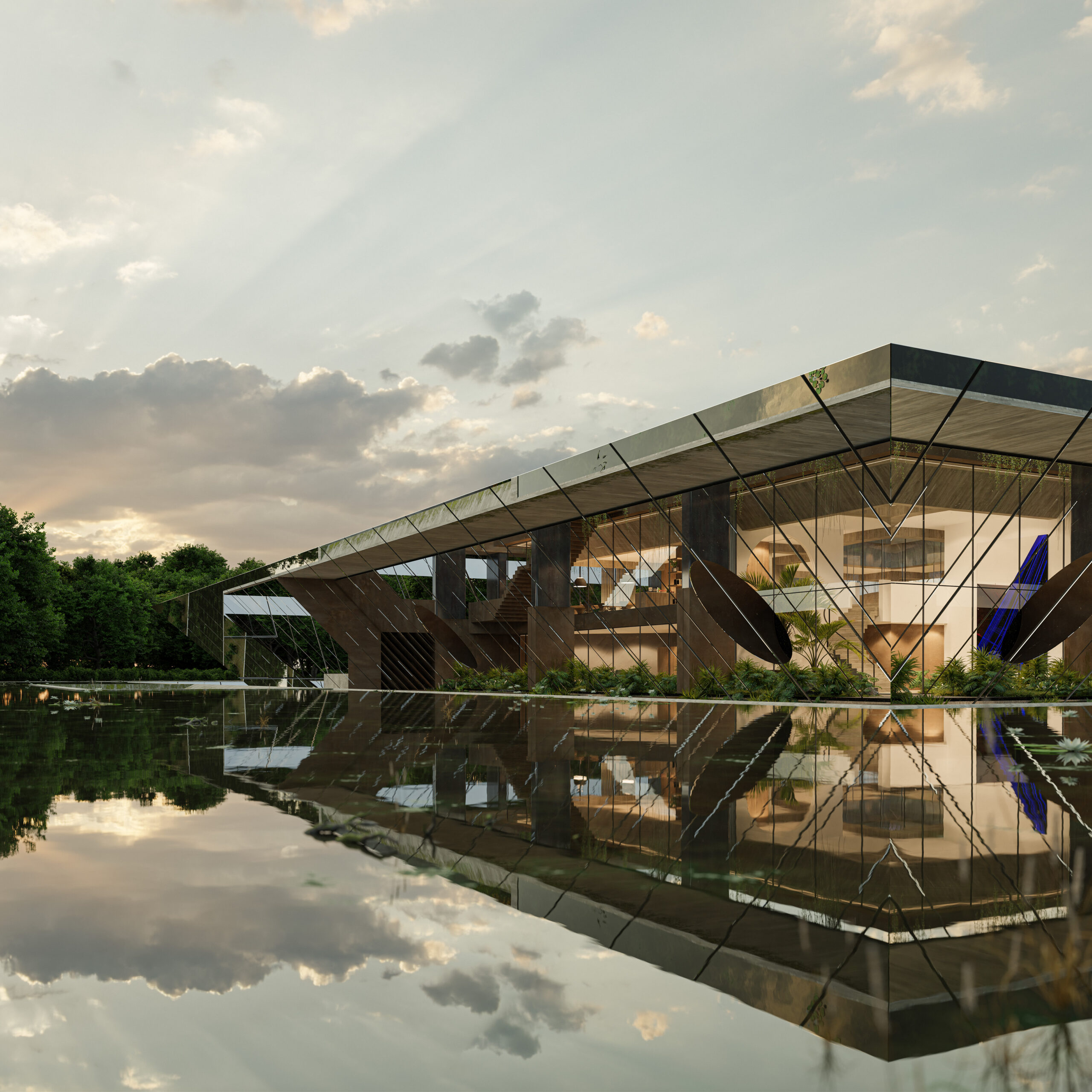
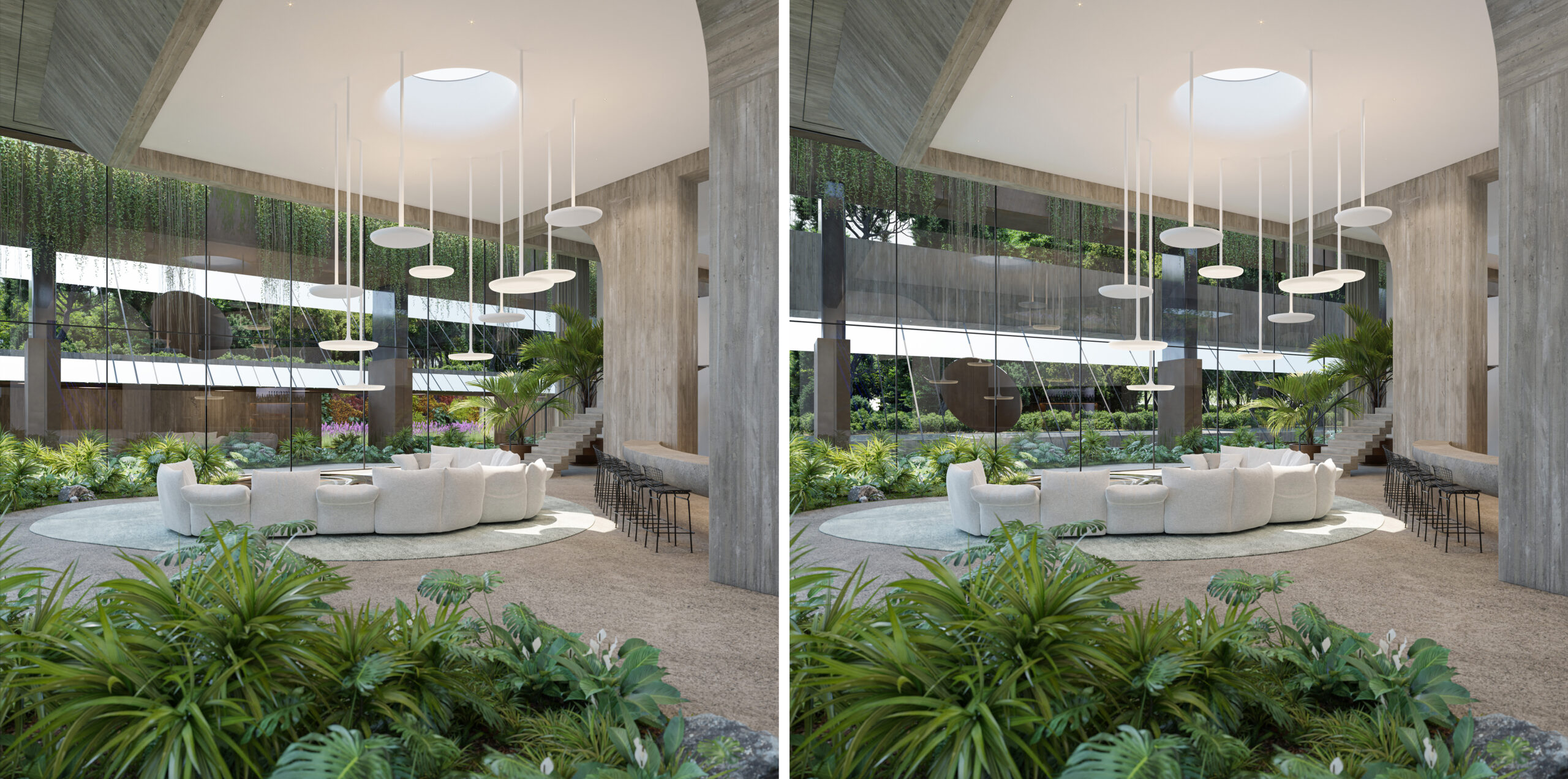
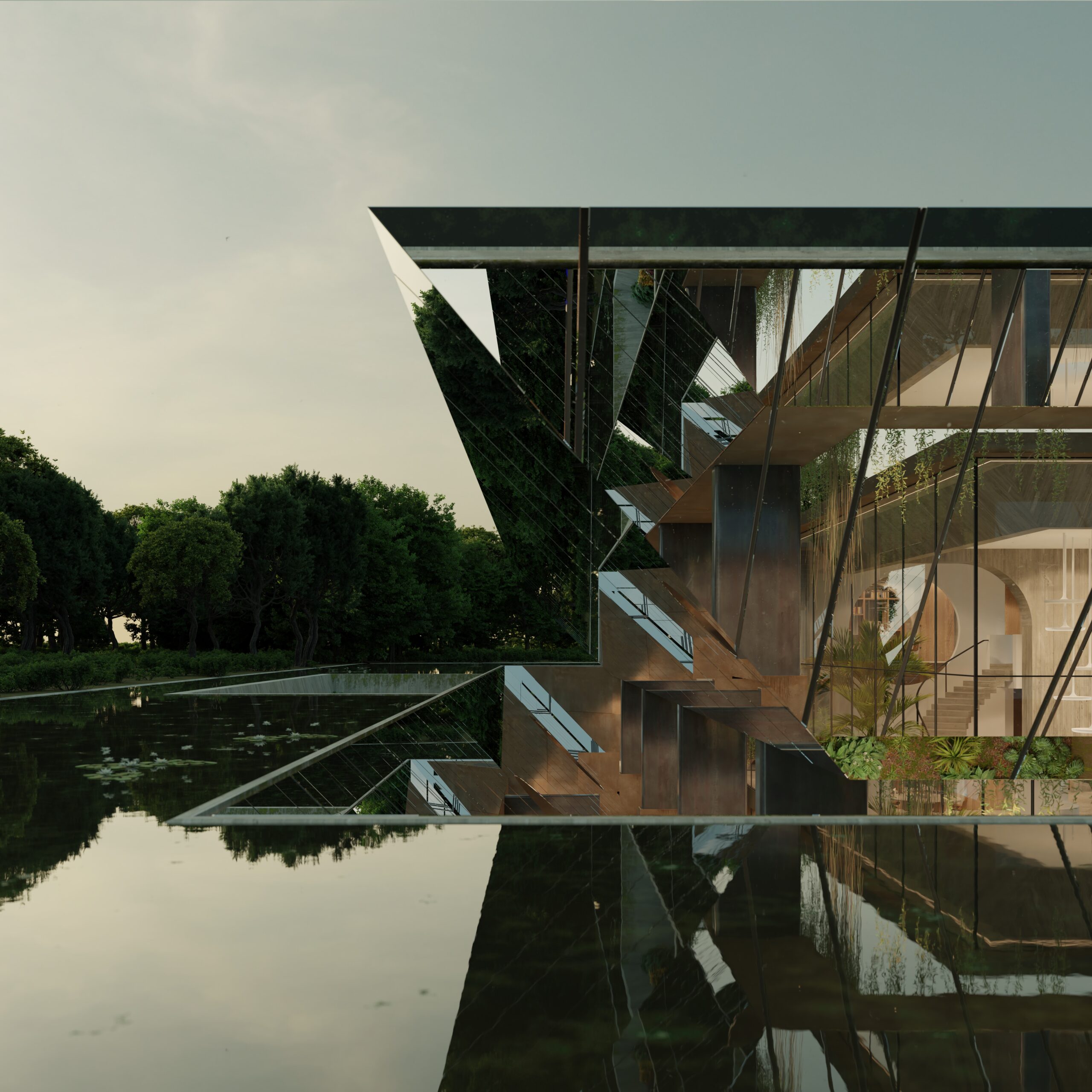
Liminal House
By McLeod Bovell Modern Houses, West Vancouver, Canada
Jury and Popular Choice Winner, Residential Interiors (>3000 sq ft), 12th Annual A+Awards
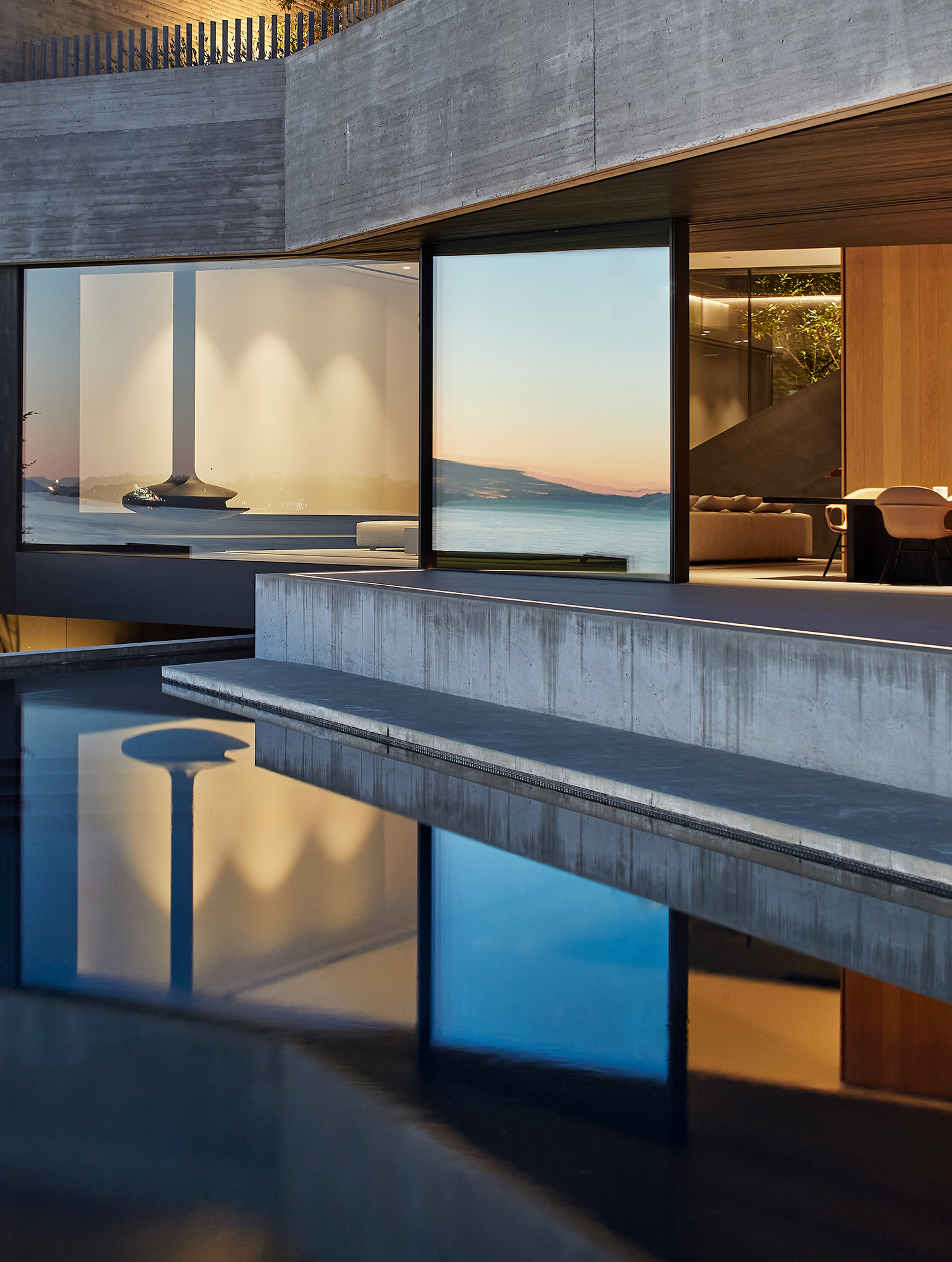
Photographs by Hufton and Crow
Liminal House’s concrete surfaces react subtly to their coastal environment. Salt carried by the strong ocean breezes will pit the surface, while carbonation — a process where carbon dioxide in the air interacts with calcium hydroxide in the material — will give the concrete a denser, more resilient finish. Over time, the once grey façade will shift to earthier hues as rain leaves mineral streaks that slowly soften its color, allowing the family home to blend better with the rugged shoreline. Surprisingly the evolving patina actually helps to protect the structure, reducing porosity while visually anchoring it to the landscape.
River Bend Residence
By Lake|Flato Architects, New Braunfels, Texas
Popular Choice Winner, Private House (M 2000 – 4000 sq ft), 12th Annual A+Awards
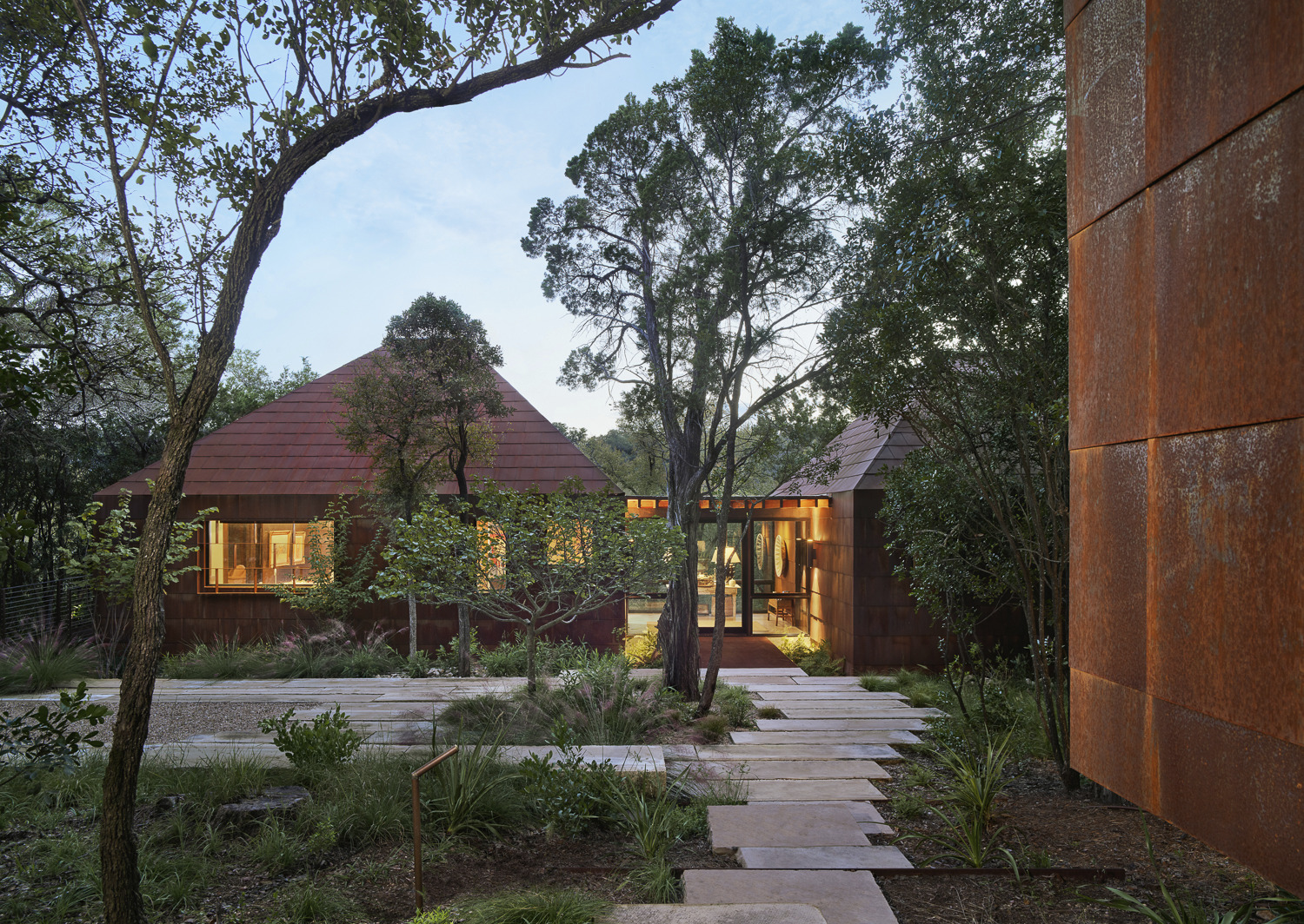
Photograph by Casey Dunn
Around the façade of River Bend Residence, Lake|Flato Architects used weathered Corten steel that will continue to oxidize with exposure to the elements. Not only a visually interesting design choice, the pre-rusted surface, a result of oxidation, has a stable layer that will protect the underlying metal as it deepens in tone thanks to the moisture in the surrounding air. Inside, a use of Douglas fir allows for more evolution as the golden timber shifts to a silvery-grey over time. Together, these materials will age naturally, allowing the building to mature comfortably in its dense woodland environment while helping it to withstand the pressures of time.
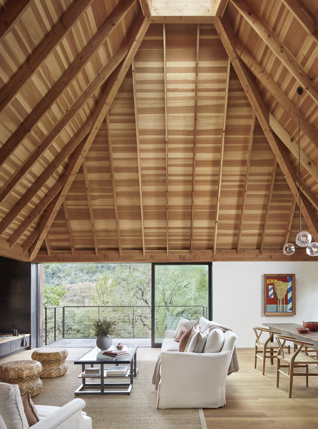
Madrone Ridge
By Field Architecture, Sonoma County, California
Jury Winner, Private House (L 4000 – 6000 sq ft), 12th Annual A+Awards
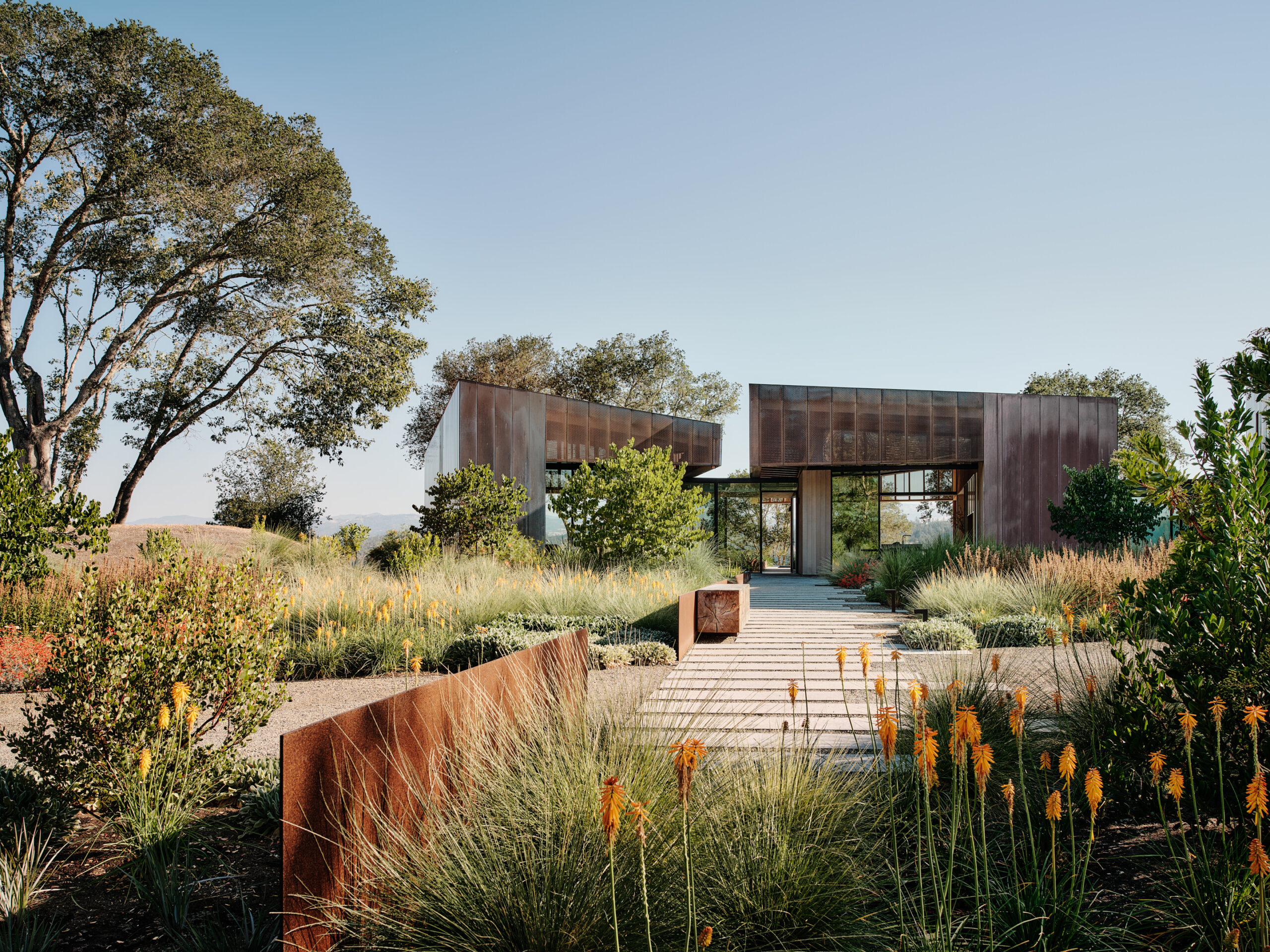
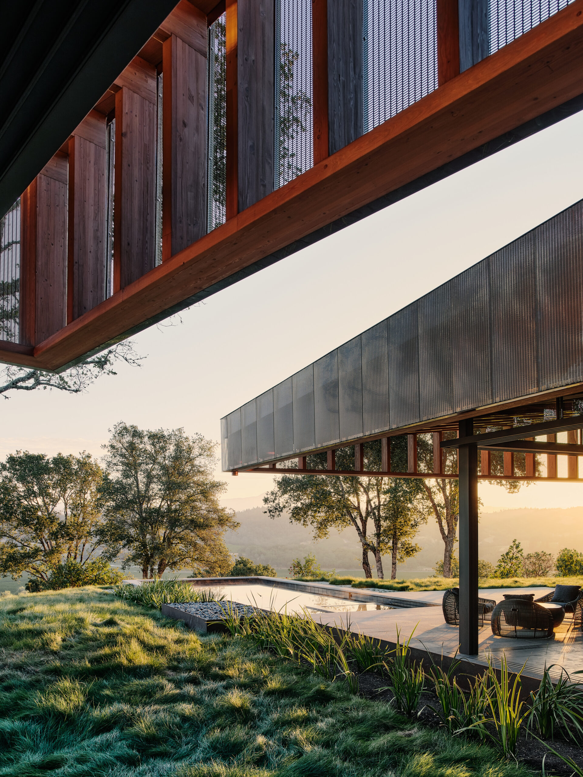
Photography by Joe Fletcher Photography
Copper cladding at Madrone Ridge offers a striking example of how the correct material choice can allow a building to synchronize with its environment. Initially bright and reflective, over time, the copper will begin to oxidize on contact with the air, creating a protective patina that shifts from coppery tones to deep greens and browns. This natural aging process shields the metal from further corrosion and will result in the home becoming integrated more comfortably into the surrounding valley.
Casa Lohr
By Veinte Diezz Arquitectos, Mérida, Mexico
Jury and Popular Choice Winner, Residential Renovations and Additions, 12th Annual A+Awards
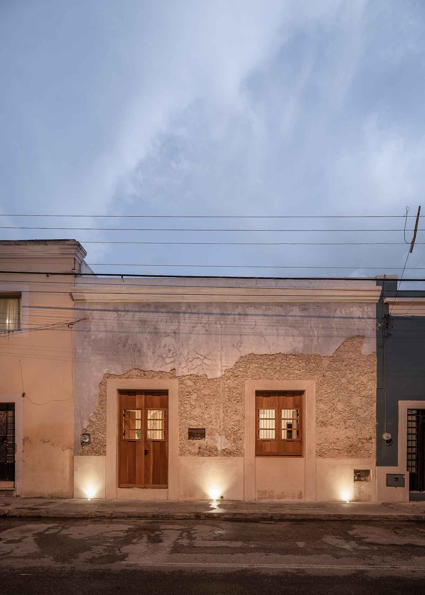
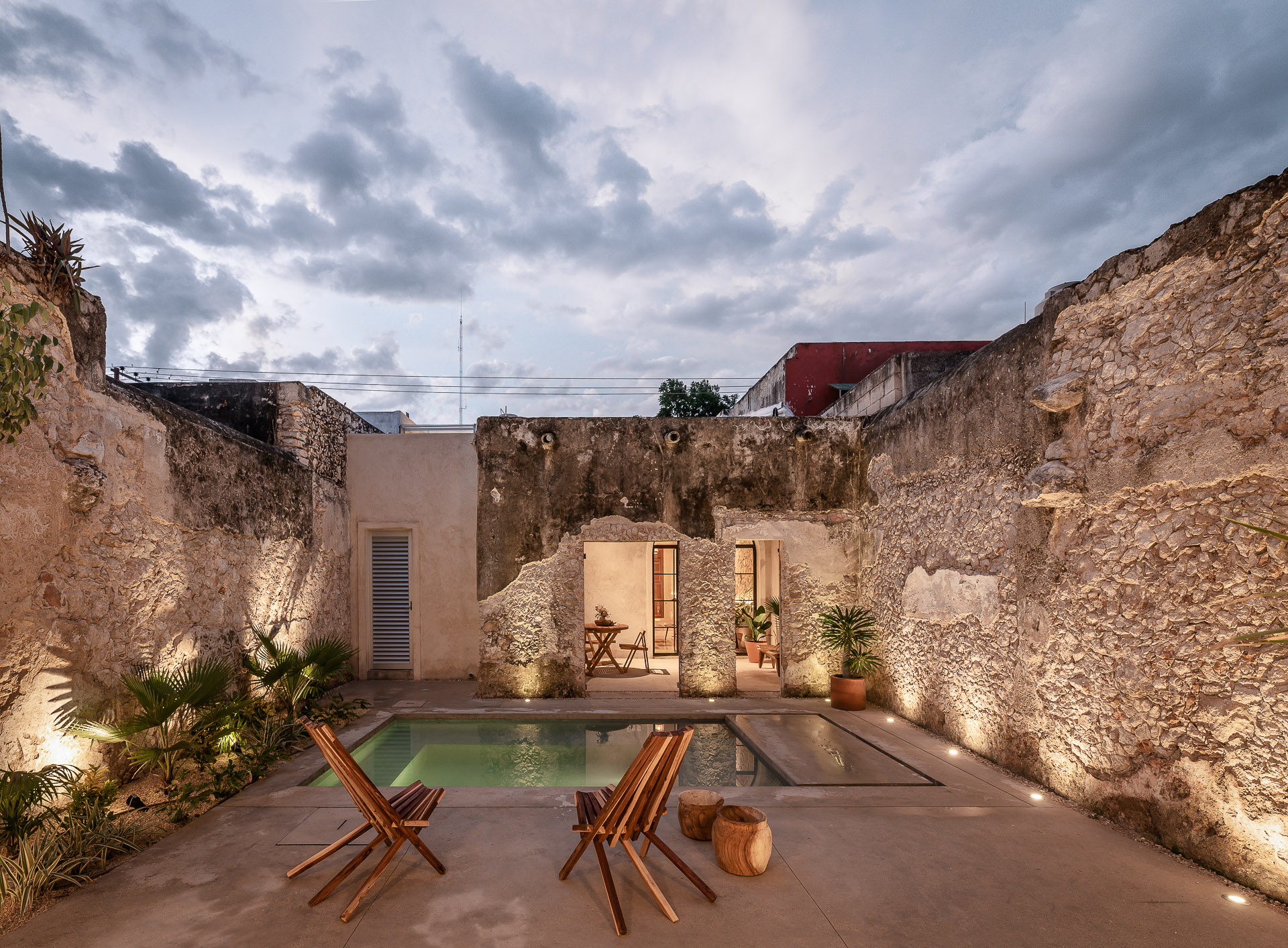
Photographs by Manolo R. Solis
At Casa Lohr, the exposed plasterwork reveals the structure’s colonial origins. The rough texture, left intentionally unfinished, allows the passage of time to play a visible role in the building’s aesthetic. Cracks and weathering expose layers of stone and brick beneath, with each imperfection marking the history of the structure. As the plaster continues to age, the façade will gradually soften, embracing the rawness of its materials and creating an ongoing dialogue between the architecture and the forces that shape it.
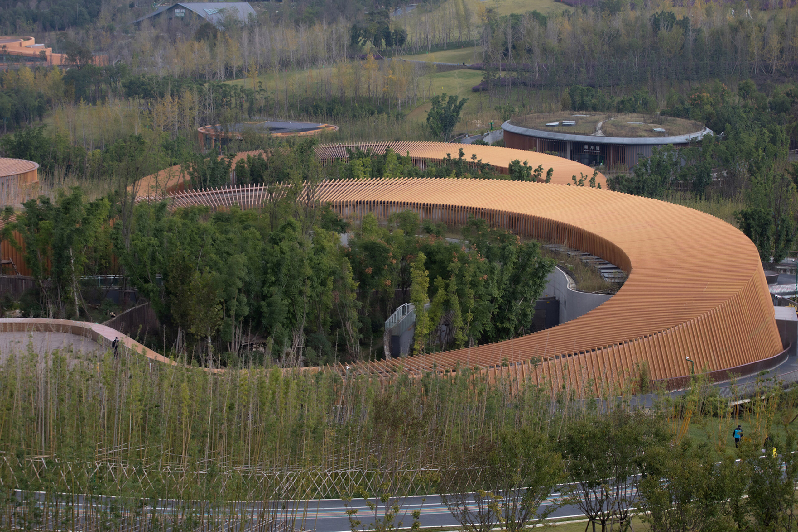
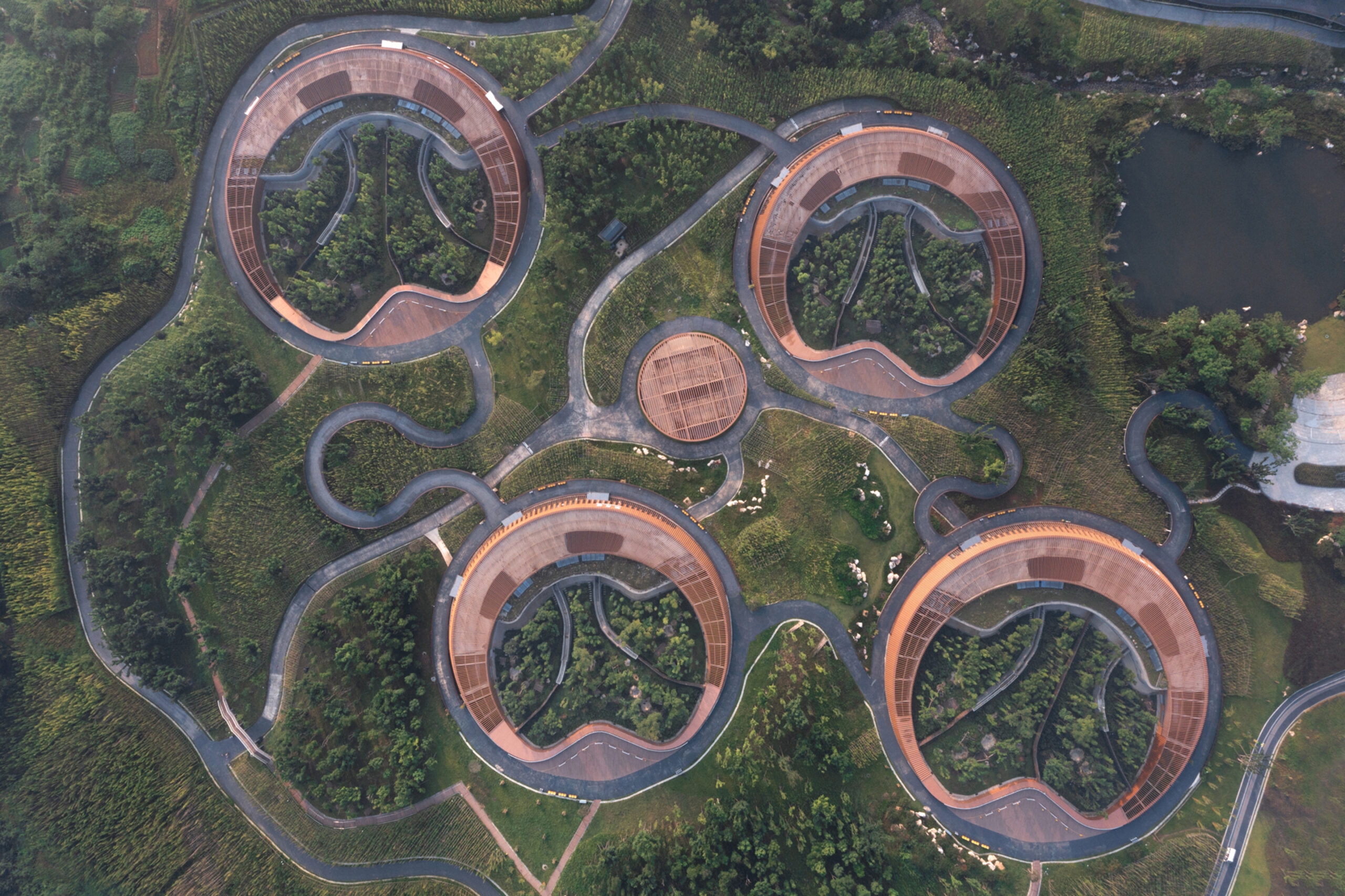
Murka Hotel (Phase II)
By Thinking Design, Wenzhou, China
Popular Choice Winner, Hotels and Resorts, 12th Annual A+Awards
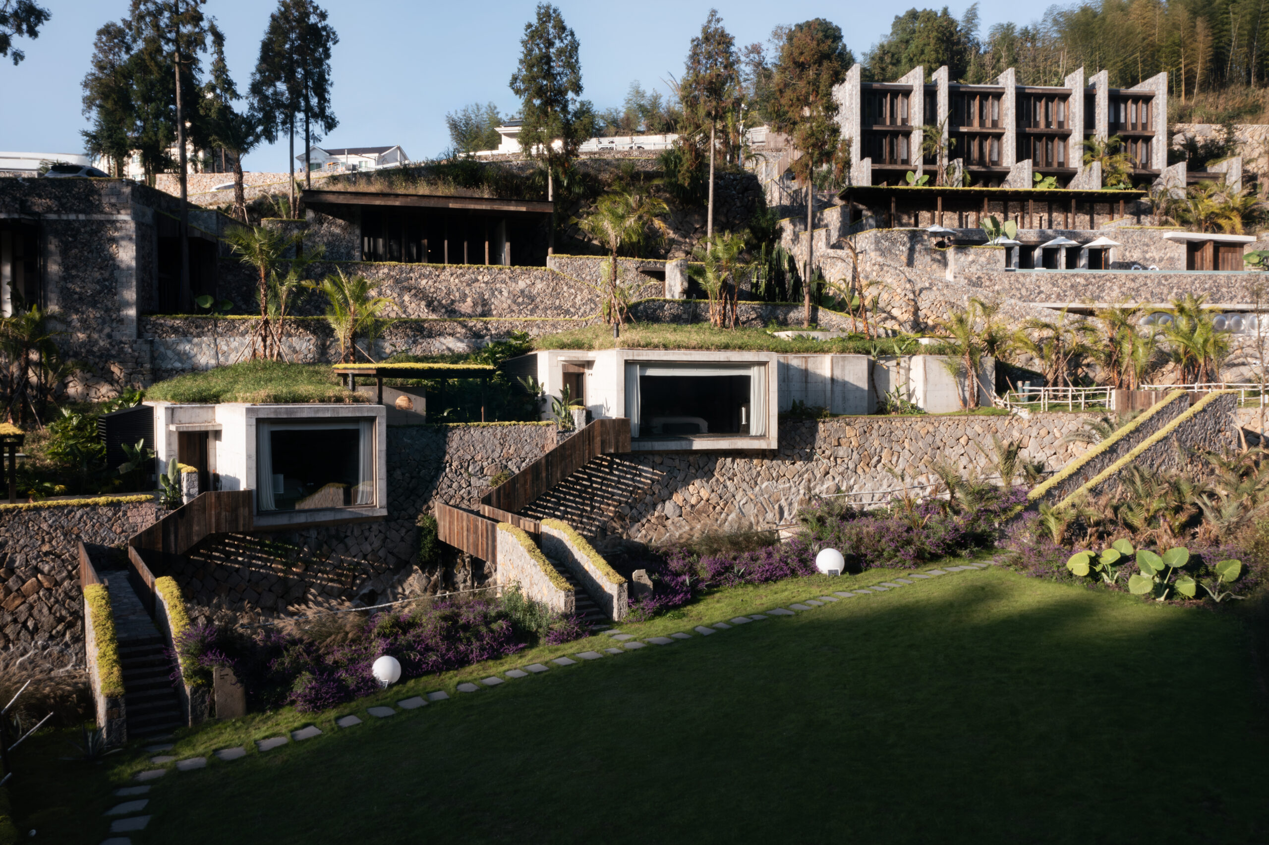
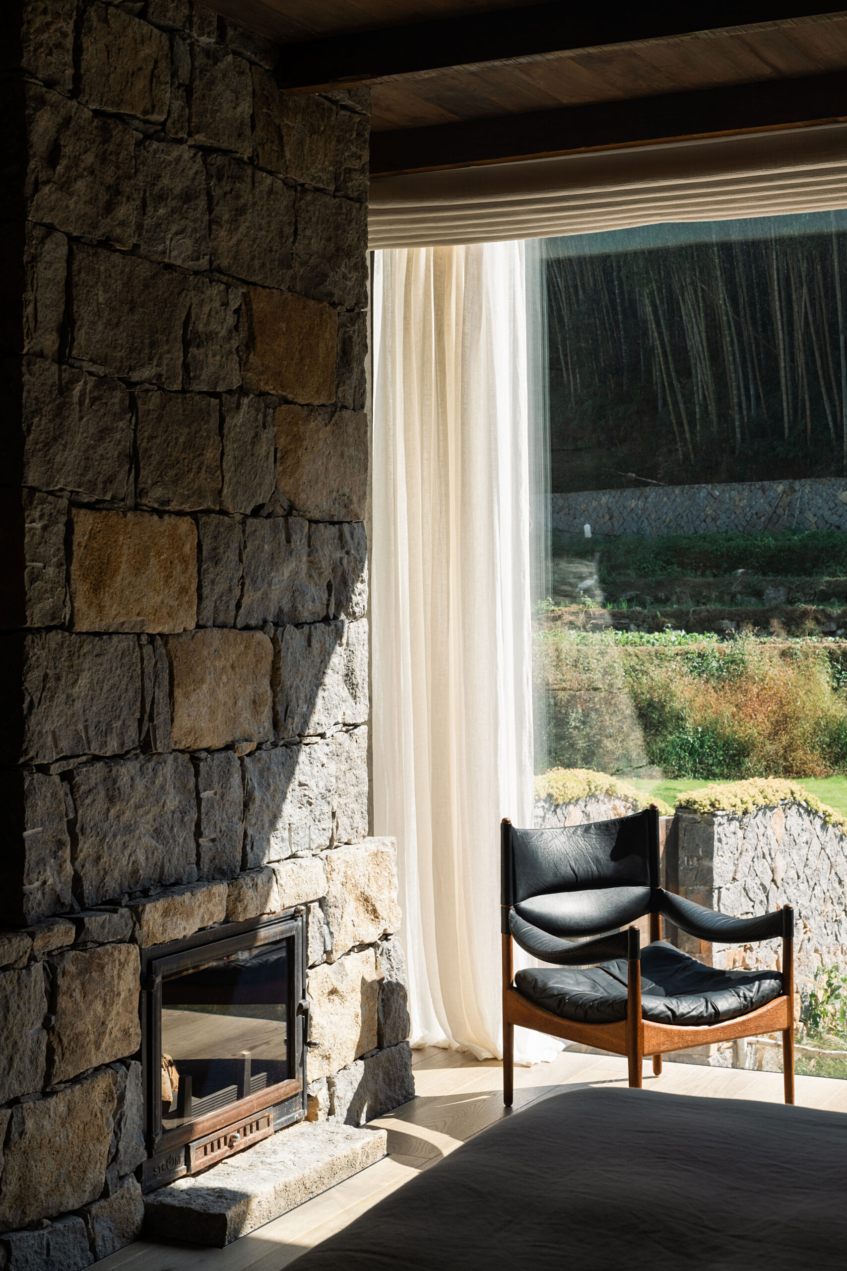 Thinking Design’s use of local stone and reclaimed timber at Murka Hotel initially helps the building blend with the natural landscape. Its raw texture and color palette pay homage to the traditional culture of the area. However, it is the use of biophilia here that will drastically alter the south-facing hotel’s appearance over time. As the stone weathers, its surface will darken and roughen, and the abundant plant life will grow on and around it. The wild grass-covered roofs will grow into the valley, allowing the buildings to be increasingly absorbed into its environment becoming a living habitat.
Architects: Want to have your project featured? Showcase your work through Architizer and sign up for our inspirational newsletters.
The post Better With Age: 5 Projects Positioning Patina as a Dominant Design Detail appeared first on Journal.
 Neri & Hu transformed a former cotton textile warehouse in Beijing’s industrial Langyuan Station into the main office and retail store for the historic Beijing pastry brand Lao Ding Feng. The original brick structure, composed of a main warehouse and annex buildings, was reimagined with a cast concrete form molded within the old brick shell, symbolizing the brand’s traditional pastries shaped by decorative molds.

 Inspired by Fuzhou’s iconic Jinshan Temple, Neri & Hu’s Relic Shelter teahouse encapsulates the city’s rich heritage amidst rapid modernization. The design preserves and elevates a relocated Qing dynasty official’s wooden residence, making it the centerpiece of the teahouse. The structure, set atop a rammed concrete base and crowned with a sweeping copper roof, mirrors traditional earthen dwellings and evokes a sense of raw monumentality.
 The Waterhouse in Shanghai’s South Bund District is a four-story, 19-room boutique hotel, built within a renovated 1930s Japanese Army headquarters. Fronting the Huangpu River and facing the Pudong skyline, the hotel’s design by Neri & Hu emphasizes a striking contrast between old and new.
 In Beijing, where traffic congestion is a daily reality for millions, Neri & Hu’s renovation of an old army weapons factory into an Automobile Repair Shop seeks to rekindle the lost allure of cars. The design incorporates a café and offices, transforming the space into a dynamic workshop with a blend of raw industrial elements and refined touches.
 Design Republic Design Commune in central Shanghai serves as a design hub, blending a flagship store for modern furniture retailer Design Republic with a mix of design-focused retail spaces, including books, fashion, and accessories. Housed in a renovated 1910s British-built Police Headquarters, the project by Neri & Hu carefully restores the original red brick structure while adding modern elements, such as a glassy street-level façade, to breathe new life into the historic building.
 Located near the Miyun Reservoir outside Beijing, the Junshan Cultural Center is a transformed two-story sales building reimagined by Neri & Hu as an iconic clubhouse and sales center. The design embraces the building’s courtyard typology, creating interlocking journeys for members and guests that connect with nature through layered courtyards and gardens.
 Xiuwu County in Henan Province, historically known as Huaiqing Prefecture, is renowned for its production of traditional Chinese medicinal herbs, including the highly valued Rehmannia root (“Shu Di Huang”). In Houyanmen Village, the county has prioritized rural industrial revitalization, with the Ice Chrysanthemum Plantation and the Prepared Rehmannia Root Crafts Exhibition Hall serving as key examples.
 The visitor center at Skamlingsbanken, a historic site in southern Denmark, is designed to blend seamlessly with its glacial landscape, reflecting the area’s rich history of democratic events and natural beauty. Built into the rolling hills, the center serves as both a gateway to the surrounding nature and a space for exhibitions on Skamlingsbanken’s past.

 The Perelman Performing Arts Center (PAC NYC) is a key cultural landmark and the final public element of the World Trade Center master plan. This dynamic venue hosts music, theater, dance, opera and film, with a design that enhances artistic creativity and offers patrons ever-changing experiences. The building’s elegant form, wrapped in translucent marble, appears solid by day and reveals its vibrant interior at night.
 The Richard Gilder Center for Science, Education, and Innovation at the American Museum of Natural History in New York enhances public understanding of science through experiential architecture. The design creates over 30 connections among 10 buildings, improving functionality and visitor flow with a new accessible entrance on Columbus Avenue. The building’s central five-story atrium, inspired by natural geologic formations, opens to natural light and invites exploration.
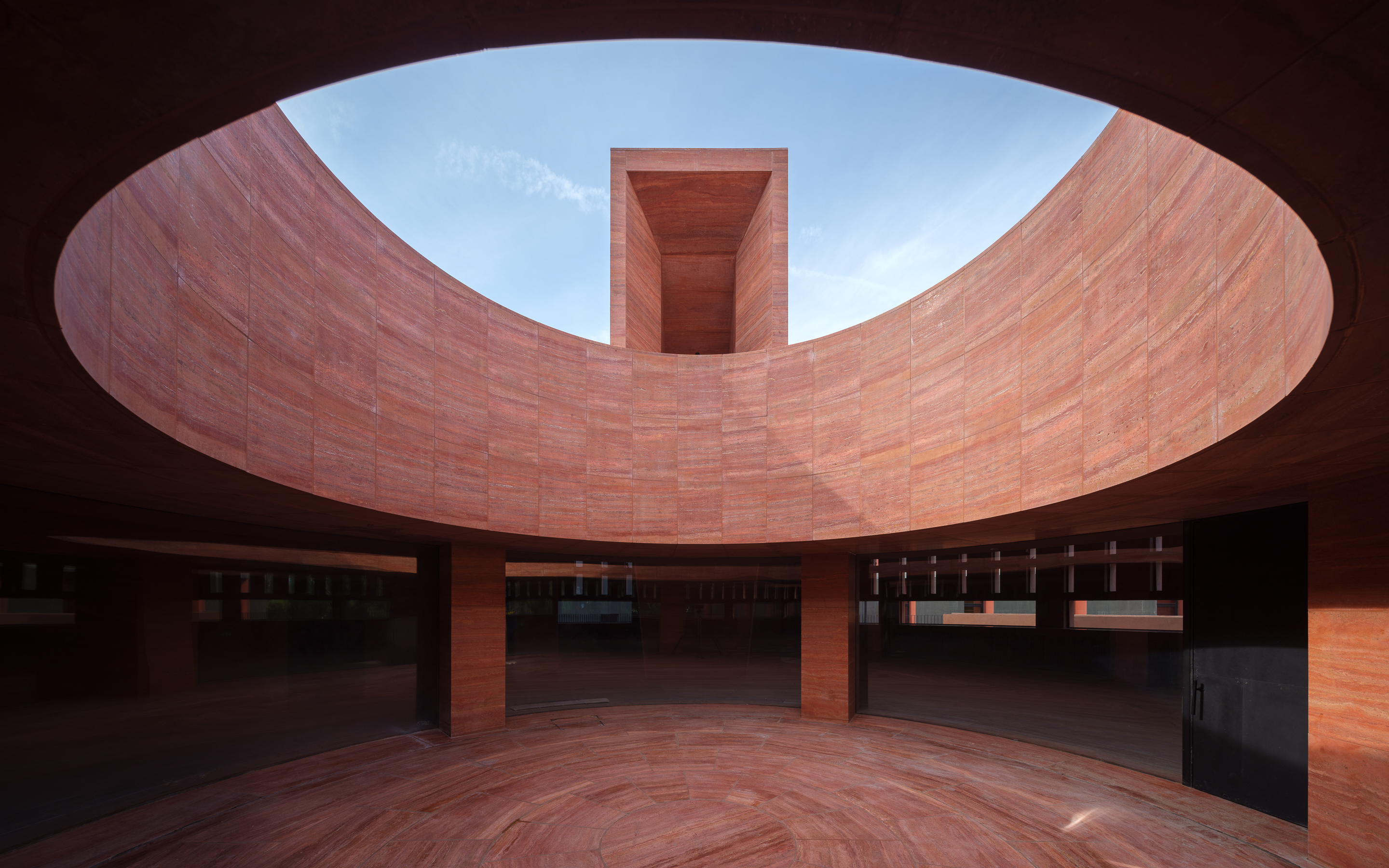

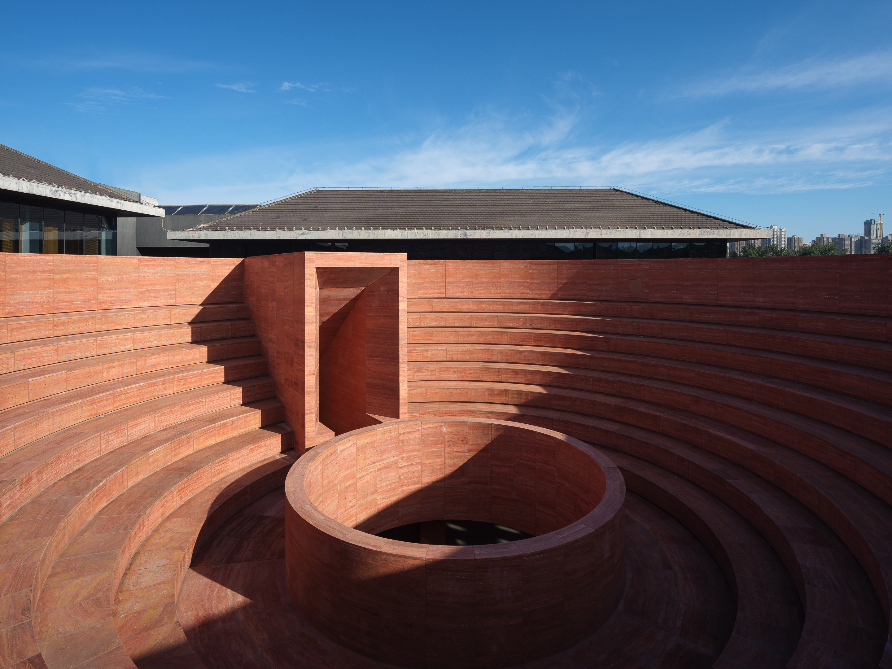 The Qujiang Museum of Fine Arts in Xi’an, located near the Giant Wild Goose Pagoda, was designed by Neri&Hu as a monolithic urban monument. Serving as an architectural icon and cultural anchor at the museum’s East Entry, the design carefully integrates with the surrounding urban fabric.