The Art of Allure: How Luxury Stores Use Façades to Conceal and Entice
Ema is a trained architect, writer and photographer who works as a Junior Architect at REX in NYC. Inspired by her global experiences, she shares captivating insights into the world’s most extraordinary cities and buildings and provides travel tips on her blog, The Travel Album.
In the competitive world of luxury retail, a store’s façade serves as a silent yet powerful communication tool. More than just a barrier between the outside world and the opulent interiors, the façade is a critical element that defines a brand’s identity and allure. Luxury brands have perfected the art of using façades not only to attract attention but also to craft a narrative of exclusivity and sophistication. This article explores luxury stores’ architectural strategies to conceal and entice, transforming their façades into compelling visual statements that hide and reveal.
The Façade as a Storyteller
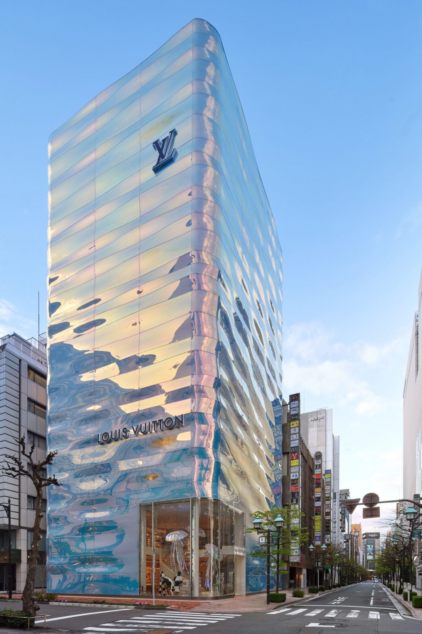
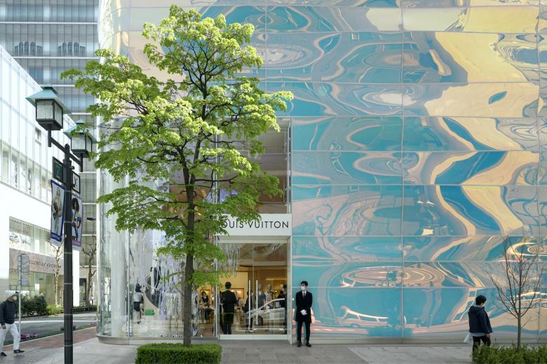
Louis Vuitton Ginza Namiki by AS Co., Peter Marino Architect, Tokyo, Japan | Glass by ShenZhen ShenNanYi Glass Product
Every building is designed with a specific purpose in mind, with the contents or products offered inside often changing over time. For instance, clothing stores continuously introduce new collections and products, leading to a constant rotation of items on display. The same is true for car dealerships and jewelry stores, where the merchandise frequently evolves. While the goods inside these stores may change regularly, the building itself remains constant, designed to serve its original purpose year after year. This is why buildings should be designed with a timeless quality, enhancing the brand’s allure rather than detracting from it.
In luxury retail, the façade is the first point of contact between the brand and the consumer. It acts as a storyteller, conveying messages of opulence, craftsmanship and exclusivity. Unlike typical retail spaces, where functionality may overshadow form, luxury stores typically invest significantly in the aesthetics of their exteriors. These façades are not merely entrances; they are architectural expressions that embody the brand’s essence and invite potential customers to explore further.
One of my favorite examples is the Louis Vuitton Flagship Ginza Store in Tokyo, characterized by its translucent glass façade, which mirrors the surrounding cityscape during the day and emits a soft glow at night. The use of glass creates an intriguing sense of mystery, as little can be seen from the outside. Only the corner of the building is open, inviting people to come in and discover what lies within and to experience the interior for themselves. The building’s unique modern design embodies the essence of water with its smooth, undulating surfaces, naturally drawing people’s attention. The shimmering façade draws the eye, captivating passersby with its sparkle and reflections. The glass façade appears to dance with shifting colors, creating a sense of fluidity that is echoed inside with a feature staircase and fixtures, evoking the playfulness and rhythm of water.
Concealment: The Power of Mystery
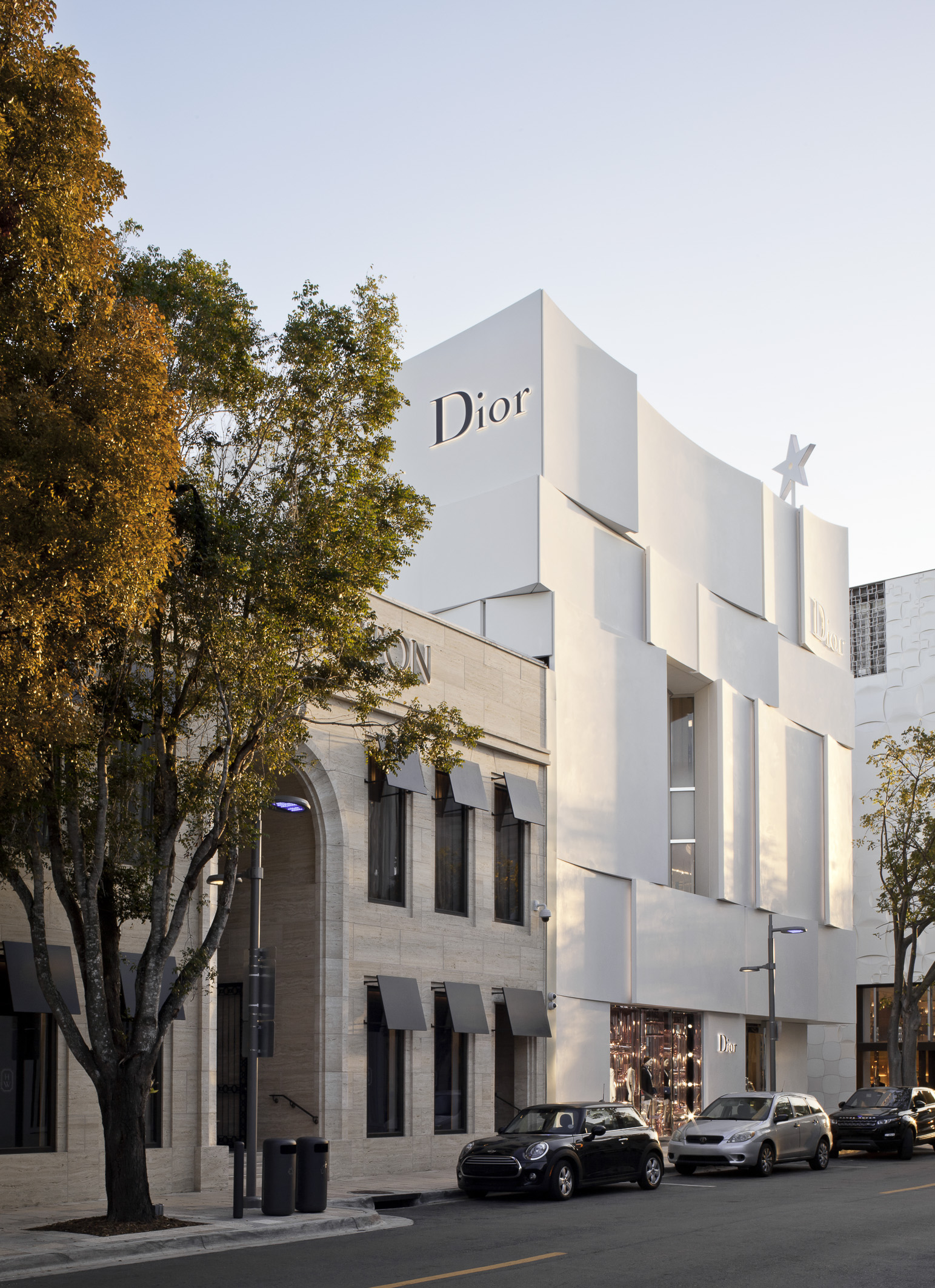
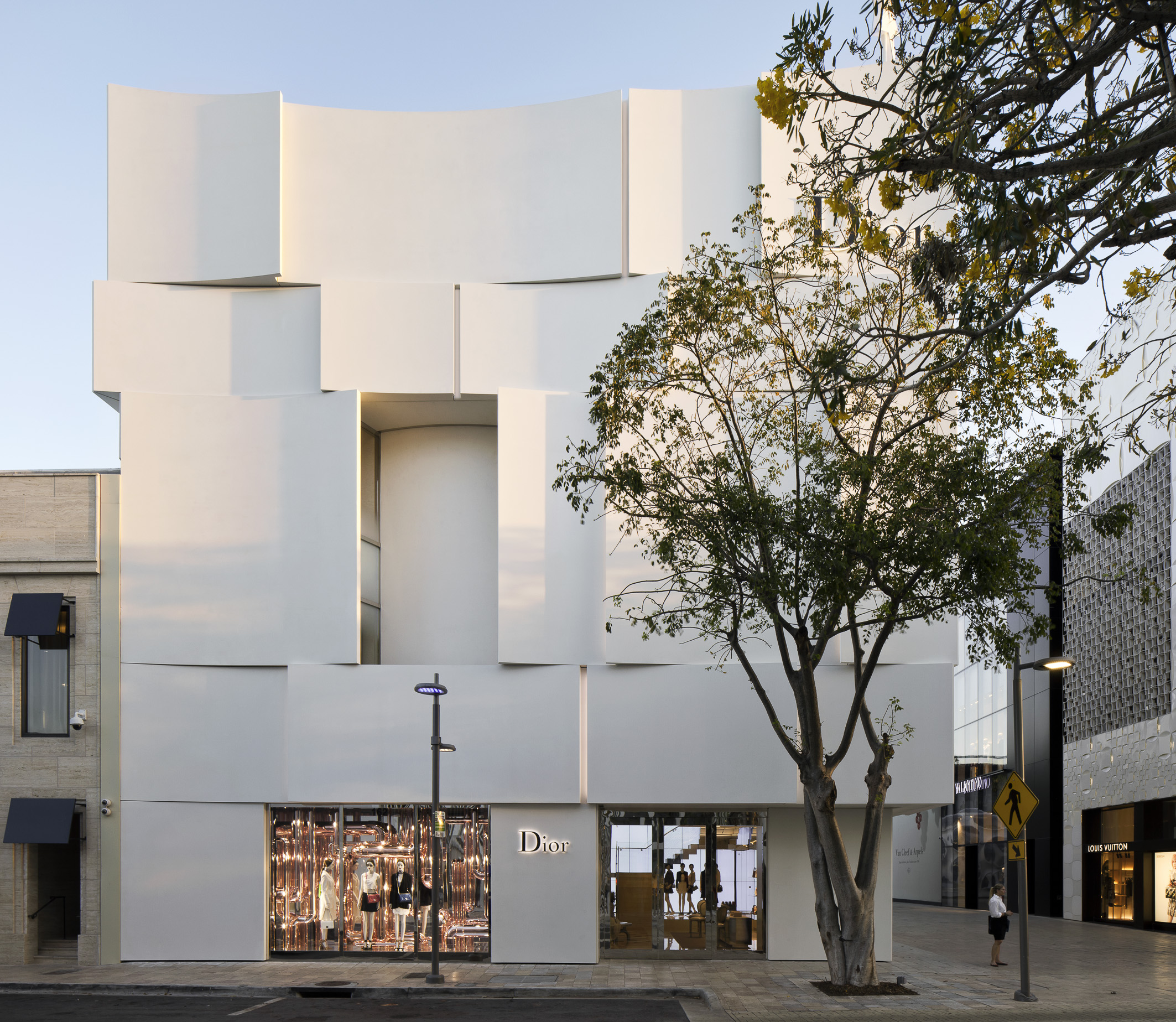
Dior Miami Façade by BarbaritoBancel Architect, Miami, Florida
Have you ever noticed that when you pass by a luxury store, you often can’t see everything inside? Instead, you catch glimpses through carefully curated openings, doorways or windows. The façade may vary, being fully transparent in some sections while opaque in others, enticing you to enter and explore what’s hidden inside. Luxury brands often use the strategy of concealment to create an aura of mystery and exclusivity. By limiting the visibility of the store’s interior, these façades (that are often intriguing and beautiful themselves) generate intrigue, compelling passersby to step inside and discover what lies beyond. This approach capitalizes on the allure of the unknown, making the act of entering the store feel like a privileged experience.
A great example is Dior Miami’s façade, which is composed of sleek, overlapping white panels that resemble the delicate folds of fabric — a subtle nod to the brand’s couture heritage. These panels are arranged in a way that allows for narrow, vertical openings to offer brief glimpses into the store’s luxurious interior. A few large panels on the ground floor, and even fewer on the upper levels are left open to offer glimpses inside the store, hinting at what lies inside. This design choice offers tantalizing glimpses of the interior, sparking curiosity and engagement while maintaining an air of exclusivity unique to the Dior brand and its building.
Enticement: The Play of Transparency
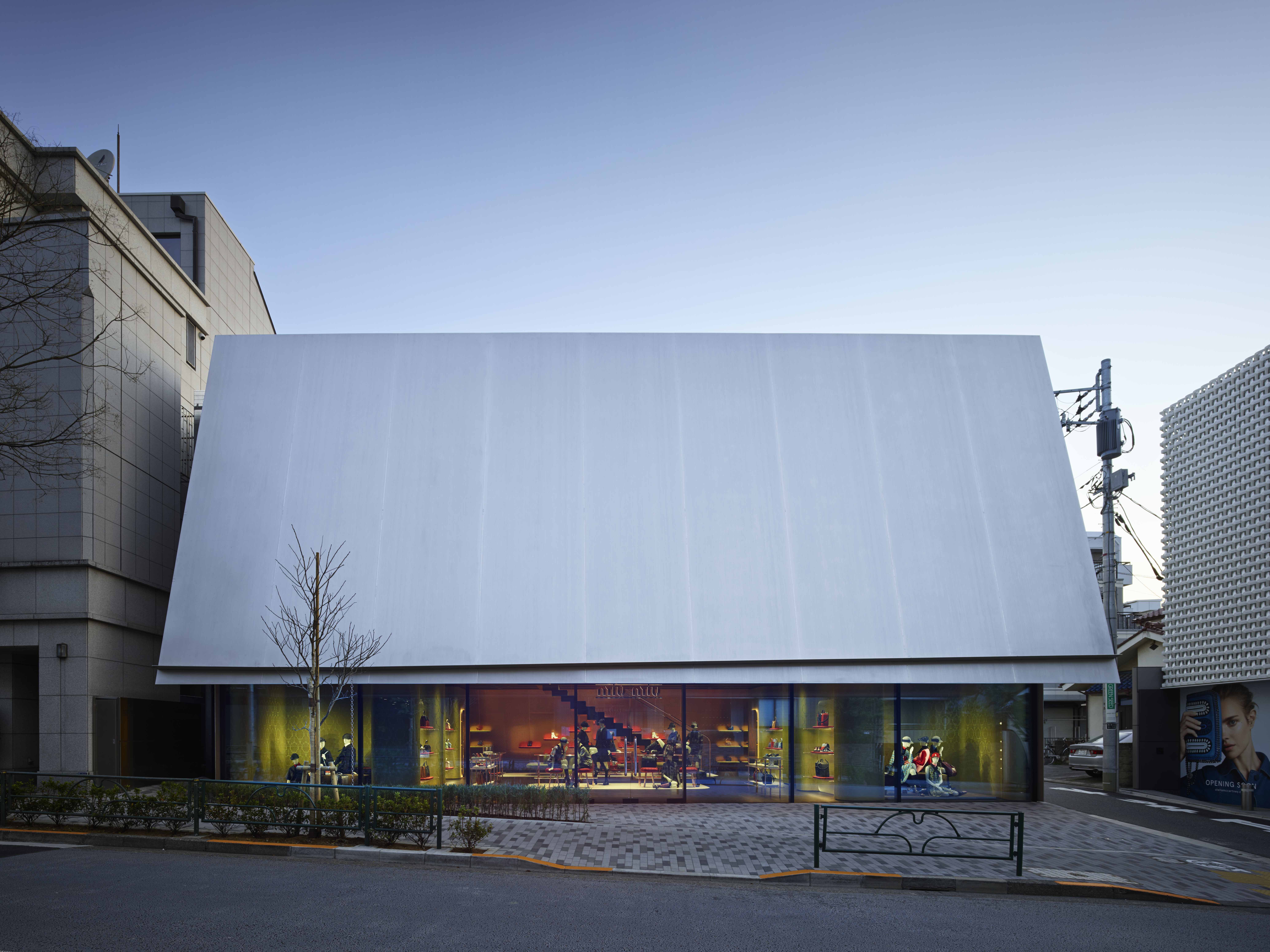
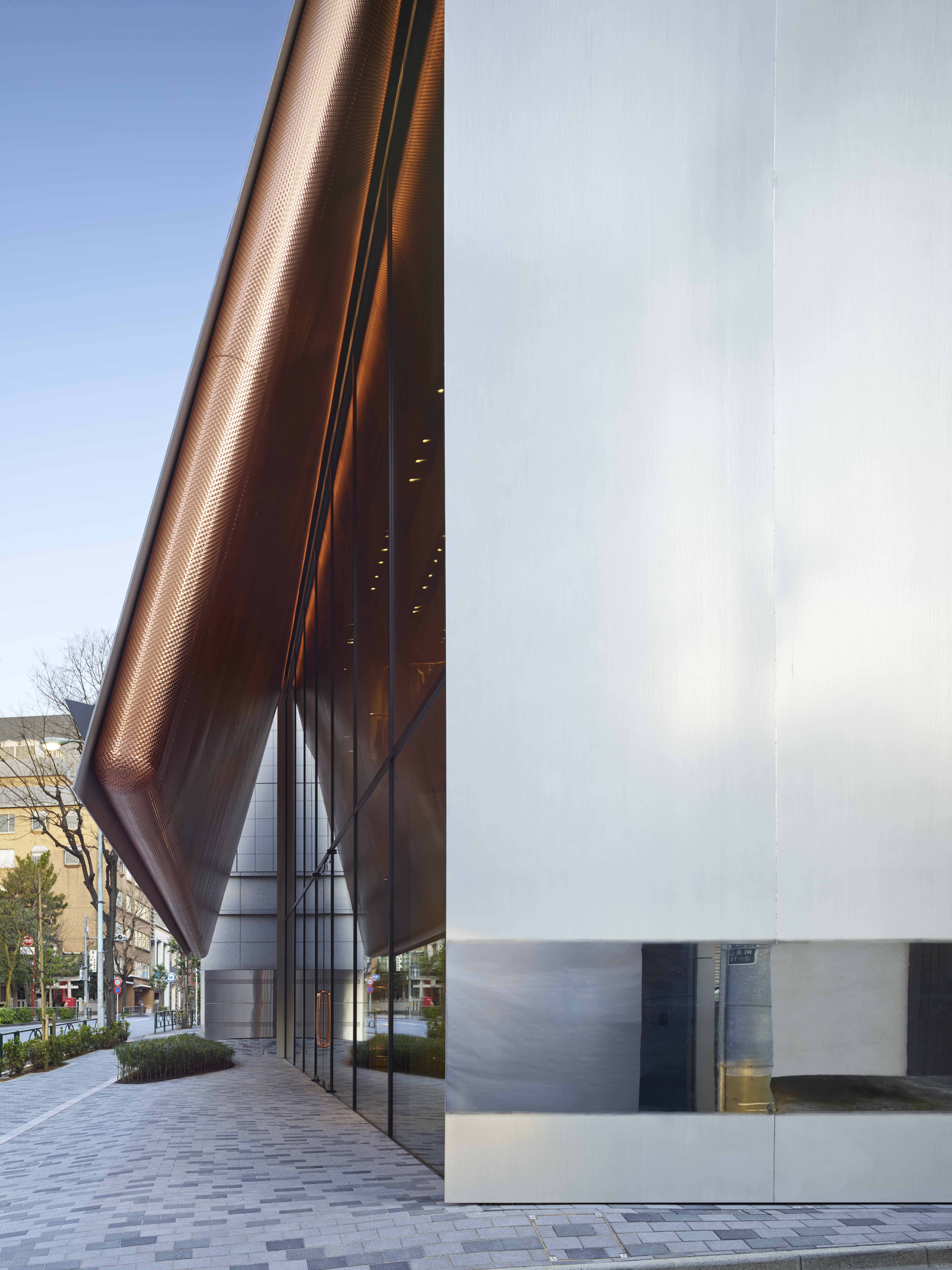
Miu Miu Aoyama by Herzog & de Meuron, Tokyo, Japan
In contrast to the strategy of concealment, some luxury brands use transparency to offer tantalizing glimpses of their interiors. This technique strikes a delicate balance, providing just enough visual access to pique curiosity without revealing everything. Glass, and the way the glass is used creatively, is frequently the material of choice, allowing for a visual connection between the inside and the outside.
This brings me to addressing an architectural detail: mastering light and shadow. A key feature of luxury façades is their intricate manipulation of light and shadow, which creates a dynamic visual experience that evolves throughout the day. By harnessing natural light, designers can help brands craft façades that are visually engaging and sometimes even ever-changing.
The Miu Miu Aoyama store in Tokyo uses an opaque metal façade, giving the building a more intimate quality. The building resembles a partially opened gift box, perfectly suited to conceal the brand’s products while hinting at the excitement of unveiling its contents. The façade serves as a sun-shading device that controls light and shadow, while also providing an engaging visual experience without being over powering. It plays with perspective, revealing and concealing the interior as one moves around the building. Unlike the other examples in this article, the entire ground floor of this building is open, yet maintains a sense of concealment, offering just enough visibility at street level to intrigue pedestrians and entice them to enter. The rounded copper panels on the inside of the building’s façade add warmth and texture, contrasting with the sleek, sharp silver steel corners that appear lifted, as if the edges of the façade have been cut and raised.
The Façade as a Branding Tool
A well-designed façade is an extension of a brand’s identity. Luxury brands use architectural elements to differentiate themselves from competitors and to reinforce their unique brand image. Signature design motifs, colors, and materials become visual shorthand for the brand’s values and aesthetic.
Chanel, for instance, a brand most of us know so well is instantly recognizable by its use of black, white and beige — a color palette that reflects the brand’s commitment to timeless elegance. The clean lines and minimalist aesthetic go beyond Chanel’s branding; they are reflected in Chanel’s façades, which emphasize the brand’s commitment to modernity and simplicity. These design choices ensure that each Chanel store is a distinctive embodiment of the brand’s ethos.
Materials Matter: Conveying Luxury Through Choice
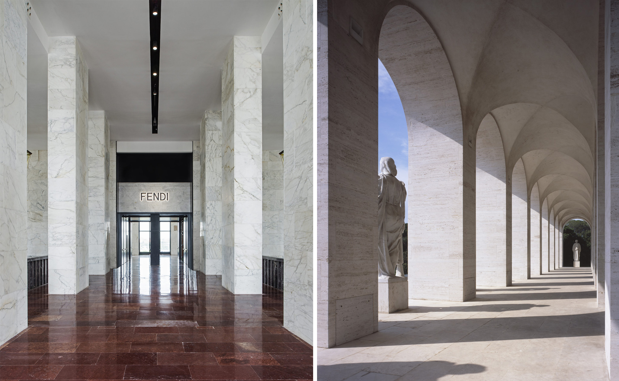
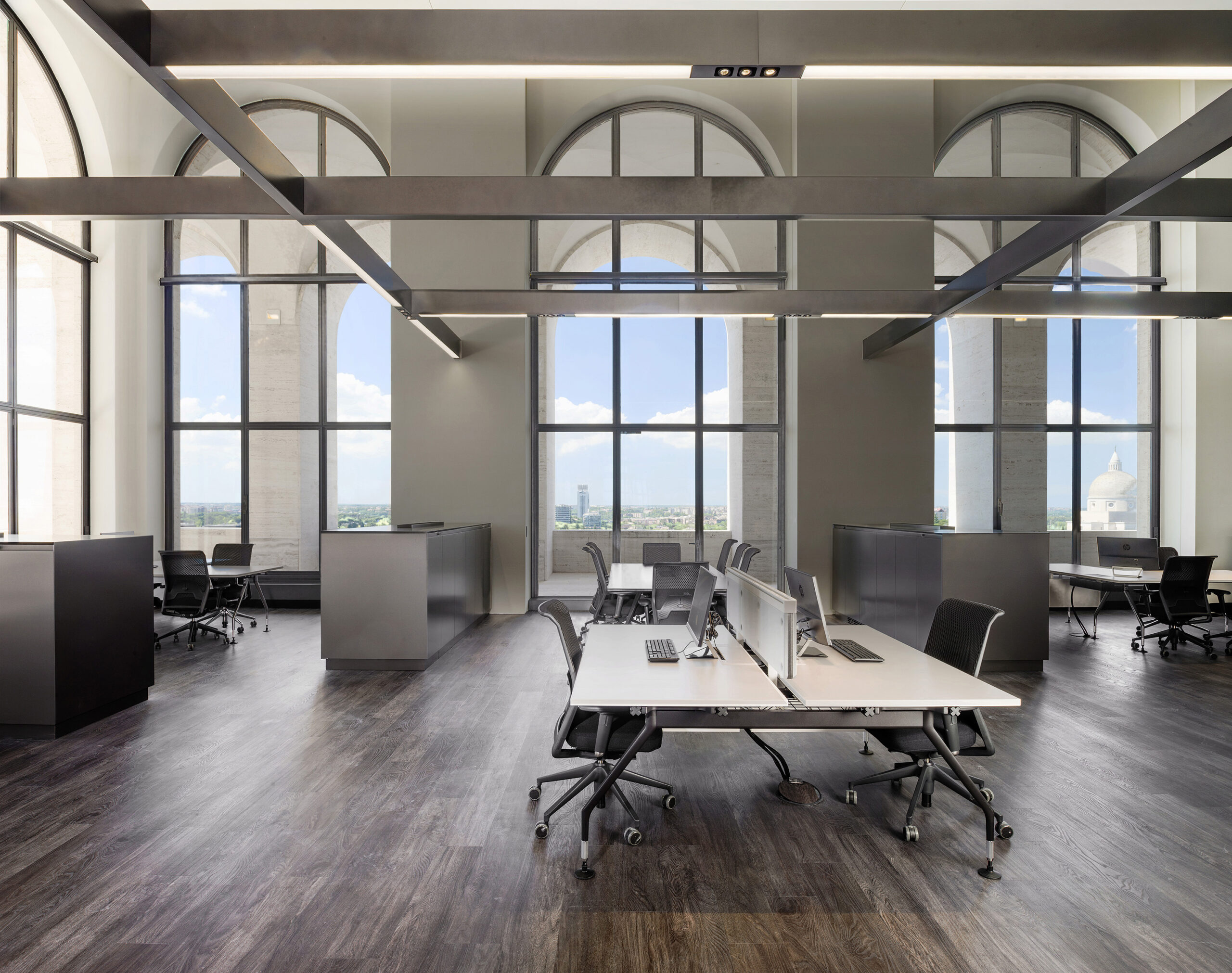
Fendi HQ by Marco Costanzi Architects, Rome, Italy
The selection of materials is paramount in the design of any façade. High-end brands choose materials that embody luxury and exclusivity, such as marble, bronze, exotic woods, and occasionally even gold leaf. These materials are chosen not only for their visual impact but also for their tactile qualities, which can evoke an emotional response from customers.
For example, Fendi’s headquarters in Rome is a stunning example of how a luxury brand can blend historical elegance with modern sophistication. Although it is not a retail store, Fendi HQ is an excellent example of how a luxury brand uses architecture and façade design to create a sense of mystery, allure, and enticement. Located in the Palazzo della Civiltà Italiana, also known as the “Square Colosseum,” this iconic building serves as both a cultural landmark and a representation of Fendi’s commitment to preserving and reinterpreting heritage. The building’s façade is characterized by its series of symmetrical arches, a nod to classical Roman architecture, which lends the structure a sense of timelessness and grandeur.
The glass elements provide transparency, offering glimpses into the interior while reflecting the surrounding cityscape, thus creating a dialogue between the past and present. Inside, Fendi has seamlessly integrated luxurious, modern interiors with the building’s historical context. The use of marble, wood, and other high-end materials reflects the brand’s dedication to craftsmanship and luxury, while the open spaces and strategic lighting emphasize the building’s architectural beauty. By combining classical architectural forms with modern design techniques, Fendi HQ encapsulates the essence of the brand—respect for tradition, a passion for innovation, and an unwavering commitment to luxury. This harmonious blend of old and new not only preserves the building’s historical significance but also propels it into the contemporary luxury market, making it a fitting home for one of fashion’s most revered brands.
The jury and the public have had their say — feast your eyes on the winners of Architizer's 12th Annual A+Awards. Subscribe to our Awards Newsletter to receive future program updates.
The post The Art of Allure: How Luxury Stores Use Façades to Conceal and Entice appeared first on Journal.
